
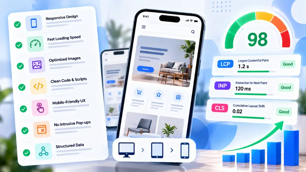

Mobile-first design means building the smallest-screen experience first, then expanding it for larger screens. For SEO in 2026, it also means passing Core Web Vitals on a mid-range phone: Largest Contentful Paint (LCP) at 2.5 seconds or less, Interaction to Next Paint (INP) at 200 milliseconds or less, and Cumulative Layout Shift (CLS) at 0.1 or less.
This mobile first design checklist covers the decisions that affect those numbers: viewport configuration, responsive layout, touch target sizing, images, fonts, JavaScript, and testing. Use it as a pre-launch review or as an audit of an existing site.
What Is Mobile-First Design?
Short answer: Mobile-first design is an approach where you design and code for phones first, using the constraints of small screens, slower networks, and touch input to decide what a page needs. Larger layouts are then added on top using CSS media queries.
It differs from responsive design, which is a technique. Responsive design adapts one codebase to many screen sizes. Mobile-first is a priority order for how you write that responsive code: base styles target small screens, and min-width queries add complexity for tablets and desktops.
The practical benefit is restraint. When a phone must load the page on a congested connection, unnecessary scripts, oversized images, and decorative widgets become hard to justify.
Why Does Mobile-First Design Matter for SEO in 2026?
Short answer: Google predominantly indexes the mobile version of your pages, and Core Web Vitals are reported separately for mobile and desktop. If your mobile page is thinner, slower, or less stable than your desktop page, the mobile version is the one that counts.
Two facts anchor this:
- Mobile content is what gets indexed. Google stated in its mobile-first indexing guidance that, under mobile-first indexing, only the content shown on the mobile version is used for indexing and ranking. Hidden or removed mobile content is effectively invisible to Search.
- Core Web Vitals use the same thresholds on every device. According to web.dev’s explanation of how the thresholds were defined, they are not segregated by device, and pages are assessed at the 75th percentile of real user visits. Because phones are slower than laptops, mobile is usually the harder report to pass.
One note on proportion: Google has described page experience as one of many signals, and relevant content can still rank when experience is imperfect. Treat Core Web Vitals as a quality baseline that supports user satisfaction, not as a substitute for useful content.
Core Web Vitals Targets for Mobile (2026)
| Metric | Measures | Good | Needs improvement | Poor |
| LCP (Largest Contentful Paint) | Loading speed | 2.5 s or less | 2.5 to 4.0 s | Over 4.0 s |
| INP (Interaction to Next Paint) | Responsiveness | 200 ms or less | 200 to 500 ms | Over 500 ms |
| CLS (Cumulative Layout Shift) | Visual stability | 0.1 or less | 0.1 to 0.25 | Over 0.25 |
INP replaced First Input Delay as the responsiveness metric in March 2024, so any checklist that still mentions FID is out of date.
The Mobile-First Design Checklist
1. Viewport configuration
Without a viewport declaration, phones render your page at a desktop width and shrink it, which makes text unreadable and layouts break. Add this to the <head>:
<meta name=”viewport” content=”width=device-width, initial-scale=1″>
- Do not disable zoom with user-scalable=no or maximum-scale=1. It harms accessibility.
- Confirm no element forces a fixed pixel width wider than the screen.
- Check for horizontal scrolling at 320 and 375 pixel widths.
2. Responsive layout
Responsive design is the delivery mechanism for mobile-first. Check that:
- Base CSS targets small screens, with min-width media queries adding larger layouts.
- Layouts use flexible units (%, rem, fr) and modern tools like CSS Grid and Flexbox.
- Images and videos scale with max-width: 100%.
- Navigation collapses sensibly, and primary actions stay reachable with one thumb.
- Tables and code blocks scroll inside their own container instead of widening the page.
3. Touch target sizing
Fingers are less precise than cursors. Several standards apply, and they differ:
| Source | Requirement |
| WCAG 2.2, SC 2.5.8 (Level AA) | Targets at least 24 by 24 CSS pixels, with exceptions for spacing and inline links |
| WCAG 2.1, SC 2.5.5 (Level AAA) | Targets at least 44 by 44 CSS pixels |
| Lighthouse tap targets audit | Flags targets under 48 by 48 pixels that overlap other targets |
Per Chrome’s Lighthouse documentation, 48 by 48 pixel targets never fail the audit, and 8 pixels of spacing is a good starting point. Designing to 48 pixels satisfies all three standards. Increase padding rather than changing the visual size:
.nav-link,
.btn {
min-height: 48px;
min-width: 48px;
padding: 12px 16px;
}
.nav-link + .nav-link {
margin-left: 8px;
}
Also keep body text at 16 pixels or larger. Smaller text prompts pinch-zooming, which is a common reason users abandon forms.
4. Mobile page speed and LCP
LCP is usually a hero image or the main heading block. To pass on mobile:
- Identify the LCP element in PageSpeed Insights or Chrome DevTools, and make it the first thing the browser fetches.
- Serve modern, correctly sized images. Use responsive srcset and sizes, and formats like WebP or AVIF where supported.
- Do not lazy-load the LCP image. Lazy loading belongs on below-the-fold media.
- Preload critical assets, such as the hero image and primary web font.
- Trim render-blocking CSS and JavaScript so the first view is not waiting on code it does not need.
- Check server response time. A slow first byte caps every other improvement.
5. Layout stability and CLS
Layout shift happens when elements move after the user starts reading. Typical fixes:
- Set explicit width and height attributes, or use aspect-ratio, on images, iframes, and video.
- Reserve space for ads, embeds, and cookie banners before they load.
- Avoid inserting content above existing content, unless it responds to a user action.
- Use font-display: swap with a metrically similar fallback font to reduce text jumps.
6. Responsiveness and INP
INP measures how quickly the page responds to taps, clicks, and key presses across the whole visit. Mobile CPUs struggle most with long JavaScript tasks. To improve INP:
- Break long tasks into smaller chunks and yield to the main thread.
- Defer non-critical scripts, and remove unused ones.
- Audit third-party tags such as chat widgets, analytics, and ad libraries, which are frequent causes of poor interaction scores.
- Keep event handlers light, and move heavy work out of tap responses.
- Give instant visual feedback, such as a pressed state, even if processing continues.
7. Content parity
Because Google indexes the mobile version, check that mobile pages have the same primary content, headings, structured data, meta tags, and robots directives as desktop. Collapsing sections into accordions is fine, provided the content is in the mobile HTML. Removing it is not.
8. Forms and conversion paths
- Use the right input types (tel, email, number) so the correct keyboard appears.
- Enable autocomplete attributes to reduce typing.
- Keep labels visible rather than relying only on placeholders.
- Place primary buttons where a thumb can reach them, and avoid sticky elements that cover form fields.
How Do You Test Mobile-First Design?
Short answer: Combine field data (what real users experience) with lab tools (to debug causes). Field data decides whether you pass; lab tools help you find out why you do not.
A practical testing routine:
- Search Console’s Core Web Vitals report shows groups of URLs by status using real-user data. Note that Google retired the standalone Mobile Usability report in late 2023, so use Lighthouse and manual device checks for tap targets and viewport problems.
- PageSpeed Insights shows field data from the previous 28 days alongside a Lighthouse lab test.
- Chrome DevTools device mode helps reproduce layouts at 320 to 430 pixel widths. Throttle the CPU and network to approximate a mid-range phone.
- A real device, ideally an older Android phone, catches problems emulators miss.
- The URL Inspection tool confirms how Googlebot Smartphone renders and sees your content.
Field data can take weeks to update after a fix, so do not expect immediate movement in Search Console.
Common Mobile-First Mistakes
- Designing in a desktop browser and shrinking later. This produces cramped layouts and heavy pages.
- Hiding content on mobile to simplify the layout, which removes it from the indexed version.
- Testing only on fast Wi-Fi with a recent flagship phone.
- Treating a perfect Lighthouse score as the goal. Real-user field data is what Core Web Vitals assessment uses.
- Adding pop-ups and sticky banners that cover content, shift layouts, or make buttons hard to tap.
- Loading every third-party script on every page, which hurts INP.
- Blocking CSS, JavaScript, or images in robots.txt, so Google cannot render the page.
When Should You Get Help?
Most checklist items are fixable by a competent developer. Bring in specialists when issues span templates, themes, and third-party code, or when performance regressions keep returning after releases. A structured website audit can separate quick CSS fixes from deeper engineering work, while Search Savvy’s technical SEO services cover crawling, rendering, and indexing issues that sit alongside speed problems. If you are rebuilding or redesigning, mobile-first thinking is cheapest at the start, which is why Search Savvy’s website design and development services treat the phone layout as the baseline rather than an afterthought. For unfamiliar terms in this guide, the website design and development glossary offers quick definitions.
Frequently Asked Questions
What is a mobile-first design checklist?
It is a list of design, code, and testing checks that make sure a site works well on phones first. Core items include viewport configuration, responsive layouts, touch target sizing, fast loading, stable layouts, and content parity with desktop.
What are the Core Web Vitals thresholds for mobile?
Good scores are LCP of 2.5 seconds or less, INP of 200 milliseconds or less, and CLS of 0.1 or less, measured at the 75th percentile of real visits. The thresholds are the same for mobile and desktop, but mobile scores are reported separately.
How big should touch targets be?
Aim for at least 48 by 48 CSS pixels with about 8 pixels of spacing. WCAG 2.2 sets a minimum of 24 by 24 pixels at Level AA, and WCAG 2.1 recommends 44 by 44 pixels at Level AAA.
Is responsive design the same as mobile-first design?
No. Responsive design adapts a layout to different screen sizes. Mobile-first is a way of prioritizing that work, starting with small screens and adding enhancements for larger ones.
Does mobile-first indexing mean my desktop site does not matter?
Google predominantly uses the mobile version for indexing and ranking, so mobile content and markup carry the most weight. Your desktop site still serves desktop users, and it should offer equivalent content.
How long does it take to see Core Web Vitals improvements?
Search Console and PageSpeed Insights rely on rolling real-user data, so improvements can take several weeks to show. Lab tools like Lighthouse reflect changes immediately, which makes them useful for verifying fixes.
The Practical Takeaway
Start with the basics that affect every page: a correct viewport tag, touch targets of 48 pixels, an LCP image that loads early, reserved space to prevent shifts, and lean JavaScript. Verify with field data, test on a real mid-range phone, and keep mobile content equal to desktop. If you want a second set of eyes on your results, Search Savvy can help you review your mobile experience alongside your technical SEO foundations.