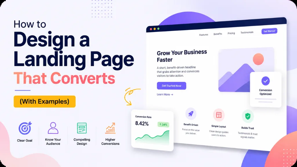

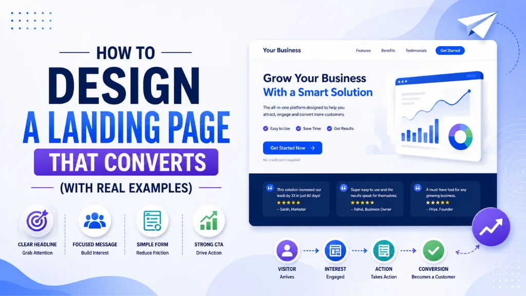

Here is the conversion gap most website owners never look at closely enough: the median dedicated landing page converts at 4.02% in 2026 – nearly double the 2.35% median for general website pages. The top 25% of landing pages exceed 11.45%. The gap between a median landing page and a top-performing one is not traffic quality, offer strength, or budget. It is design decisions.
Designing a landing page that converts requires a fundamentally different mindset from designing a regular website page. A website is a brochure – it serves multiple audiences, multiple purposes, and multiple goals simultaneously. A landing page is a funnel – it exists for one visitor, one offer, and one action. Every element either serves that conversion or dilutes it. There is no neutral.
Designing a landing page well has also become more commercially significant in 2026 because every percentage point of conversion improvement on a page receiving significant traffic is typically worth 30 to 70% more pipeline than the same investment in additional traffic. Fixing the page is more efficient than buying more visitors to a leaking page.
Designing a landing page for 2026 also means optimising for mobile-first audiences. 83% of landing page visits now happen on mobile devices. Desktop still converts 8% better than mobile on average, but that gap is closing for pages actively optimised for mobile forms, tap targets, and fast load times.
At Search Savvy, landing page design is evaluated as a conversion architecture problem before it is a visual design problem – because the structural decisions (what is on the page, in what order, and what is removed) determine conversion rate far more than colour palettes or imagery choices. This guide covers both.
What Is a Landing Page and Why Is It Different from a Website Page?
Designing a landing page starts with understanding what makes it structurally different from a homepage or a blog page. A landing page is a standalone web page designed to receive traffic from a specific source – a paid ad, an email campaign, a social media post – and convert that traffic into a single, defined action: a sign-up, a purchase, a booking, or a download.
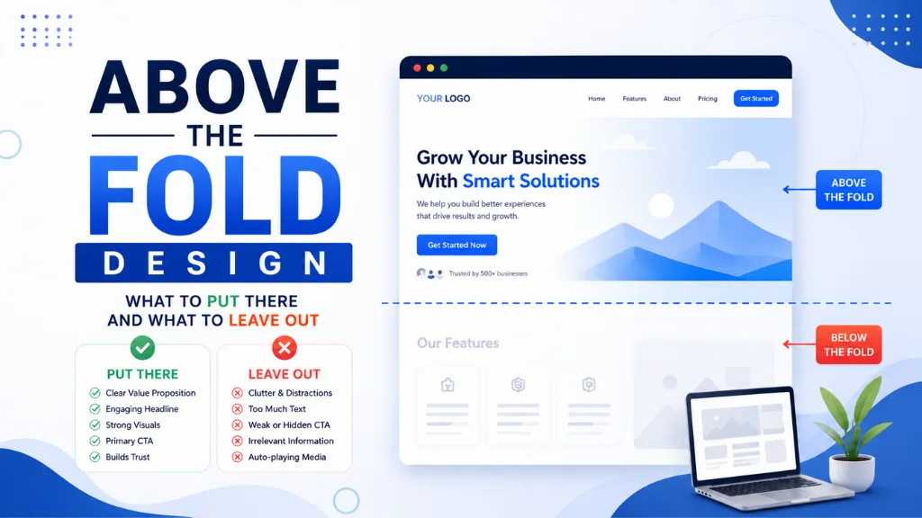
Designing a landing page correctly means removing everything that does not serve that single conversion goal. Navigation menus, unrelated links, social media buttons, and footer links all invite visitors to leave the conversion path. Research from Unbounce consistently finds that landing pages with navigation menus convert at 10 to 15% lower rates than equivalent pages without navigation.
Only 16% of landing pages currently remove the navigation bar. The other 84% still show a full site menu – one of the simplest and highest-impact changes available to any business running a landing page.
People Also Ask: What is the difference between a landing page and a homepage? Short Answer: A homepage serves multiple audiences and purposes simultaneously – brand introduction, navigation hub, content discovery. A landing page serves one specific visitor coming from a specific traffic source and directs them toward one specific action. Landing pages outperform homepages for conversion specifically because they eliminate the competing choices that homepages present. The average landing page conversion rate (4.02%) is nearly double the average homepage conversion rate (2.35%).
What Are the 9 Core Elements of a High-Converting Landing Page?
Designing a landing page that reaches the top performance quartile consistently includes the same nine elements, arranged in a sequence that matches how motivated visitors naturally process information and make decisions.
Element 1: A Benefit-Led Headline
Designing a landing page starts with the headline – the single most important conversion variable on the page. A strong headline can improve conversions by 250 to 300% over a weak one, according to 2026 split testing data compiled across tens of thousands of landing pages.
High-converting headlines follow one of three formulas:
- Outcome-led: “Rank on page one in 90 days without link building”
- Problem-agitation: “Why your landing page loses 60% of paid traffic before anyone reads the headline”
- Specific number + outcome: “Get 3x more email signups from the same traffic”
Designing a landing page headline means naming exactly what the visitor will get – in their language, not yours. Feature-led headlines (“Our AI-powered marketing platform”) consistently underperform outcome-led alternatives (“Double your email open rate in 30 days”) because visitors buy outcomes, not capabilities.
Example – Slack’s landing page headline: “Where work happens” evolved to more specific outcome framing as A/B testing showed specificity converts better than brand-voice abstraction.
Element 2: A Clear, Single Call to Action
Designing a landing page requires a single primary CTA – one button, one destination, one ask. Pages with a single CTA convert at 13.5% on average; pages with multiple competing CTAs drop to 10.5%. The 3-percentage-point difference compounds enormously at scale.
CTA copy matters as much as placement. Using “Submit” as button text decreases conversion by 3%. First-person, outcome-specific copy significantly outperforms:
- “Start My Free Trial” outperforms “Start Your Free Trial” by 14%
- “Get My Free SEO Report” outperforms “Download Now” by 31%
- “Claim My Discount” outperforms “Get Discount” by measurable margins in tested e-commerce contexts
Element 3: A Subheadline That Closes the Understanding Gap
Designing a landing page needs a subheadline that answers the question the headline creates – what specifically you do, who it is for, and why it is different. The headline creates interest; the subheadline earns the scroll.
A working formula: “We help [specific audience] achieve [specific outcome] through [specific mechanism] without [specific pain point].”
Element 4: A Hero Visual That Shows Reality
Designing a landing page with the right hero image produces meaningfully better results than a wrong one. Pages showing real people using a product or experiencing an outcome convert better than abstract illustration, generic stock photography of people at laptops, or product shots in isolation.
The visual’s job is to reduce the cognitive effort of imagining using the product. The clearer and more specific the visual connection to the offer, the less mental work the visitor has to do.
Element 5: Specific Social Proof Above the Fold
Designing a landing page without social proof leaves a trust gap that copy alone cannot close. 92% of consumers read testimonials before making a decision. Testimonials appear in 36% of the top-performing landing pages across all industries – making their absence a critical gap in most others.
What makes social proof land above generic praise:
- Specific numbers (“Saved us 6 hours per week”) outperform vague praise (“Great tool, highly recommend”)
- Named, real attributions with a photo or company logo outperform anonymous quotes by a significant margin
- Star rating + review count placed above the fold provides immediate credibility before the visitor has read a word of copy
- “Trusted by 10,000+ businesses” placed below the hero image requires specific numbers – vague claims like “trusted by industry leaders” are invisible
Example – Notion’s landing page: Uses a combination of specific company logo recognition (Figma, Perplexity, Headspace) and a review star rating immediately below the fold – both providing instant third-party validation before any feature claims.
Element 6: A Short, Focused Form
Designing a landing page form is where most businesses over-collect and under-convert. Per Unbounce’s 2026 Conversion Benchmark Report (analysing 44 million conversions), three-field forms convert at 10.1% while nine-field forms drop to 3.6%. Every field beyond five adds a 20 to 30% conversion penalty.
The practical rule: collect the minimum data needed to route the lead to the right next step, then qualify further in a follow-up email or sales call. Over- qualifying at the form stage is one of the most expensive landing page mistakes.
Specific field impacts from 2026 data:
- Phone number field: −5% conversion when required, −2% when optional
- Password fields: −14% conversion (use magic-link alternatives)
- CAPTCHA challenge: −3.2% conversion (invisible CAPTCHA: −0.4%)
- Company-size dropdown: −8% conversion but +34% lead quality improvement
People Also Ask: How many form fields should a landing page have? Short Answer: Three to five fields is the optimal range for most landing pages in 2026. Three-field forms convert at 10.1%; nine-field forms drop to 3.6%, according to Unbounce’s analysis of 44 million conversions. Each field beyond five adds a 20 to 30% conversion penalty. The rule of thumb: collect only what you need to route the lead to the next step – qualify further by email or phone, not at the form stage.
Element 7: Page Speed Under Two Seconds
Designing a landing page that loads slowly is designing a landing page that fails before any visitor reaches the headline. A page loading in one second converts at three times the rate of a page loading in five seconds. Bounce rate increases by 32% as load time rises from one to three seconds and by 106% from one to six seconds.
The practical speed checklist:
- Convert all images to WebP format (25 to 35% smaller than JPEG/PNG with no visible quality difference)
- Remove navigation and non-essential scripts that load before the page content
- Use a CDN to serve assets from a geographically close server node
- Add explicit width and height attributes to all images to prevent layout shift (CLS) that makes pages appear broken while loading
Element 8: Mobile-First Design, Not Mobile-Adapted Design
Designing a landing page mobile-first means the mobile version is the primary design, not an afterthought applied to a desktop layout. Mobile-responsive pages convert at 11.7% versus 10.7% for desktop-only optimised pages in 2026 – for pages that actively optimise mobile forms, tap targets, and load speed, not just scale down the desktop version.
Specific mobile landing page requirements:
- All tap targets at minimum 44 × 44 pixels with adequate spacing
- Form fields large enough to tap and type comfortably without zooming
- CTA button thumb-reachable without scrolling on a standard phone screen
- Single-column layout – multi-column designs that work on desktop break the visual hierarchy on a 375px mobile screen
Element 9: A Trust Block Below the CTA
Designing a landing page with a trust reinforcement block immediately below the primary CTA reduces the psychological risk that causes hesitation just before a click. This block typically includes: HTTPS security badge, money-back guarantee or risk reversal statement, brief privacy assurance, and any relevant certifications or recognitions.
People Also Ask: Where should the CTA button be placed on a landing page? Short Answer: Above the fold is essential – CTAs placed above the fold are 73% more visible than those below it. Centre alignment outperforms left alignment by 682% for click rate. Place one CTA above the fold and a second repetition after any major value or social proof section for longer pages where scrolling is expected. Never have more than one destination – multiple competing buttons consistently reduce overall conversion rate.
What Is the A/B Testing Priority Sequence for Landing Pages?
Designing a landing page is a hypothesis that needs testing, not a finished product. The A/B testing sequence below is ordered by impact-to-effort ratio – test the elements that move conversion rate the most first:
- Headline – highest impact, quickest to statistical significance
- CTA copy and button colour – high impact, quick to test
- Social proof placement – testimonials above vs below fold; logos vs star ratings
- Hero image – person vs product vs outcome visual
- Form length – 3 fields vs 5 fields; phone required vs optional
- Page speed – load time improvement vs control (technical test, highest ROI of any change)
The non-negotiable rule: test one element at a time. Testing headline and CTA simultaneously makes it impossible to know which change produced the result.
How Should Indian Businesses Design Landing Pages?
Designing a landing page for an Indian audience requires mobile-first execution as an absolute baseline, since Indian search and social traffic arrives overwhelmingly on mid-range Android devices with variable 4G connections.
Designing a landing page for Indian markets also benefits from India-specific social proof – testimonials from recognisable Indian brand names, INR pricing displayed explicitly rather than as a converted dollar amount, and trust signals like GST number visibility for B2B landing pages where procurement compliance matters.
According to Search Savvy’s insights from auditing landing pages for Indian D2C, SaaS, and service businesses, the most common conversion gap is not the headline or CTA – it is page speed on mobile. Pages designed and tested on desktop fibre connections regularly fail Core Web Vitals on mid-range Android over 4G, which is the actual device and network combination reaching the landing page in most Indian markets.
Conclusion: Structure First, Then Style
Designing a landing page that converts is primarily a structural discipline, not a visual one. The elements that produce the most measurable conversion improvement – removing navigation, shortening forms, improving page speed, adding specific social proof – require no graphic design skill at all.
Search Savvy evaluates landing pages as conversion architecture first and visual design second, because the data consistently shows that structural decisions explain the gap between a 2.35% average and a top- quartile 11.45% – not colour choices or imagery.
FAQ: Designing a Landing Page That Converts – Your Questions Answered
Q1: What is the average landing page conversion rate in 2026? The median dedicated landing page converts at 4.02% in 2026, nearly double the 2.35% median for general website pages. The top 25% of landing pages exceed 11.45%. The global average across all industries sits around 6.6%, with top- performing pages using warm email traffic or highly targeted campaigns reaching 15 to 20%.
Q2: How many CTAs should a landing page have? One primary CTA, pointing to one destination. Pages with a single CTA convert at 13.5% compared to 10.5% for pages with multiple competing CTAs. A second repetition of the same CTA lower on the page is acceptable for long pages where scrolling is expected – but both buttons must point to the same destination.
Q3: Should a landing page have a navigation menu? No. Navigation menus invite visitors to leave the conversion path and consistently reduce landing page conversion by 10 to 15%, according to Unbounce research. Remove the navigation entirely on dedicated landing pages. If the page is a hybrid serving multiple purposes, consider a simplified header with only the brand logo, which links to the homepage rather than a full site menu.
Q4: How long should a landing page be? Length should match the complexity of the offer and the temperature of the traffic. For low-commitment offers (free lead magnet, email signup), shorter pages with clear CTAs convert 13.5% better. For high-value or high-price offers where the visitor needs to be persuaded, longer pages with testimonials, FAQs, and detailed benefit sections can generate significantly more leads – one documented case found 220% more leads from a long-form page for a complex B2B offer.
Q5: Do videos improve landing page conversions? Often yes. Landing pages with video relevant to the offer consistently show higher engagement, and 38.6% of experienced marketers rank video as the single biggest impact element on landing page conversions. Video testimonials outperform text testimonials by 80 to 86%. The requirement is that the video directly addresses buyer concerns or demonstrates product value – entertainment video for its own sake does not produce the same lift.
Q6: What is the most important landing page fix for a business getting significant traffic but low conversions? Page speed is typically the highest ROI fix available – a one-second improvement can triple conversions relative to a five-second page load, and it requires no copywriting or design changes. After speed, form length reduction (to five fields or fewer) and navigation removal are the next highest-impact structural changes before testing copy or visual elements.
Running traffic to a landing page that isn’t converting – or unsure whether your landing page structure is the reason? Visit Search Savvy for a landing page audit that benchmarks your current conversion rate against industry top-quartile performance and identifies the specific structural changes most likely to move it.