
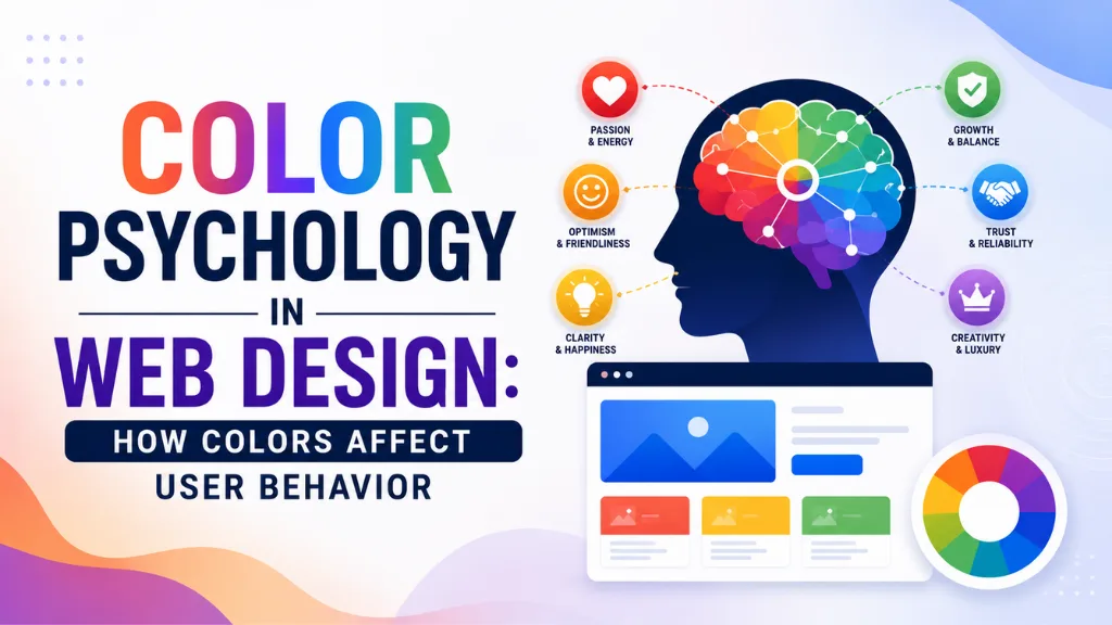

Here is a design decision that most websites make in under an hour and almost never revisit: the color palette. That hour-long choice is quietly determining whether visitors feel trust or doubt, urgency or calm, confidence or confusion – before they have read a single word.
Color psychology in web design is the study of how color choices influence human emotions, perceptions, and behaviour when interacting with a website. It is not a soft, creative concept. It is backed by measurable data – 62 to 90% of snap judgments about a digital product are based on color alone, and visitors form an opinion about a brand within 0.05 seconds of landing on the page. That initial reaction is almost entirely visual, and color is its primary driver.
Color psychology in web design has also become a more consequential business topic in 2026 specifically because the gap between well-designed and poorly designed websites is widening. Consistent colour systems increase brand recognition by up to 80%. High-contrast UI colours improve readability by 40% and overall task completion speed. These are not marginal aesthetic effects – they are conversion and usability advantages that compound over time.
Color psychology in web design sits at the intersection of science, culture, and brand strategy. The best-performing websites in 2026 are not choosing colors because they look nice. They are choosing them because they communicate a specific emotional intent to a specific audience – and testing to confirm that the intent lands.
At Search Savvy, color decisions form part of every website evaluation we run, because color affects conversion rates, time on page, and brand trust in ways that no amount of copy improvement can compensate for if the palette is fundamentally wrong. This guide explains how.
What Is Color Psychology in Web Design?
Color psychology in web design is the applied science of selecting colours that produce specific emotional and behavioural responses in website visitors – guiding attention, communicating brand values, reducing cognitive friction, and increasing the likelihood of desired actions like clicking, signing up, or buying.
Color psychology in web design works through two mechanisms simultaneously. The first is universal cognitive response – physiological reactions that occur across most people regardless of culture, such as red raising heart rate and creating urgency. The second is learned association – the cultural and personal connections people build with colours over time, such as blue meaning trust and professionalism in finance and technology specifically because so many brands in those sectors have used blue consistently for decades.
People Also Ask: Does color really affect website conversions? Short Answer: Yes, measurably. Up to 90% of snap judgments about a product are based on color alone. Colour increases brand recognition by up to 80%. Contrast – the relationship between your CTA colour and its surrounding elements – directly affects click rates. The key insight from 2026 A/B testing data is that there is no universally “best” colour for conversions; contrast with the surrounding page, not the colour itself, is what drives click behaviour.
How Does Color Psychology Work in Web Design?
Color psychology in web design works through a hierarchy of attention, emotion, and association that operates in milliseconds – before conscious processing begins. When a visitor lands on a page, their visual system processes colour before layout, text, or imagery. The emotional response that follows shapes the entire remainder of their visit.
Color psychology in web design operates through three functional roles:
Establishing visual hierarchy: High-contrast, saturated colours command attention first. CTA buttons, headlines, and key information should always be the highest-contrast elements on a page, using colour to direct the eye along the intended path rather than leaving attention to wander.
Communicating brand character: The colours a brand consistently uses build cumulative associations over time. Visitors who see a specific palette repeatedly begin to associate it with the brand’s values – which is why colour consistency across platforms increases brand recognition by 80%.
Triggering emotional states: Warm colours create energy, urgency, and excitement. Cool colours create trust, calm, and confidence. These emotional states influence decision-making speed and risk perception in ways that directly affect conversion rates.
What Does Each Colour Communicate in Web Design?
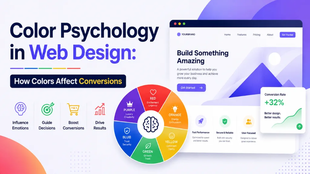
Color psychology in web design is colour-specific – each major hue has documented emotional associations that designers and marketers can use intentionally.
Blue – Trust, Professionalism, and Calm
Color psychology in web design places blue as the most widely used colour in professional and corporate contexts for a clear reason: it is the world’s favourite colour, chosen by 57% of men and 35% of women globally, and its associations with trust, competence, and calm make it the dominant choice for finance, technology, healthcare, and SaaS brands.
Blue is also the safest link and CTA colour for unfamiliar audiences, since it generates the most clicks on hyperlinks due to decades of established web convention. Facebook, LinkedIn, PayPal, Twitter/X, Samsung, and Salesforce all use blue as their primary brand colour, building on the same trust and professionalism associations.
Best for: Financial services, technology, B2B platforms, healthcare, professional services.
Red – Urgency, Excitement, and Action
Color psychology in web design places red as the highest-energy colour in the spectrum – one that literally raises heart rate and respiration. This physiological response makes red highly effective for creating urgency and prompting immediate action, which is why sale banners, countdown timers, and limited-availability notices are predominantly red across e-commerce.
The famous HubSpot A/B test (originally from Performable) showed a red CTA button outperforming a green one by 21% – not because red is universally superior for CTAs, but because in that specific context, red created more contrast with the surrounding page. The lesson is contrast, not colour prescription.
Best for: Sale promotions, food and restaurant brands, entertainment, urgency-driven e-commerce CTAs, sports brands.
Green – Growth, Health, and Reassurance
Color psychology in web design places green in dual roles depending on context: natural, health-focused, and sustainable brands use it for its organic, growing associations, while financial brands use it to signal positive movement, gains, and forward progress.
Green’s cultural associations with “go” – from traffic lights – also make it effective for confirmation states: success messages, completed steps, and positive feedback all commonly use green to signal that an action was successful.
Best for: Health and wellness, sustainability, organic and natural products, fintech (positive states), environmental brands.
Yellow – Optimism, Energy, and Caution
Color psychology in web design assigns yellow the dual role of energy and caution. Bright yellow is one of the first colours the human eye detects and works well for highlighting key information and creating warmth – but it is rarely used as a primary background colour due to readability problems with text on yellow surfaces.
Brands including McDonald’s, Snapchat, IKEA, and DHL use yellow strategically in small doses for energy and optimism rather than as a dominant palette choice.
Best for: Children’s brands, food and beverage, highlight elements, CTAs on dark backgrounds.
Orange – Enthusiasm, Creativity, and Affordability
Color psychology in web design places orange between red’s urgency and yellow’s warmth – producing an energetic, friendly, and action-oriented response that is slightly less intense than red. Brands like Amazon, Swiggy, and Duolingo use orange for CTAs and primary actions specifically because it captures attention without the aggressive connotations of red.
Best for: Consumer brands, e-commerce CTAs, creative services, youth- oriented platforms, food delivery.
Black and Dark Tones – Luxury, Sophistication, and Exclusivity
Color psychology in web design uses black and dark palettes to signal premium quality, sophistication, and exclusivity. Dark mode adoption has hit 82% among users who have the option in 2026, with dark-mode-first design now specified in 30% of new web projects – up from 8% in 2021.
Luxury brands, high-end technology products, and fashion houses consistently use black as the primary palette because it communicates a seriousness and premium positioning that lighter palettes cannot replicate.
Best for: Luxury goods, high-end fashion, premium technology, nightlife and entertainment, photography portfolios.
People Also Ask: What colours are best for CTA buttons in 2026? Short Answer: The colour with the highest contrast against the surrounding page is the best CTA colour – not any specific hue in isolation. HubSpot’s famous red-beats-green CTA test shows that contrast, not colour, drives clicks. In 2026 A/B testing data, orange, red, and bright green appear most frequently as high-performing CTA colours across diverse brand contexts – but this reflects their typical contrast advantage against blue and white page backgrounds, not a universal rule that applies regardless of context.
How Does Color Affect Conversion Rates Specifically?
Color psychology in web design connects directly to conversion rates through three specific pathways that have been measured across large-scale A/B testing.
Attention direction: When the CTA button is the highest-contrast element on a page, eye-tracking studies consistently show it receives more visual attention and more clicks. Single-colour CTA pages with a strong contrast button outperform multi-colour cluttered pages by measurable margins – because clear visual hierarchy reduces the cognitive effort needed to find the action.
Emotional state and decision speed: Warm colours accelerate decision-making by creating urgency and excitement. Cool colours slow decision-making in a positive way – building confidence and encouraging careful consideration of an important commitment. This is why e-commerce sale pages use red and orange, while financial products and SaaS trials use blue and green.
Brand trust and credibility: Colour consistency across a brand increases recognition by 80%, which compounds into conversion uplift over repeat visits. A visitor who has seen a brand’s colour system multiple times before a purchase decision converts at a meaningfully higher rate than a first-time visitor – making consistent colour application a long-term conversion investment as much as a one-time design decision.
What Are the 2026 Color Trends in Web Design?
Color psychology in web design in 2026 is shaped by a specific mood shift documented across award-winning websites and major design platform data.
The dominant shift is away from aggressive, high-contrast neon palettes toward what designers are calling “calm confidence” – intentional, muted-but-vibrant palettes that feel sophisticated rather than loud. Specific trends:
- Neo-mint and soft green tones – sage, moss, and seafoam dominating health, fintech, and sustainability brands as sustainability and biophilic design associations make earth tones and natural palettes the leading trend
- Frosted blue and graphite purple – cool, tech-forward palettes expressing clarity and futurism for AI-native and enterprise technology brands
- Terracotta, burnt orange, and clay pink – warm, humanised palettes bringing emotional warmth to digital interfaces that feel overly technical without them
- High-saturation dopamine palettes – neon gradients and playful hues returning in youth-oriented, lifestyle, and D2C consumer brands that need energy and personality
- Dark mode as default – 30% of new web design projects now specify dark-mode- first, up from 8% in 2021, driven by 82% user adoption rates
Why Does Accessibility Matter in Color Psychology for Web Design?
Color psychology in web design is only fully effective when it is also accessible. 81% of websites fail basic colour contrast accessibility checks in 2026 – meaning the majority of websites have colour choices that are difficult or impossible to read for the approximately 300 million people globally with colour vision deficiency.
Color psychology in web design that fails accessibility requirements simultaneously fails SEO and user experience: screen readers and accessibility crawlers flag poor contrast, Google’s quality evaluators note poor accessibility, and users who cannot read the content correctly leave without converting. Accessibility is not a charitable consideration – it is a conversion and ranking requirement.
The minimum contrast ratio for body text is 4.5:1 (WCAG AA standard). Large text and graphical elements require a 3:1 minimum. Tools like WebAIM Contrast Checker allow any colour combination to be tested against these standards before implementation.
How Should Indian Businesses Apply Color Psychology in Web Design?
Color psychology in web design requires cultural awareness that changes significantly across markets – and India’s market is particularly colour-rich in its cultural associations.
Red carries associations of prosperity, auspiciousness, and celebration in Indian culture rather than just urgency or danger – which means its use on Indian brand websites carries positive trust connotations that it might not in Western markets. Green similarly carries spiritual significance alongside its Western associations with health and growth.
According to Search Savvy’s insights from reviewing web design choices for Indian D2C and service brands, the most common colour mistake is applying Western e-commerce colour conventions without testing how Indian audiences respond to them – particularly for brands serving tier-2 and tier-3 city audiences where colour associations can differ significantly from metro demographics.
Conclusion: Color Is a Strategic Asset, Not a Preference
Color psychology in web design is not about following trends or selecting a palette that the designer finds attractive. It is about choosing colours that communicate a specific emotional intent to a specific audience – and then testing whether that intent lands in the way the data predicts.
Search Savvy, every website design recommendation we make includes colour rationale rooted in brand audience psychology, industry conventions, and contrast testing against accessibility standards – because a colour choice made without this framework is a conversion opportunity left to chance.
FAQ: Color Psychology in Web Design – Your Questions Answered
Q1: Does colour choice really affect how much people trust a website? Yes. 62 to 90% of snap judgments about a product or brand are based on colour alone, and colour increases brand recognition by 80% through consistent use. Blue specifically builds trust and professionalism associations in most Western and Asian business contexts, which is why it dominates finance, healthcare, and technology brand palettes globally.
Q2: What is the best colour for a website CTA button in 2026? The best CTA colour is whichever creates the highest contrast against the surrounding page – not any specific hue in isolation. Orange, red, and bright green appear most frequently in high-performing CTA tests because they commonly create strong contrast against blue and white page backgrounds. The right answer for your page requires A/B testing your specific audience and layout context.
Q3: How many colours should a website use? The 60-30-10 rule is the most widely recommended framework: 60% dominant colour (typically a neutral background), 30% secondary colour (brand colour applied to headers, sections, and key elements), and 10% accent colour (used exclusively for CTAs and the single most important interactive element). More than three prominent colours creates visual noise that reduces conversion by competing for attention.
Q4: How does dark mode affect colour psychology in web design? Dark mode has reached 82% user adoption among those who have the option in 2026, and 30% of new web design projects are now specified as dark-mode-first. Dark backgrounds shift colour psychology toward luxury, sophistication, and technical precision – making them most effective for premium technology brands, creative portfolios, and enterprise products. They require significant contrast testing to maintain readability for coloured text and UI elements.
Q5: Do colour associations work the same across all cultures? No. Colour associations vary significantly across cultures. Red means urgency in Western markets but auspiciousness and prosperity in India and China. White means purity in Western contexts but mourning in some East Asian cultures. Any brand designing for a global or multi-regional audience should research colour associations specific to each target market before finalising a palette.
Q6: How do I know if my website’s colour contrast meets accessibility standards? Use a contrast ratio checker such as WebAIM’s Contrast Checker, which tests any foreground/background colour pair against WCAG 2.1 standards. Aim for a 4.5:1 contrast ratio for body text (AA standard) and 3:1 for large text and interactive elements. The Chrome browser’s DevTools Accessibility panel also flags contrast failures on any live page during a developer audit.
Not sure whether your website’s colour palette is communicating the right brand values to your specific audience – or whether poor contrast is quietly hurting both conversions and accessibility? Visit Search Savvy for a website design and conversion audit that includes colour strategy evaluation alongside technical and content performance.