
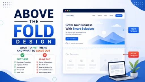
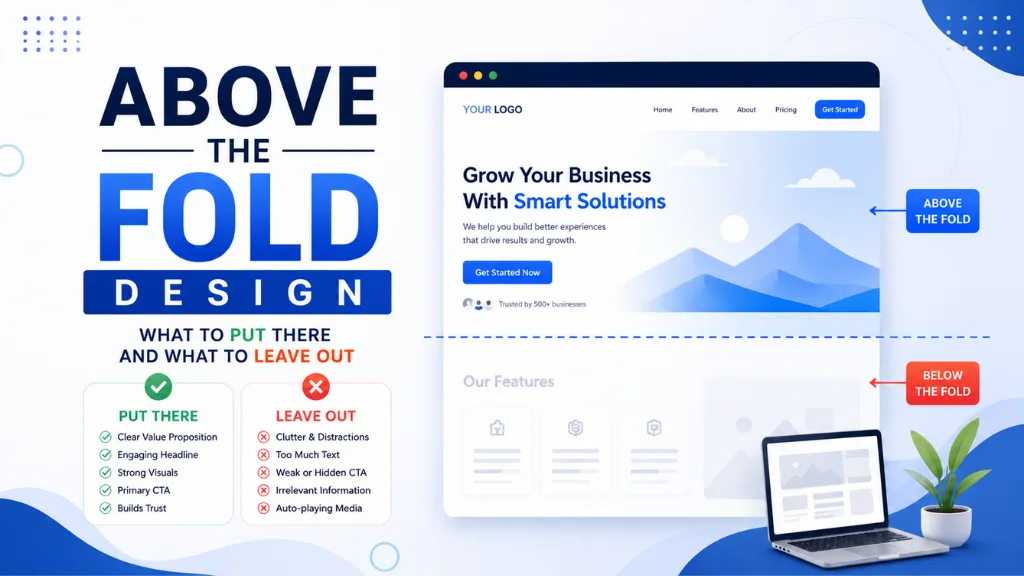

Here is the part of web design where the most decisive decisions get made with the least deliberate thought: the first viewport a visitor sees before a single scroll happens.
Above the fold design – the portion of a webpage visible on screen without scrolling – is where most websites fail the visitor who just arrived from a paid ad, an organic result, or a social media click. Not because the content below is poor, but because the decision to scroll or leave happens before the visitor ever reaches it.
Above the fold design operates within a defined decision window: users spend 11 seconds on desktop and 7 seconds on mobile scanning the first viewport before committing to scroll or exit. In that window, they answer two questions entirely based on what they see: “Is this page what I expected?” and “Is there a reason to stay?” If either answer is unclear, they leave.
Above the fold design in 2026 also carries a technical dimension most business owners overlook: Google’s Core Web Vitals measure how quickly above-the-fold content renders and how stable it is visually. A slow or shifting fold simultaneously hurts conversion rates and search rankings – making fold design a dual business and SEO priority.
At Search Savvy, the first viewport is the first thing we examine in any website conversion audit, because the decisions made here produce the highest-impact returns per hour of effort of any design work on the site. This guide is specifically about content decisions – what belongs in the fold and what consistently makes it worse.
What Is Above the Fold Design and Why Does the Content Decision Matter?
Above the fold design refers to the visual layout and content of the webpage area visible without scrolling. On desktop it spans roughly 600 to 800 pixels of height; on mobile in portrait orientation, approximately 400 to 500 pixels.
Above the fold design content decisions matter because 57% of desktop visitors and 64% of mobile visitors never scroll below the first viewport. The fold is not the most prominent section of the page – it is the only section most visitors will ever see. Everything placed below it exists primarily for the minority who scroll.
This is not an argument for cramming everything into the fold. It is an argument for being extremely selective about what earns a place there – because every element that enters the fold competes with every other element for the 7 to 11 seconds of scanning attention available.
People Also Ask: Does above the fold content still matter with modern scrolling habits? Short Answer: Yes, even more so. Despite the long-scroll design trend and universal awareness that scrolling is natural, 57% of desktop visitors and 64% of mobile visitors still never scroll beyond the first viewport. Above the fold content receives 57% of total viewing time even on pages where scrolling is common. The fold does not determine what is on the page – it determines whether visitors decide to engage with anything else on it.
What Should You Put in Your Above the Fold Design?
Above the fold design content should be reduced to the minimum number of elements that answer the visitor’s two primary questions – “Is this for me?” and “What should I do?” – as efficiently as possible.
Six elements consistently belong in the fold. Everything else either belongs below the fold or should be removed entirely.
Element 1: A Specific, Benefit-Led Headline
Above the fold design starts with the headline – the single element most responsible for whether a visitor stays or leaves. A headline that earns the scroll names the specific outcome the visitor wants in language they would use themselves.
Headlines built around the brand’s internal language (“Your all-in-one marketing platform”) consistently underperform headlines built around the visitor’s desired outcome (“Get 3x more leads from the same website traffic”).
The test: if the headline could belong to any of your competitors without modification, it is not specific enough to do its job in the fold.
What to include:
- One H1 headline that names a specific, concrete outcome
- Maximum 10 to 12 words – longer headlines rarely fit cleanly on mobile without wrapping into a block that slows reading
What to leave out:
- Your tagline unless it functions as a compelling headline (most do not)
- Your company name in the H1 unless brand recognition is already high
Element 2: A Single Clarifying Subheadline
Above the fold design should pair the headline with a subheadline that closes the most likely comprehension gap – what you do, who it is for, or what makes the offer different. 80% of visitors read only the headline and the first line of the subheadline before deciding to engage further.
The subheadline does not need to be creative. It needs to be clear.
What to include:
- One or two sentences maximum
- The specific audience (“for Indian D2C brands”), mechanism (“through weekly SEO audits”), and differentiator (“without needing a developer”)
What to leave out:
- Multiple subheadings competing with each other
- Brand history, founding story, or mission statements at this stage
Element 3: One Primary Call to Action
Above the fold design should contain exactly one primary CTA – one button, pointing to one destination, with action-oriented copy that specifies what happens next.
Pages with a single primary CTA convert at 13.5% versus 10.5% for pages with multiple competing CTAs. That 3-percentage-point difference compounds significantly at scale. Two equally prominent buttons create the paradox of choice – hesitation that ends in neither being clicked.
What to include:
- One high-contrast button above the fold, centre-aligned or left-aligned with sufficient whitespace around it
- First-person outcome copy: “Start My Free Audit” or “Get My SEO Report” rather than generic verbs like “Learn More” or “Submit”
What to leave out:
- Multiple primary buttons of equal visual weight
- Secondary CTAs in the fold (place these below the fold after value has been delivered)
- A “Watch Demo” and a “Start Trial” at the same prominence level
People Also Ask: How many CTAs should be above the fold on a webpage? Short Answer: One primary CTA. Pages with a single CTA convert at 13.5% compared to 10.5% for pages with multiple competing CTAs – a measurable conversion loss from adding choice. A secondary CTA can appear later on the page after additional value has been delivered, but in the fold, one action and one destination is the correct structure. Two equally prominent buttons produce hesitation and lower overall clicks on both.
Element 4: Specific Social Proof – One Concrete Signal
Above the fold design should include at least one verifiable trust signal before the visitor reaches the CTA. Social proof placed in the fold reduces the anxiety that causes a visitor to pause before clicking – it signals that the risk of taking the next step has already been evaluated and managed by others.
Effective fold-level social proof is specific rather than generic. “Trusted by industry leaders” is invisible. “Used by 10,000+ businesses across India” is concrete. A star rating with a visible review count – “4.9 out of 5 from 2,300 reviews” – is immediately verifiable and is processed faster than a testimonial paragraph.
What to include:
- A star rating with numeric review count from a verifiable platform
- A specific user or customer count with a number, not a range
- Recognisable client or partner logos (two to three is more credible than fourteen stacked in a tiny footer strip)
- A named, one-sentence quote with a real photo – if space allows
What to leave out:
- Long testimonial blocks with multiple paragraphs (place below the fold)
- Vague phrases like “World-class” or “Award-winning” without specifics
- A list of 20 logos too small to read on mobile
Element 5: A Hero Visual That Reduces Imagination Effort
Above the fold design benefits from a hero visual that reduces the mental effort of imagining what the product, service, or outcome looks like in practice. The visual’s job is not decoration – it is to close the gap between “this sounds interesting” and “I can see exactly how this applies to me.”
Real product screenshots, real people using the product, or clear outcome visualisations consistently outperform abstract illustration and generic stock photography of laptops and handshakes.
What to include:
- A real, specific visual that shows the product in use or the outcome in context
- On SaaS and digital products: an annotated product screenshot showing the specific benefit the headline promises
- On service businesses: a real photo of a real team member or client result
What to leave out:
- Generic stock photography that could belong to any competitor
- Abstract illustration that does not communicate what the product does
- Multiple competing images fighting for the eye’s first landing point
Element 6: A Minimal Navigation Header
Above the fold design includes a header by default on most websites, and the content of that header has a measurable effect on conversion. Navigation menus with multiple links give visitors reasons to leave the conversion path before they have read the headline.
On dedicated landing pages, removing navigation entirely improves conversion by 10 to 15%. On homepages and product pages where navigation is necessary, limiting the header to the brand logo and a maximum of five clearly labelled navigation links – with the primary CTA as the only right-aligned button – minimises the distraction cost.
What to include:
- Brand logo linked to the homepage
- Maximum five navigation items, with the most conversion-relevant link furthest right
- One prominent header CTA button in a contrasting colour
What to leave out:
- Dropdown mega menus in the fold header
- Social media icon links in the header (they send visitors away before they convert)
- A search bar in the header if the site is not a content resource or e-commerce store with a large catalogue
What Should You Leave Out of Your Above the Fold Design?
Above the fold design is as much about removal as inclusion. The seven elements most commonly found in folds that consistently hurt rather than help:
1. Auto-Playing Videos or Animations
Above the fold design with auto-playing video slows page load and increases Cumulative Layout Shift (CLS) – directly impacting both user experience and Core Web Vitals scores. Visitors who arrived from a quiet environment and encounter unexpected audio immediately seek the mute or close button, not the CTA.
If video is a priority, use a static thumbnail with a visible play button that gives the visitor control. This preserves the visual without the load and experience cost.
2. Chatbot Pop-ups or Notification Requests
Above the fold design is compromised immediately when a chatbot widget pops open over the headline, or when a browser notification permission request appears within the first three seconds. These interruptions prevent visitors from reading the headline and subheadline that earn the scroll.
Defer chatbot opening logic to 30 seconds after page load minimum. Never trigger a notification request in the first viewport session.
3. Cookie Consent Banners That Obscure Content
Above the fold design problems in Europe and increasingly globally centre on cookie consent banners that slide up from the bottom or appear centrally, covering the CTA or headline. Design cookie consent as a slim bottom bar rather than a full-screen modal, and ensure it does not trigger a layout shift that moves content as it appears.
4. Too Much Text
Above the fold design is not a content area – it is a decision area. Visitors in the fold are scanning for relevance signals, not reading. Long paragraphs of body copy in the fold are almost never read; they function as visual noise that makes the headline and CTA harder to locate quickly.
Body copy, detailed feature explanations, and supporting content all belong below the fold where visitors who chose to scroll arrive with higher intent and more patience for detail.
5. Competing Value Propositions
Above the fold design fails when it presents three equally strong value propositions in a rotating carousel or stacked layout – creating uncertainty about which message is the most important. One clear primary message is more persuasive than three competent ones, because certainty converts better than comprehensiveness.
6. Social Media Feed Widgets
Above the fold design with an embedded Twitter or Instagram feed in the hero adds external links that send visitors away from the conversion path, creates layout shift as the feed loads asynchronously, and typically loads slowly enough to hurt Largest Contentful Paint (LCP) scores.
7. Trust Seals Without Context
Above the fold design cluttered with five or six small security badges and trust icons – “Norton Secured,” “McAfee,” “SSL Certificate,” “Verified by Visa” – is a common overcorrection. One or two relevant trust signals add credibility; five or more create visual noise that signals anxiety rather than confidence.
People Also Ask: What is the biggest above the fold design mistake businesses make in 2026? Short Answer: Having no clear primary message and no visible CTA in the first viewport. The second most common mistake is a feature-led headline that describes the product rather than naming the visitor’s desired outcome. Both produce the same result: visitors who cannot quickly determine whether the page is for them and leave before scrolling. A specific outcome-led headline paired with a single visible CTA button resolves both problems simultaneously.
How Does Mobile Change Above the Fold Design Decisions?
Above the fold design for mobile requires the same six elements in a tighter space – a 400 to 500-pixel-high viewport on a 375-pixel-wide screen leaves room for a headline, a one-line subheadline, and a button before the fold ends.
The mobile fold test: load your homepage on an actual phone in portrait orientation, without scrolling, and count how many of the six essential elements are visible. If the CTA requires scrolling to reach on mobile, it is not above the fold on the device where 83% of landing page visits originate.
How Should Indian Businesses Think About Above the Fold Design?
Above the fold design matters especially for Indian businesses driving paid traffic on mobile, where mid-range Android devices on 4G connections often render pages more slowly than desktop Lighthouse scores suggest. A fold design that loads in 1.2 seconds on fibre may load in 3.8 seconds on 4G – and bounce rate increases 32% as load time rises from one to three seconds.
According to Search Savvy’s insights from auditing fold design for Indian e-commerce and service businesses, the most common gap is a hero image sized for desktop display being served to mobile visitors – a 400KB uncompressed JPEG that delays LCP and generates the kind of early exit that no CTA optimisation can compensate for.
Conclusion: The Fold Is a Filter, Not a Feature
Above the fold design is not a creative canvas – it is a filter that decides whether every other investment in the page, the ad, and the SEO that brought a visitor to the site gets a return. Keep the six essentials, remove the seven common mistakes, and test regularly as traffic patterns and device mixes change.
Search Savvy evaluates above the fold design as the first priority in any conversion audit, because this is the moment the visitor decides whether to stay – and everything below the fold only matters if this moment goes well.
FAQ: Above the Fold Design – Your Questions Answered
Q1: What is the ideal height of above the fold content in 2026? The fold height varies by device: approximately 600 to 800 pixels on desktop and 400 to 500 pixels on mobile in portrait orientation. Since 83% of landing page visits originate on mobile, design the fold for the mobile viewport first and confirm that all six essential elements – headline, subheadline, CTA, social proof signal, hero visual, and minimal header – are visible without scrolling on a standard 375-pixel-wide phone screen.
Q2: Should above the fold design be the same on desktop and mobile? The same six elements should be present on both, but the layout must adapt. Multi-column desktop layouts typically need to collapse to single-column on mobile, hero images need to be cropped for portrait orientation rather than scaled down from landscape, and CTA buttons need to be large enough to tap without zooming – a minimum of 44 × 44 pixels with adequate spacing from surrounding elements.
Q3: How does above the fold design affect Core Web Vitals? Largest Contentful Paint (LCP) measures how quickly the main above-the-fold content element renders – directly connecting fold design to Google’s ranking signal. Heavy, unoptimised hero images or render-blocking scripts that delay fold loading hurt LCP scores and simultaneously increase bounce rates. Cumulative Layout Shift (CLS) measures how much fold content moves as the page finishes loading – caused by images without defined dimensions and late-loading elements like cookie banners.
Q4: Do I need a hero image in the fold? Not necessarily. Many high-converting landing pages use text-only folds with a strong headline, subheadline, and CTA against a clean background – particularly for B2B and SaaS products where the benefit is abstract enough that no image communicates it more clearly than the headline. If a visual genuinely reduces the mental effort of imagining the outcome, include it. If it is decorative, it should be below the fold or removed.
Q5: Should a navigation menu appear in the fold? On dedicated landing pages designed for a single conversion: no – removing navigation improves conversion by 10 to 15%. On homepages and product pages where navigation is necessary: yes, but keep it minimal. Limit to five or fewer items, avoid dropdown menus in the header, remove social media links from the header, and ensure the primary CTA button in the header has the highest contrast of any header element.
Q6: How often should above the fold design be tested? A/B test specific fold elements continuously rather than redesigning the whole fold periodically. Test the headline first – it has the highest impact and reaches statistical significance fastest. Then test CTA copy, then social proof placement, then hero visual. Run each test to at least 1,000 sessions per variant before drawing conclusions, and allow 28 days for CrUX field data to reflect any speed changes from design modifications.
Sending paid traffic to a fold that isn’t converting – or unsure whether your mobile fold even shows the CTA without scrolling? Visit Search Savvy for a conversion and technical audit that evaluates your fold against the six essentials and maps the specific removals and additions most likely to move your conversion rate.