Typography for Websites: How to Pick Fonts That Work for SEO
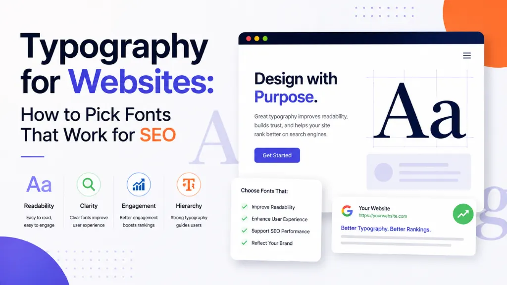

Most website owners think of fonts as a purely visual decision – something the designer picks and everyone else signs off on. In 2026, that assumption is genuinely costly, because Google now scores your typography choices directly through its ranking algorithm.
In this article8 sections
Typography for websites is a Core Web Vitals problem, not just a design one – a slow-loading or layout-shifting font degrades your Largest Contentful Paint and Cumulative Layout Shift scores, both of which factor directly into Google’s ranking signals, according to Logos Web Designs’ 2026 typography guide. The font you picked for its aesthetic matters just as much as the font you picked for how fast it loads.
At Search Savvy, typography comes up in nearly every technical SEO audit we run, because it sits at the intersection of design, performance, and accessibility – three things that all directly influence rankings and conversions. This guide breaks down exactly how typography for websites affects SEO in 2026, and what to actually do about it.
Why Does Typography for Websites Matter So Much for SEO in 2026?#
Typography for websites matters for SEO because fonts sit directly on the critical rendering path – the sequence of steps a browser must complete before it can show readable text to a visitor.
Fonts do not contain keywords, but a slow-loading or unstable font directly degrades two of Google’s three Core Web Vitals metrics: Largest Contentful Paint and Cumulative Layout Shift, according to Logos Web Designs’ 2026 typography guide. If your largest visible element is a text headline, a slow font drags your LCP score down directly, since the browser cannot paint that headline until the font file finishes downloading.
Typography for websites also affects layout stability, which Google measures explicitly. When a custom font finally loads and replaces the browser’s fallback font, the new letterforms take up different space, jolting the page and inflating your CLS score. Font swaps are one of the most common reasons websites blow past Google’s “good” CLS threshold of 0.1, per Semrush’s CLS guidance cited in the same report.
People Also Ask: Do fonts actually affect Google search rankings? Short Answer: Not directly through keywords, but yes indirectly – fonts influence Largest Contentful Paint and Cumulative Layout Shift, two Core Web Vitals metrics that Google uses as ranking signals. A slow or unstable font is a measurable SEO liability.
How Does Font Loading Actually Affect Core Web Vitals?#
Typography for websites goes wrong most often during the font loading process itself, which has three distinct phases – and each one is an opportunity for something to break.
The browser first shows a fallback font, then swaps to your custom web font once the file finishes downloading, and each transition can introduce delay or visual jumps if not handled correctly, according to a 2026 font optimization guide for frontend engineers. With Core Web Vitals directly influencing search rankings, and users bouncing from anything taking over 2–3 seconds to show readable text, font optimization has become a genuine engineering discipline, not just a styling afterthought.
Practical fixes that address this directly:
- Use font-display: swap so text renders in a fallback font immediately, rather than staying invisible while the custom font downloads
- Preload critical font files using <link rel=”preload”> so the browser fetches them earlier in the loading sequence, per Mewa Studio’s 2026 Core Web Vitals guide
- Self-host key fonts rather than relying on third-party font CDNs, which removes an extra DNS lookup and external request
- Stick to one or two font families to limit the number of font files the browser must download in total
People Also Ask: What does font-display: swap actually do? Short Answer: It tells the browser to show text immediately using a fallback font, rather than leaving text invisible while the custom font downloads. This directly improves perceived load speed and prevents a blank-text delay that hurts both UX and Core Web Vitals scores.
Should You Use Web-Safe Fonts or Custom Fonts for Better SEO Performance?#
Typography for websites often comes down to a genuine trade-off between design flexibility and raw performance, and the data leans further toward performance than most designers expect.
Sites using only system fonts have zero additional font-related requests, giving them faster LCP and zero font-related layout shift, since external font files typically add 10–100KB or more per weight and style, plus DNS lookup time, according to Pop Web Design’s 2026 web-safe fonts guide. If performance is your top priority, web-safe fonts eliminate font-related layout shift and loading delay entirely.
That said, custom fonts remain valuable for brand differentiation, and the trade-off is manageable if handled correctly:
- Web-safe fonts – fastest option; zero extra requests; ideal for performance-critical pages
- Self-hosted custom fonts with preloading – good middle ground; retains brand identity while minimising load delay
- Multiple third-party web fonts – highest visual flexibility, but the highest performance cost; use sparingly and only where brand impact truly justifies it
People Also Ask: Do web-safe fonts really load faster than custom fonts? Short Answer: Yes. Web-safe fonts are already installed on a visitor’s device, so there are zero additional download requests, which means faster Largest Contentful Paint and no font-related Cumulative Layout Shift compared to custom web fonts.
How Does Font Choice Affect Readability and Conversions?#
Typography for websites is not only a technical concern – the actual font and its formatting directly shape how long visitors stay and how much of your content they absorb.
Users spend 10–15% less time on websites with poor readability compared to those with excellent readability, according to CRO Benchmark’s 2026 readability statistics. The optimal body text size sits between 16 and 18 pixels, per Baymard Institute data cited in the same report, and text should maintain a WCAG-recommended contrast ratio of at least 4.5:1 against its background for normal-size text.
Line spacing matters more than most site owners realise. Increasing line spacing from 100% to 120% has been shown to improve reading accuracy by roughly 20% and cut eye strain by about 30% during long reading sessions, according to Logos Web Designs’ readability research. Separately, switching to a more appropriate typeface for individual readers produced a 35% boost in reading speed while retaining comprehension, per a 2026 UCF Readability Consortium study summary.
People Also Ask: What is the best body text size for a website in 2026? Short Answer: Between 16 and 18 pixels for most body text, with many accessibility experts recommending 18–20 pixels for optimal readability. Text should never drop below 16 pixels, since smaller sizes reduce reading accuracy and hurt accessibility compliance.
How Should You Choose Typography for Accessibility Compliance?#
Typography for websites has direct accessibility implications, since roughly 15% of the global population experiences some form of disability that can affect how they read on-screen text, according to OneWebCare’s 2026 readability guide.
Choosing an accessible font means prioritising clear, unambiguous letterforms – where characters like “I,” “1,” and “l” are easily distinguished from one another, according to Network Solutions’ 2026 font guide. Fonts like Atkinson Hyperlegible and Verdana were purpose-built for screen accessibility and consistently score well against key accessibility properties.
A few practical accessibility rules for typography:
- Use relative units (rem) rather than fixed pixel sizes, so text scales when a user adjusts browser settings
- Maintain WCAG contrast ratios – at least 4.5:1 for normal text and 3:1 for large text
- Avoid overly ornate or decorative fonts for body copy, reserving stylistic fonts for headlines only
- Test with a contrast checker tool before publishing, rather than relying on visual judgment alone
People Also Ask: Is there an official list of ADA-compliant fonts? Short Answer: No. ADA compliance is based on outcomes – sufficient contrast, scalable text, and adequate spacing – rather than a fixed list of approved fonts. Any font meeting those readability and contrast requirements can be considered compliant.
Why Does Typography for Websites Need Special Consideration for Indian Audiences?#
Typography for websites targeting Indian audiences carries an added layer most global font guides overlook entirely: script support for regional languages beyond the Latin alphabet.
India’s linguistic diversity means websites often need to support scripts like Devanagari, Tamil, Bengali, and others alongside English, and this has direct implications for Unicode support, font rendering, and accessibility compliance, according to a 2026 overview of India’s language and script landscape. A font that renders beautifully in English can completely fail to display Hindi or regional- language content correctly if it lacks the necessary script support.
Font families built specifically for multi-script support solve this problem. Noto Sans Devanagari offers clean letterforms and excellent readability for both digital and print Hindi content, according to Five Elements’ 2026 Hindi font guide, while broader families like Baloo 2 support Devanagari, Bengali, Tamil, and other Indian scripts within a single consistent typeface, per Network Solutions’ 2026 guide.
According to Search Savvy’s insights from building bilingual and regional-language websites, choosing a font family with genuine multi-script support from the start avoids costly rework – swapping fonts after launch to accommodate a regional-language page often means retesting layout, spacing, and performance across the entire site.
People Also Ask: Can I use the same font for English and Hindi content on my website? Short Answer: Only if the font has genuine Devanagari script support – most standard Latin- only fonts cannot render Hindi correctly. Font families like Noto Sans Devanagari or Baloo 2 are built to support both scripts consistently within one design system.
How Should You Actually Choose Typography for Your Website?#
Typography for websites should be approached as a system, not a single font decision – the goal is a small, deliberate set of choices that balance brand voice, readability, and performance together.
According to Search Savvy’s insights from technical SEO audits across Indian businesses, the most common typography mistake is treating font choice purely as a branding decision, without anyone checking the performance or accessibility implications before launch.
A practical typography checklist for most websites:
- Limit yourself to one or two font families across the entire site
- Use font-display: swap and preload critical fonts to protect Core Web Vitals
- Set body text between 16–18 pixels with at least 120% line spacing
- Check contrast ratios against WCAG AA standards before publishing
- Confirm script support for any regional languages your audience needs
- Test on a real, throttled mobile connection, not just desktop broadband
At Search Savvy, we recommend treating typography as part of the same conversation as page speed and accessibility – not a separate, purely aesthetic decision made in isolation.
FAQ: Typography for Websites and SEO#
Q1: How many fonts should a website use? A: One to two font families is the general best practice – typically one for headlines and one for body text. Each additional font family adds load time and complexity without proportional benefit for most websites.
Q2: Does font size directly affect SEO? A: Not directly through ranking algorithms, but indirectly, yes. Text that is too small hurts readability and mobile usability, which affects engagement metrics and Core Web Vitals – both of which do factor into search rankings.
Q3: Are Google Fonts good for website performance? A: They can be, especially when self-hosted rather than loaded from Google’s CDN, which removes an extra DNS lookup. Many Google Fonts, including Noto and Open Sans, are also well-optimised and widely tested for both performance and readability.
Q4: What is the difference between readability and legibility in typography? A: Readability refers to how easily individual characters and words can be distinguished, while legibility describes how comfortably users can read extended passages of text. Both matter, but legibility becomes more important for long-form content like blog posts.
Q5: Should I use a different font for mobile than desktop? A: Not usually a different font entirely, but font size and line spacing should adjust responsively. The same font family can work across both, provided the sizing and spacing scale appropriately for smaller screens.
Q6: How do I check if my website’s fonts are hurting Core Web Vitals? A: Use tools like Google PageSpeed Insights or Chrome DevTools to check your Largest Contentful Paint and Cumulative Layout Shift scores. Font-related issues typically show up as delayed text rendering or visible layout jumps as the page loads.
Want a technical SEO and typography audit for your website? Visit Search Savvy to speak with an expert who can identify exactly where your fonts are helping or hurting performance and rankings.