Color Psychology in Web Design: How Colors Affect Conversions
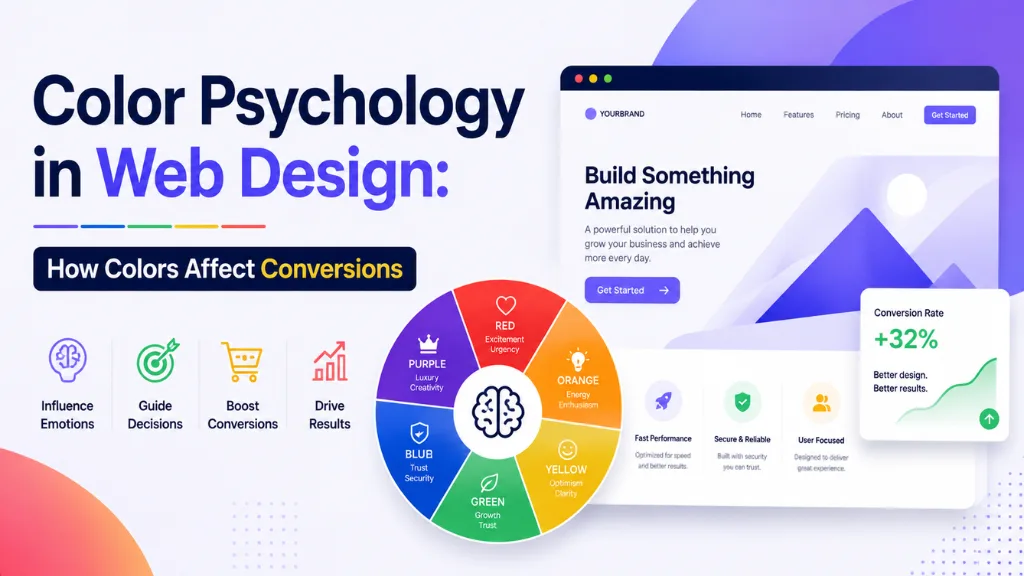

Before a visitor reads a single word on your website, their brain has already made a judgment about it. That judgment happens in well under a second, and color is one of the biggest inputs driving it – long before your copy, your offer, or your layout gets a chance to matter.
In this article7 sections
Color psychology in web design is not a soft, subjective topic anymore. It is backed by measurable, repeated data: red CTA buttons have been shown to outperform green ones by roughly 21%, a finding HubSpot first documented in 2011 and that a 2026 replication study across 14 mid-sized e-commerce brands and 38,000 sessions confirmed still holds, according to Amra and Elma’s 2026 button color research.
At Search Savvy, color decisions come up in nearly every website and landing page project we work on, because clients often pick colors based on personal taste rather than what the data shows actually drives clicks. This guide breaks down how color psychology in web design actually works, what the 2026 numbers say, and how to apply it – including specific considerations for Indian audiences.
Why Does Color Psychology in Web Design Matter So Much in 2026?#
Color psychology in web design matters because color is processed by the brain faster than almost any other visual input, shaping trust and purchase decisions before a visitor consciously registers your message.
Color recall outperforms brand-name recall by roughly 2.5 times – 78% of consumers remember a brand’s color, while only 43% recall the brand name itself, according to Review42’s 2026 color psychology statistics. That gap alone explains why so much design effort goes into getting a single accent color right: it is often the most durable, memorable brand asset a website has.
Color psychology in web design also has a direct, measurable link to revenue in 2026. Consistent color theming on e-commerce product pages drives an 87% add-to-cart rate, compared to just 54% on inconsistently colored pages, per Salesforce Commerce Cloud data cited in the same Review42 report. This is not decoration – it is a conversion variable with a measurable dollar value attached.
People Also Ask: Does color really affect whether people buy something online? Short Answer: Yes. Studies show consistent, well-chosen color use can lift add-to-cart rates by over 30 percentage points compared to inconsistent color use, and color is remembered far more reliably than brand names, making it a genuine driver of both trust and action.
How Does Color Psychology in Web Design Affect CTA Buttons Specifically?#
Color psychology in web design shows up most clearly – and most measurably – on call-to-action buttons, where a single color change can move conversion rates by double digits.
Baymard Institute’s 2026 cross-platform study, spanning 22 DTC brands, found red CTA buttons produced an average 31.4% conversion lift specifically on product pages with white or light-gray backgrounds, according to a 2026 button color statistics roundup. A separate 2026 neuromarketing study using eye-tracking on 800 participants found red buttons triggered a measurable stress-response spike within 180 milliseconds, correlating with a 22% faster click decision compared to blue or green buttons on identical layouts.
Orange performs strongly too, particularly in e-commerce. Orange CTAs outperform green buttons by 2.4% and blue buttons by 3.1% in average conversion rate, combining the urgency of red with the friendliness of yellow, according to Jasmine Directory’s 2026 digital advertising color guide.
- Red – highest urgency; strong for sales, flash offers, and time-sensitive CTAs
- Orange – balances urgency with friendliness; consistently strong across e-commerce
- Blue – signals trust; the dominant choice for SaaS free-trial and B2B lead-gen buttons
- Green – reassurance and calm; effective for “get started,” confirmations, and low-risk actions
People Also Ask: Is red really the best color for a call-to-action button? Short Answer: Often, yes, for urgency-driven actions – red CTAs have shown conversion lifts of 21–34% across multiple 2026 studies. But the effect depends heavily on contrast with the surrounding page, so red is not automatically the right choice for every layout or brand.
Why Does Contrast Matter More Than the Specific Color You Choose?#
Color psychology in web design only works when the chosen color actually stands out – the psychological effect of any color depends entirely on whether it creates enough contrast to be noticed first.
An orange button on an orange page converts nothing, according to Review42’s 2026 analysis. The critical variable is visual differentiation, not the specific hue itself – your CTA button should be the most visually distinct element on the page, regardless of which color you pick. If your entire brand identity is already blue, switching CTAs to orange can create visual discord that actually decreases conversions rather than improving them.
Accessibility compounds this issue. Only 29% of websites currently meet WCAG AA color contrast standards, exposing the majority of digital properties to both usability problems and accessibility risk, per the same Review42 data. A button that fails contrast standards is not just an accessibility gap – it is a conversion leak for a meaningful share of your visitors.
People Also Ask: Does the specific color of a CTA button matter more than contrast? Short Answer: No. Contrast with the surrounding page matters more than the specific color chosen. A psychologically “ideal” color that blends into the background will underperform a less conventional color that stands out clearly against its surroundings.
How Should Color Psychology in Web Design Differ by Industry?#
Color psychology in web design is not one-size-fits-all – the right CTA color shifts meaningfully depending on your industry and what emotional state drives the purchase decision.
According to WiserNotify’s 2026 CTA color breakdown, category-level patterns hold up consistently across testing:
- E-commerce – orange and green perform consistently well; reserve red for urgency-driven sale events; avoid grey or white as a primary CTA color on product pages
- SaaS and tech – blue for trust-focused free-trial CTAs; green for “get started” or sign-up actions; orange for higher-energy lead-generation pages
- Finance and insurance – blue dominates, given its strong, well-documented association with stability and trust across most cultures
- Healthcare and wellness – green and soft blue tones support calm, reassurance-driven decision-making
According to Search Savvy’s insights from building websites across Indian industries, this framework is a strong starting point – but it needs one further layer of consideration once your audience is primarily Indian.
People Also Ask: Should every industry use the same CTA button color? Short Answer: No. E-commerce tends to favour orange and green, SaaS favours blue and green, and finance strongly favours blue. The right color depends on which emotional state – urgency, trust, or reassurance – best supports that industry’s specific purchase decision.
Why Does Color Psychology in Web Design Work Differently for Indian Audiences?#
Color psychology in web design cannot be copy-pasted from Western research without adjustment, because color carries distinct cultural meaning in India that directly changes how a color is perceived on a screen.
Red in Indian culture is far less about danger or warning than it is in the West – it is associated with vitality, blessings, and celebration, appearing throughout weddings and religious ceremonies, according to a 2026 analysis of color symbolism in Indian culture. This means red can inspire trust and positive emotion in an Indian interface in ways it may not in a Western one, where red often reads primarily as an alert or warning signal.
Yellow and gold also carry stronger positive weight in India than in most Western design guides. Yellow and gold symbolize prosperity and spiritual purity in Indian culture, and even a small gold accent in interface design can be subconsciously read as a signal of value and authority, per the same analysis. Blue retains its trust association in India too, reinforced by its presence in depictions of several Hindu deities associated with protection and wisdom.
McDonald’s is a well-documented real-world example of this principle in practice: its Indian website prominently features red and yellow together, reflecting local associations with happiness and courage, while its Swedish site drops red almost entirely in favour of green, white, and yellow tones tied to a health-conscious, environmentally aware local identity, according to Cieden’s 2026 cultural color guide.
People Also Ask: Does red mean the same thing in Indian web design as it does in the West? Short Answer: Not exactly. In Western design, red often signals danger or warning. In Indian culture, red is more strongly associated with vitality, blessings, and celebration, which can make it a stronger trust and positive-emotion signal in an Indian-facing interface than in a Western one.
How Do You Actually Choose the Right Colors for Your Website?#
Color psychology in web design should guide your starting hypothesis, not replace testing – even well-documented color effects vary by audience, page type, and device.
According to Wisernotify’s 2026 testing guidance, effective color testing means comparing genuinely different psychological positions, not two shades of the same color – red versus green, or orange versus blue – and measuring actual conversions, not just clicks.
At Search Savvy, we recommend this practical sequence for choosing website colors:
- Pick one primary CTA color for your single most important action across the site
- Test it against a genuinely different color, not a minor shade variation
- Check contrast ratios against WCAG AA standards before running any test
- Segment results by device and page type, since a color can win on one template and fail on another
- Factor in cultural context for your specific audience rather than defaulting to Western color psychology assumptions alone
People Also Ask: How long should a color A/B test run before making a decision? Short Answer: Long enough to reach statistical significance for your traffic volume – typically at least two to four weeks for most small-to-medium websites. Ending a test too early risks acting on noise rather than a genuine, repeatable pattern.
FAQ: Color Psychology in Web Design#
Q1: What is the single best CTA button color for conversions? A: There is no universal best color – red and orange consistently perform well for urgency-driven actions, while blue performs well for trust-focused actions like SaaS sign-ups. The right choice depends on contrast with your page and the emotional state your action needs.
Q2: Should I change my brand colors based on color psychology research? A: Not necessarily. Brand consistency has its own value – 78% of consumers remember a brand’s color specifically. Instead, use color psychology to choose your CTA accent color within your existing brand palette, rather than overhauling your full identity.
Q3: Does color psychology work the same way across every country? A: No. Color meaning is culturally specific. Red, for example, carries different associations in Western, Indian, and Chinese contexts. Always validate general color psychology principles against your specific target audience’s cultural context.
Q4: How much can a CTA color change realistically improve conversions? A: Documented studies show conversion lifts ranging from roughly 20% to over 30% from CTA color changes alone, though results vary significantly by industry, page design, and audience. Testing on your own site is the only reliable way to confirm the effect for your specific case.
Q5: Is it more important to focus on color or accessibility contrast? A: Both matter, but accessibility contrast is the higher priority. Only 29% of websites currently meet WCAG AA contrast standards, meaning a large share of sites are losing conversions to usability failures that no amount of color psychology can fix.
Q6: Should Indian businesses use Western color psychology guides directly? A: Use them as a starting reference, not a final answer. Indian cultural associations for colors like red, yellow, and gold differ meaningfully from Western interpretations, so validate color choices against your specific Indian audience rather than applying Western frameworks unchanged.
Want a color and conversion audit for your website or landing pages? Visit Search Savvy to speak with a design and conversion expert who can identify exactly which color choices are helping or hurting your results.