How to Make Your Website Mobile-Friendly for Google in 2026
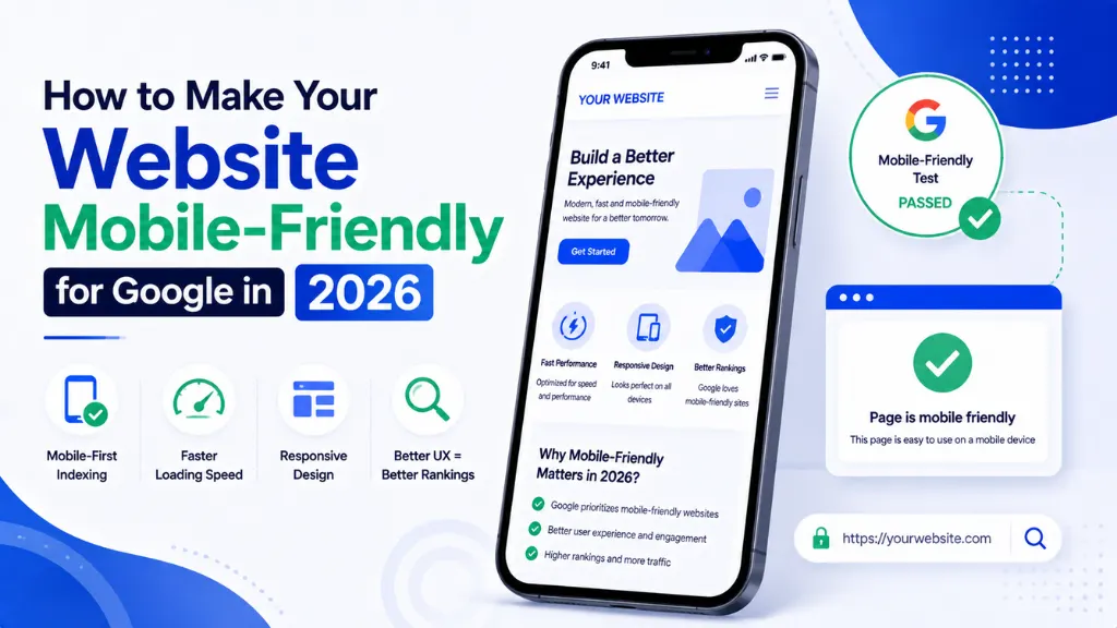

Somewhere between 75% and 80% of your visitors are almost certainly on a phone right now – and in India specifically, that share can climb past 80%. Yet nearly half of all websites still fail the exact performance thresholds Google uses to decide who ranks.
In this article8 sections
Website mobile-friendly is no longer a design preference – it is the single lens Google uses to evaluate your entire site, regardless of how many visitors actually arrive on desktop. Mobile devices account for approximately 59.6% to 64% of all global internet traffic, and in rapidly growing digital economies like India, that number climbs to roughly 76–80% or higher, according to Rannlab’s 2026 mobile-first design report.
At Search Savvy, mobile-friendliness audits are one of the first things we check on any new client site, because a strong desktop experience genuinely counts for very little if the mobile version is not equally solid. This guide breaks down exactly what makes a website mobile-friendly for Google in 2026, and the specific fixes that move the needle.
Why Does Website Mobile-Friendly Status Matter So Much for SEO in 2026?#
Website mobile-friendly status determines your search rankings directly, because Google now applies mobile-first indexing to 100% of all websites – meaning it evaluates your mobile pages first, not your desktop pages, when deciding where you rank.
Mobile-first indexing means that when Google crawls your site to evaluate its content, structure, speed, and quality, it is looking specifically at your mobile pages – not your desktop pages, according to Navoto’s 2026 mobile SEO guide. If your mobile version hides content, loads slowly, breaks layouts, or strips structured data, those weaknesses directly limit your rankings, even if your desktop site is technically flawless.
Website mobile-friendly problems also compound because of how consistently common they remain. Only about 39% to 48% of websites currently pass all three Core Web Vitals on mobile, compared to 54% on desktop – a gap that represents a genuine, substantial competitive opportunity for sites that get it right, according to Rannlab’s 2026 analysis.
People Also Ask: Does Google really only look at my mobile site when ranking me? Short Answer: Essentially, yes. Mobile-first indexing, now applied to 100% of websites, means Google evaluates your mobile version’s content, speed, and structure to determine rankings – even for searches performed on desktop devices.
What Is Content Parity and Why Does It Matter for Website Mobile-Friendly Compliance?#
Website mobile-friendly compliance hinges heavily on content parity – ensuring your mobile version contains the exact same core content, structured data, and internal links as your desktop version, with nothing hidden or removed.
If crucial information, structured data, or internal links are present on your desktop site but hidden or removed on mobile, Google assumes they simply do not exist at all, according to Rannlab’s 2026 design guide. This is one of the most commonly violated mobile-first requirements – and one of the highest-impact fixes for sites experiencing rankings drops they cannot otherwise explain.
Historically, developers hid heavy text, large images, or complex navigation menus on mobile to save screen space. In 2026, this is treated as a fatal SEO error, since any content omitted from the mobile version is functionally invisible to Google’s ranking systems, regardless of how complete the desktop version remains.
People Also Ask: What happens if content exists on desktop but is hidden on mobile? Short Answer: Google treats that content as if it does not exist at all, since mobile-first indexing evaluates only the mobile version. This can cause significant, hard-to-diagnose ranking drops for the specific terms tied to the hidden content.
Which Core Web Vitals Metrics Matter Most for Website Mobile-Friendly Performance?#
Website mobile-friendly status is measured concretely through Core Web Vitals – three specific metrics Google collects from real users on real mobile devices, not from synthetic lab tests run under ideal conditions.
Core Web Vitals are measured from real user data collected through Google’s Chrome User Experience Report, meaning your rankings reflect the actual mobile experience your real visitors encounter – often on 4G or slower connections – not the score from a single, optimistic PageSpeed Insights test, according to Navoto’s 2026 guide. A page that loads in 1.2 seconds on desktop fiber may show a Largest Contentful Paint of 3.8 seconds on a mid-tier mobile device, per DigitalApplied’s 2026 mobile SEO guide.
The three metrics to prioritise:
- Largest Contentful Paint (LCP) – how long the largest visible element takes to load; target under 2.5 seconds on mobile
- Interaction to Next Paint (INP) – how quickly the page responds to a user’s tap or click, replacing First Input Delay as Google’s responsiveness metric
- Cumulative Layout Shift (CLS) – how much the layout visibly shifts as elements load in; target under 0.1
People Also Ask: Why do Core Web Vitals scores differ between desktop and mobile testing? Short Answer: Because mobile Core Web Vitals are measured from real users on real Android devices, often on 4G or slower connections, while desktop scores often reflect faster, more stable conditions. A page can pass comfortably on desktop while failing significantly on mobile.
How Does Intrusive Interstitial Policy Affect Website Mobile-Friendly Rankings?#
Website mobile-friendly evaluation specifically penalises intrusive interstitials – popups or overlays that cover the main content and are difficult to dismiss on a small screen.
Google announced this policy in 2017, and it remains firmly enforced in 2026 – popups that block content immediately after a mobile visitor arrives are treated as a genuine ranking liability, according to DigitalApplied’s 2026 mobile SEO guide. Legally required content, such as age verification dialogs, and reasonably sized cookie consent banners are generally exempted from this penalty, since they serve a genuine compliance purpose rather than an aggressive marketing one.
Practical rules for avoiding this penalty:
- Avoid full-screen popups appearing immediately on page load, particularly email sign-up or app-download prompts
- Keep cookie consent banners reasonably sized rather than covering the full screen
- Delay promotional popups until a visitor has genuinely engaged with the page, if using them at all
- Ensure any interstitial is easy to dismiss with a clearly visible close button
People Also Ask: Are all mobile popups penalised by Google? Short Answer: No. Legally required interstitials, like age verification, and reasonably sized cookie consent banners are generally exempt. The penalty specifically targets intrusive popups that cover the main content and are difficult for a mobile visitor to dismiss.
How Should You Design Mobile Navigation for Website Mobile-Friendly Compliance?#
Website mobile-friendly navigation requires a genuinely different approach than desktop, since limited screen real estate means visitors need to find what they are looking for using fewer taps and less visual scanning.
A well-structured hamburger menu with clear categories, a prominent search function for content-heavy sites, and sticky navigation that does not consume excessive vertical space are widely considered current best practices, according to DigitalApplied’s 2026 mobile SEO guide. Google’s 2026 standards expect fully functional, visually appealing experiences on screens as small as 320 pixels wide, according to Webdesigner Factory’s 2026 mobile-first design report.
Interactive elements need adequate spacing for touch navigation specifically, since Search Console’s mobile usability reports commonly flag text too small to read, clickable elements placed too close together, and content wider than the screen, per the same source. Content must remain readable without requiring the visitor to zoom in.
People Also Ask: What screen width should a mobile-friendly website design for in 2026? Short Answer: Google’s current standards expect fully functional experiences on screens as small as 320 pixels wide. Interactive elements need adequate spacing for touch, and text must stay readable without requiring the visitor to zoom.
What Does This Mean for Indian Businesses Specifically?#
Website mobile-friendly requirements carry particular weight for Indian businesses, given how disproportionately mobile the Indian internet audience already is compared to global averages.
In rapidly growing digital economies like India, mobile traffic climbs to roughly 76% to over 80% of all internet traffic, considerably higher than the 59.6–64% global average, according to Rannlab’s 2026 report. For Indian businesses, this means a weak mobile experience is not a minor gap affecting a small slice of visitors – it is the primary experience the overwhelming majority of your audience will ever see.
According to Search Savvy’s insights from auditing Indian client sites, mobile page speed deserves particular attention given typical Indian mobile network conditions, since real user Core Web Vitals data reflects actual 4G – and sometimes 3G – connection speeds, not the fast office broadband most site testing happens on by default.
How Should You Actually Test and Fix Website Mobile-Friendly Issues?#
Website mobile-friendly diagnosis starts with Google’s own tools, which reveal exactly where a site falls short of current mobile-first standards before any redesign work begins.
Check Google Search Console under the Coverage and Core Web Vitals reports, and use the URL Inspection tool to see precisely how Googlebot renders specific pages, according to Media Components’ 2026 mobile-first guide. Google will also send direct alerts to your Search Console account if it detects significant mobile usability issues, making regular monitoring genuinely low-effort once set up correctly.
A practical audit and fix sequence:
- Check Search Console’s Mobile Usability and Core Web Vitals reports for existing flagged issues
- Run the URL Inspection tool on key pages to confirm how Googlebot actually renders them
- Verify content parity between desktop and mobile versions, page by page, for your most important pages
- Optimise images and enable lazy loading to defer off-screen images and reduce initial load time
- Test on a throttled 4G connection, not fast office broadband, to reflect real user conditions
- Verify canonical tags point correctly between desktop and mobile versions to avoid duplicate content issues
At Search Savvy, we recommend running this audit quarterly rather than treating mobile optimisation as a one-time project – Google’s thresholds and real-world network conditions both continue shifting.
FAQ: Making Your Website Mobile-Friendly for Google#
Q1: What is the difference between “mobile-friendly” and “mobile-first”? A: A mobile-friendly site simply displays correctly on a phone. Mobile-first means Google specifically uses your mobile version – not desktop – to determine crawling, indexing, and rankings. Passing one does not automatically guarantee passing the other.
Q2: Does AMP still help mobile rankings in 2026? A: AMP can enhance page speed and user experience on mobile, but it is just one of many factors affecting rankings. Most 2026 guidance treats it as a complement to strong responsive design, not a required or standalone ranking strategy.
Q3: How often should I test my website’s mobile-friendliness? A: Quarterly is a reasonable standard cadence for most businesses, though any significant site redesign, content update, or third-party plugin change warrants an immediate re-check using Search Console’s Mobile Usability and Core Web Vitals reports.
Q4: Can a desktop-focused site still rank well in 2026? A: Rarely, and generally at a disadvantage. Even accessible desktop-only sites can technically rank, but Google’s evolving priorities – including AI search experiences pulling from mobile-optimized content – make a genuine mobile-only mindset increasingly necessary for top visibility.
Q5: Does mobile page speed affect conversions, not just rankings? A: Yes, significantly. Google reports that a one-second delay in load time can reduce conversions by up to 20%. Mobile speed issues cost both search visibility and actual revenue simultaneously.
Q6: What is the most commonly overlooked mobile-friendliness issue? A: Content parity – hiding or removing content, internal links, or structured data on the mobile version that exists on desktop. This is consistently cited as one of the highest-impact, most frequently violated mobile-first indexing requirements.
Want a mobile-friendliness audit for your website? Visit Search Savvy to speak with a technical SEO expert who can identify exactly where your mobile experience is costing you rankings.