How to Design a Landing Page That Converts (With Examples)
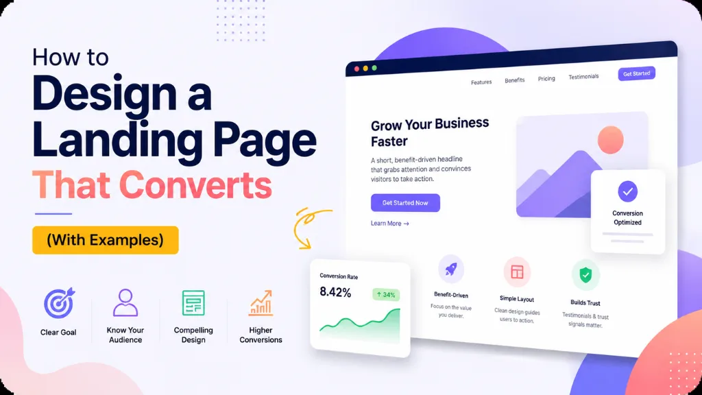

The gap between an average landing page and a genuinely great one is larger than most business owners assume. The median dedicated landing page converts at roughly 4–6.6% depending on the benchmark used, while the top 25% of pages exceed 11.45%, according to DigitalApplied’s 2026 landing page statistics. That gap is rarely about traffic quality – it comes down to design decisions.
In this article9 sections
Design a landing page correctly, and you turn the same ad spend, the same traffic, and the same offer into two to three times more customers. Design one poorly, and you are quietly paying to send visitors to a page that was never going to convert them, no matter how good your targeting was upstream.
At Search Savvy, landing page design is often the single highest- leverage fix we make for clients running paid campaigns, because it directly determines whether the traffic you are already paying for actually turns into revenue. This guide walks through exactly how to design a landing page that converts, with current 2026 data and examples throughout.
Why Does It Matter So Much How You Design a Landing Page?#
Design a landing page with intention, and every design choice either supports conversion or quietly works against it – there is no neutral element on a page built for one purpose.
A landing page is fundamentally different from a homepage. Unlike a homepage, which serves multiple audiences and goals at once, a landing page exists for one reason: to convert a specific visitor into a specific action, according to Neel Networks’ 2026 landing page guide. Every percentage point of conversion improvement is typically worth 30–70% more pipeline than the same spend poured into additional traffic, per DigitalApplied’s 2026 data.
Design a landing page as an afterthought, and the cost compounds silently. If you are already spending significantly on paid traffic, a weak landing page is very often the actual bottleneck – not your targeting, not your bid strategy, and not your ad copy.
People Also Ask: Why does landing page design matter more than ad targeting sometimes? Short Answer: Because even perfectly targeted traffic converts poorly on a confusing or slow page. A one-point conversion rate improvement typically delivers more pipeline value than the equivalent spend on additional traffic, making design one of the highest-leverage fixes available.
How Do You Design a Landing Page Headline That Converts?#
Design a landing page headline as the single highest-stakes sentence on the page, because it is often the only thing a visitor reads before deciding whether to stay or leave.
A crafted, relevant headline can lift conversions by 250–300% compared to a generic one, according to Involve.me’s 2026 landing page statistics. Headlines that speak directly to the visitor’s need and clearly state the offer consistently outperform clever or vague alternatives – clarity beats cleverness almost every time.
Practical rules for a headline that converts:
- State the specific outcome, not a vague benefit – “Get 20 qualified leads in 30 days,” not “Grow your business”
- Use short sentences, 15–20 words maximum, written at roughly an 8th-grade reading level
- Match the headline to the ad that brought the visitor there – message mismatch is one of the fastest ways to lose a visitor in the first three seconds
Example: A landing page for an SEO audit service might use “Find Out Why Your Website Isn’t Ranking – Free Audit in 24 Hours” instead of “Professional SEO Services for Your Business.” The first names a specific outcome and timeframe; the second says almost nothing.
How Should You Design a Landing Page Form to Reduce Abandonment?#
Design a landing page form with real restraint, because every additional field you ask for directly reduces the number of people willing to complete it.
Single-field forms convert at 13.4%, three-field forms at 10.1%, five-field forms at 7.8%, and nine-field forms drop to just 3.6%, according to a 2026 practitioner guide citing Unbounce benchmark data. Separately, reducing a form from 11 fields down to 4 produced a 120% increase in conversions in one documented study, per Involve.me’s 2026 statistics.
For Indian audiences specifically, form design needs one more adjustment. Forms should ask for a phone number rather than email, since Indian leads convert far better on a follow-up call than an email sequence, and WhatsApp opt-in tends to outperform both, according to Vedwix’s 2026 India landing page cost and design guide.
- Ask only for what you truly need at this stage – name and phone number is often enough
- Add optional fields sparingly – a budget or company-size dropdown can cut conversion by roughly 8% while improving lead quality by 34%, so use it only when qualification matters
- State a clear data security line near the form to reduce abandonment from privacy concern
People Also Ask: How many form fields should a landing page have? Short Answer: As few as possible – ideally one to four. Every added field measurably reduces completion rates, though a small number of qualifying fields can be worth the trade-off if lead quality matters more than raw volume for your business.
How Does Page Speed Affect Whether a Landing Page Converts?#
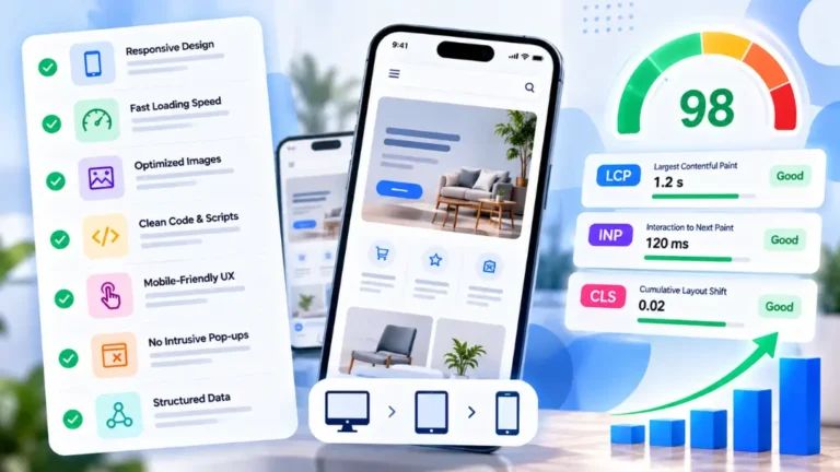
Design a landing page for speed as a conversion feature, not a technical afterthought, because the data shows load time has one of the largest measurable effects on whether visitors stay.
Pages that load in one second convert at 9.6%, compared to just 3.3% at five seconds – nearly a three-times gap driven by speed alone, according to the same 2026 practitioner benchmark data. For India specifically, Google data shows 53% of mobile visits are abandoned after just three seconds of load time, per Landy AI’s 2026 India landing page guide.
Given that Indian mobile connections average roughly 14 Mbps, page weight matters enormously. Design a landing page to stay under 500KB total page weight, and test it on a throttled 4G profile – not office broadband – before spending on ads, according to Vedwix’s 2026 guide.
People Also Ask: How much does page speed actually affect conversion rate? Short Answer: Significantly. Pages loading in one second convert at roughly 9.6%, versus 3.3% at five seconds. In India, over half of mobile visits abandon a page after three seconds of load time, making speed one of the highest-impact design factors.
How Should You Design a Landing Page for Mobile-First Visitors?#
Design a landing page mobile-first by default in 2026, not as a secondary consideration, because mobile now accounts for the overwhelming majority of landing page traffic in most markets.
Mobile drives 83% of landing page traffic globally, and over 75% of web traffic in India comes from mobile devices specifically, according to Abbacus Technologies’ 2026 India landing page cost guide. Despite that volume, desktop still converts meaningfully better – desktop conversion rates average 4.8–5.06% compared to mobile’s 2.49–2.9%, a 40–51% gap, per Lovable’s 2026 landing page guide. Closing that gap is where significant untapped revenue sits for most businesses.
Practical mobile-first design steps:
- Design the mobile layout first, then adapt up to desktop, not the reverse
- Use large, thumb-friendly CTA buttons placed within easy reach of one-handed scrolling
- Compress every image to WebP format, which can cut total image payload by 500KB–1MB
- Test on a throttled connection to catch performance issues broadband testing would miss
People Also Ask: Why does mobile convert worse than desktop even with mobile-first design? Short Answer: Smaller screens, slower connections, and more distracted browsing contexts all reduce mobile conversion rates, even on well-designed pages. The 40–51% gap between desktop and mobile conversion represents one of the largest optimisation opportunities most businesses have.
How Do Trust Signals Help You Design a Landing Page That Converts?#
Design a landing page with visible trust signals close to the point of decision, because visitors weighing whether to hand over contact details or payment information look for proof before they act, not after.
Testimonials, client logos, and guarantees significantly improve credibility and conversion rates, according to Landingi’s 2026 landing page best practices guide. Place these elements near the CTA itself, not buried at the bottom of the page where hesitant visitors have already left before reaching them.
Example: A B2B service landing page might place three short client testimonials with names, company names, and photos directly beside the form, rather than in a separate “reviews” section lower down the page.
People Also Ask: Where should trust signals go on a landing page? Short Answer: As close to the call-to-action as possible. Testimonials, logos, and guarantees work best when a hesitant visitor can see them at the exact moment they are deciding whether to complete the form or make a purchase.
Why Does Localisation Matter When You Design a Landing Page for India?#
Design a landing page for Indian audiences with genuine localisation in mind, not just a currency symbol swap, because language and cultural context directly affect whether visitors feel the page was built for them.
For many categories – local services, mass-market products, and educational content – a Hindi landing page will significantly outperform an English one simply because it feels more personally addressed, according to Digital Dawn’s 2026 India landing page guide. Even for English-language pages, using Indian context – city names, “for Indian businesses,” and direct address – makes copy feel noticeably more relevant to the visitor.
According to Search Savvy’s insights from building landing pages for Indian D2C and service brands, regional-language variants for Tier-2 and Tier-3 city campaigns consistently outperform a single English-only page, particularly for categories where trust and personal connection drive the buying decision.
How Should You Test and Improve a Landing Page After Launch?#
Design a landing page as a starting point, not a finished product – the highest-converting pages are the ones that get tested and refined continuously after launch, not left alone once they go live.
Launch systematic A/B tests, analyse conversion data, and refine page elements based on real user behaviour rather than assumptions, according to Digital Roots Media’s 2026 landing page design guide. At Search Savvy, we recommend testing one variable at a time – headline, form length, or CTA copy – so you can actually attribute a performance change to the specific element you altered.
A simple testing priority order for most pages:
- Headline – highest potential impact, fastest to test
- Form length and fields – directly affects completion rate
- CTA copy and placement – test action-specific phrasing over generic “Submit”
- Hero image or video – test relevance and clarity over polish alone
- Trust signal placement – test proximity to the CTA versus lower on the page
At Search Savvy, we treat every landing page as a living asset – the businesses that keep testing consistently outperform the ones that launch once and move on.
FAQ: How to Design a Landing Page That Converts#
Q1: What is a good landing page conversion rate in 2026? A: The median dedicated landing page converts at roughly 4–6.6% depending on the benchmark, with top-quartile pages exceeding 11.45%. Rates vary significantly by industry, so compare your page against your specific vertical rather than a blanket average.
Q2: Should I use a landing page template or build a custom page? A: Templates achieve solid average conversion rates and launch in hours to days, making them the right starting point for most businesses. Custom development becomes worthwhile once you have a proven offer, sufficient traffic, and a clear reason the template’s limitations are costing you.
Q3: How many images should a landing page have? A: As few as needed to support the offer clearly – every image adds to page weight and load time. Use product-specific, relevant imagery rather than generic stock photos, and compress everything to WebP format to minimise the speed impact.
Q4: Does removing navigation links actually help conversion? A: Yes, generally. Removing the top navigation menu keeps visitors focused on the single conversion action instead of inviting them to explore other pages and lose momentum. Only about 16% of landing pages currently do this, leaving room for most businesses to improve.
Q5: How long should a landing page be? A: Long enough to answer the visitor’s objections and short enough to stay focused – there is no universal ideal length. High-consideration purchases typically need more content and social proof; simple, low-commitment offers convert well with a short, focused page.
Q6: Should Indian businesses build separate landing pages for regional languages? A: Often, yes. Hindi or other regional-language landing pages frequently outperform English-only pages for local services, mass-market products, and educational offers, particularly when targeting Tier-2 and Tier-3 city audiences.
Want a landing page audit for your current campaigns? Visit Search Savvy to speak with a conversion optimisation expert who can identify exactly where your page is losing visitors.