Landing Page Design Checklist for Festive Sales Conversions

Most festive ad clicks end on a landing page, and that page decides whether the budget pays off. Flipkart has announced Big Billion Days from 9 October, Diwali’s main day is 8 November 2026, and Baymard’s aggregate of 50 studies puts the average cart abandonment rate at 70.22%. Much of that loss is fixable design.
In this article18 sections
This landing page design checklist covers what to put above the fold, where the call to action goes, how to keep mobile pages fast, how to show honest urgency under Indian rules, and how to remove checkout friction. The short version: match the ad’s promise, show the offer and one clear action immediately, load fast on mid-range phones, be transparent about the total price, and never fake scarcity.
What Is a Festive Landing Page?#
A festive landing page is a dedicated page built for one seasonal campaign, such as a Diwali sale, that continues the promise of an ad and guides visitors to a single purchase action. Unlike a homepage, it focuses on one offer, one audience and one next step.
Google Ads Help describes landing page experience as how relevant and useful your page is to people who click your ad, rated below average, average or above average. Google recommends making the page mobile friendly and fast, and suggests using conversion rate as a proxy for a good experience. Good festive landing page design follows the same logic: every element should serve the single offer the visitor clicked for.
The Landing Page Design Checklist at a Glance#
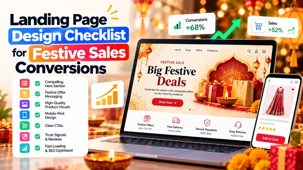
| # | Checklist item | Pass if |
| 1 | Message match | Headline repeats the ad’s offer |
| 2 | Above the fold | Offer, dates, visual, one CTA and a trust cue are visible |
| 3 | CTA placement | Primary CTA appears early and repeats after each proof block |
| 4 | Mobile speed | LCP 2.5 s or less, INP 200 ms or less, CLS 0.1 or less |
| 5 | Price transparency | Total cost and delivery date are shown early |
| 6 | Trust | Reviews, returns and contact details are visible |
| 7 | Urgency | Every timer and stock message is real |
| 8 | Forms | Guest checkout, minimal fields |
| 9 | Accessibility | Tap targets are large, contrast is strong |
| 10 | Testing | Conversion is tracked by device and tested before launch |
1. Above-the-Fold Design#
Above-the-fold design decides whether people keep scrolling. Nielsen Norman Group’s eyetracking research found users spent about 57% of viewing time above the fold and 74% in the first two screenfuls. That study used desktop monitors, and the fold on a phone is a moving line, so treat it as a principle rather than a pixel target. NN/g also notes that people scroll only when the top of the page convinces them the rest is valuable.
Put these in the first screen:
- A headline that mirrors the ad, such as “Diwali gifts under ₹999,” not a generic brand line.
- The offer and its end date.
- One strong product or collection visual.
- One primary CTA.
- One trust cue, such as a rating or “free returns.”
- A delivery promise, ideally with a pincode checker.
2. CTA Button Placement and Design#
CTA button placement should make the next step obvious at every point of doubt.
- Show the CTA in the first screen and repeat it after each product group, proof block and FAQ.
- Use a specific label, such as “Shop Diwali gifts,” not “Submit.”
- Keep one primary action per screen. Secondary actions should look secondary.
- Consider a sticky CTA on mobile so the action stays reachable while scrolling.
- Size targets properly. WCAG 2.2 requires targets of at least 24 by 24 CSS pixels at level AA, and recommends 44 by 44 for important controls.
- Offer a chat option where customers expect it. Meta reports nearly 60% of users are likely to buy after seeing an offer on WhatsApp, citing a Retailers Association of India whitepaper.
Avoid guilt-based decline links such as “No thanks, I hate saving money.” Confirm shaming is one of the practices prohibited under India’s dark patterns rules, covered below.
3. Mobile Landing Page Speed#
Mobile landing page speed is a revenue issue. A Google-commissioned study by Deloitte and Fifty-five found that a 0.1-second mobile speed improvement raised retail conversions by 8.4% across 37 European and American brands. It dates from 2019, so read it as direction, not a forecast.
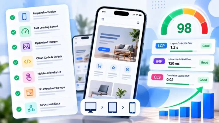
Google’s thresholds are LCP of 2.5 seconds or less, INP of 200 milliseconds or less and CLS of 0.1 or less. The 2025 Web Almanac, using July 2025 field data, found only about 62% of mobile sites had a good LCP, making loading the hardest vital to pass. Its data also points to common fixes:
- Do not lazy-load the hero image. About 16 to 17% of pages do, delaying the main content.
- Prioritize the hero with fetchpriority=”high”, used on 17% of mobile pages with image LCP elements.
- Set width and height on images. 62% of mobile pages fail to on at least one image, causing layout shift.
- Cap heavy scripts. Chat widgets, popups and tag managers compete for the main thread.
Test on a mid-range Android phone, not only a flagship. Search Savvy’s website design and development glossary defines the performance terms your team may meet, and a technical SEO audit can trace slow templates.
4. Offer, Price and Trust Design#
Conversion rate optimization on festive pages is largely about removing doubt. Baymard’s survey of US shoppers, excluding those just browsing, found the leading reasons for abandonment were:
| Reason | Share |
| Extra costs too high | 40% |
| Delivery too slow | 20% |
| Did not trust the site with card details | 19% |
| Site wanted an account | 18% |
| Long or complicated checkout | 17% |
| Returns policy unsatisfactory | 13% |
| Could not see total cost up front | 12% |
This is US data, so validate it with your own customers. The design lessons still apply:
- Show the full price early, including shipping and fees.
- Show delivery dates and order-by cut-offs before Diwali.
- Make returns and gift policies visible.
- Display reviews, contact details and secure payment options.
- Offer the payment methods your buyers use, such as UPI, cards and COD where relevant.
Add product markup so prices and availability are consistent across search and the page; Search Savvy’s free product schema generator can help.
5. Urgency Design Elements That Stay Honest#
Urgency design elements can lift action, but in India they carry legal risk when false. The Central Consumer Protection Authority’s Guidelines for Prevention and Regulation of Dark Patterns, 2023 identify 13 dark patterns, including false urgency, basket sneaking, confirm shaming and drip pricing. The CCPA issued an advisory on 5 June 2025 asking e-commerce platforms to self-audit. In August 2026 the government told Parliament that penalties totalling ₹20 lakh had been imposed for practices including false urgency, drip pricing and basket sneaking. This is not legal advice, so have your counsel review your pages.
| Honest urgency | Risky urgency |
| Timer tied to a real offer end time | Timer that resets for each visitor |
| “Order by 4 Nov for Diwali delivery” | Invented “5 people are viewing” claims |
| Real remaining stock | Fake “only 2 left” labels |
| Price shown in full up front | Fees added at payment |
| Optional add-ons | Pre-ticked extras in the basket |
6. Forms and Checkout Friction#
Baymard found the average US checkout shows 23.48 form elements by default, versus an ideal of 12 to 14. It estimates that better checkout design could raise conversion by 35.26% for the average large US or EU site, though results elsewhere will differ. Practical steps:
- Offer guest checkout by default.
- Ask only for what delivery and payment need.
- Auto-fill city and state from the pincode where possible.
- Show progress and clear error messages.
7. Test Before and During the Sale#
Track conversion rate by device, source and page. Test before launch by placing real orders on mobile. Change one element at a time, and avoid heavy redesigns once traffic peaks. If you need production help, Search Savvy’s website design and development services can support builds, and Google Ads and PPC services can align the ad and page.
Common Mistakes to Avoid#
- Sending ad traffic to the homepage.
- Hiding the offer end date.
- Lazy-loading the hero image.
- Adding fees at the last step.
- Using timers that reset.
- Making the CTA compete with five others.
Frequently Asked Questions#
What Should a Festive Landing Page Include Above the Fold?#
An ad-matching headline, the offer and end date, a strong visual, one primary CTA, a trust cue such as a rating, and a delivery promise. Keep it uncluttered so the message is clear at a glance.
Where Should the CTA Button Go on a Landing Page?#
Place a primary CTA in the first screen and repeat it after each proof block or product group. On mobile, a sticky button keeps the action reachable. Use large tap targets and a specific label.
How Fast Should a Mobile Landing Page Load?#
Google’s targets are an LCP of 2.5 seconds or less, INP of 200 milliseconds or less and CLS of 0.1 or less. Test on mid-range Android phones and prioritize the hero image.
Are Countdown Timers Allowed in India?#
Genuine timers tied to real offer end times are a normal sales tool. False urgency is a listed dark pattern under India’s 2023 guidelines, so avoid resetting timers and invented scarcity, and take legal advice.
Does Landing Page Design Affect Google Ads Costs?#
Google Ads rates landing page experience as one Quality Score component, but Google encourages using Quality Score as a diagnostic tool. Improving relevance, speed and mobile friendliness supports both performance and user experience.
Should the Festive Page Be Separate From the Homepage?#
Yes. A dedicated page can mirror the ad’s offer and remove distractions. Use a permanent URL, such as /diwali-sale/, and update it each year so it keeps accumulating history.
The Bottom Line#
Festive landing page design converts when it keeps the ad’s promise, loads quickly on phones, shows the true price and delivery date, and asks for one clear action without tricks. This week, audit your page against the checklist and fix the three biggest gaps before 8 October. If you would like help, Search Savvy’s performance marketing services are a practical starting point for joining up ads, pages and measurement.