Design Systems at Scale: Building Token-Based Component Libraries for SEO and Performance
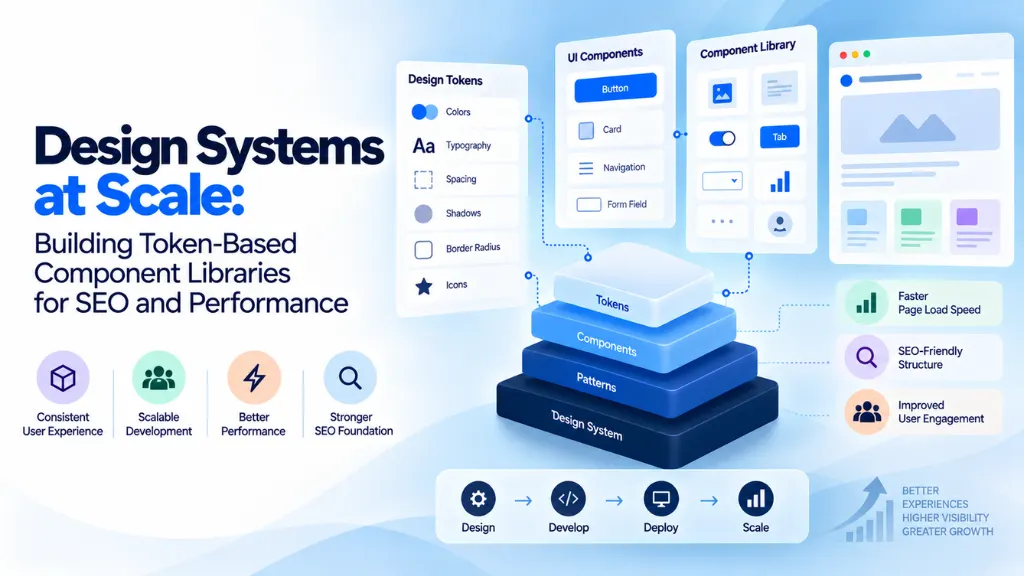

A design system built on tokens isn’t just a way to keep your buttons consistent – at real scale, it’s one of the most underrated levers a team has for Core Web Vitals, crawl efficiency, and keeping technical SEO implementation from quietly drifting across thousands of pages. Design tokens are named, platform-agnostic values – colors, spacing, typography, shadows – that act as the single source of truth for every design decision in a product, and how well-structured they are directly shapes how much CSS bloat, layout instability, and implementation drift a site accumulates as it grows.
In this article10 sections
The person who actually coined the term put it more sharply than most explanations manage. Jina Anne, who introduced “design tokens” while working on Salesforce’s Lightning Design System in 2014, has been explicit that tokens are more than a fancy name for variables: “design tokens are just variables’ is like saying ‘responsive design is just media queries,” she wrote – a distinction that matters enormously once you’re managing a design system across dozens of pages, brands, or platforms rather than a single site.
This guide, shaped by the frontend architecture work we do for clients at Search Savvy, explains what token-based component libraries actually are, why 2026 is the year the underlying standard finally matured, and how getting the architecture right pays off directly in SEO and performance terms – not just design consistency.
What Are Design Tokens, and Why Do They Matter at Scale?#
A design token is a named value that captures a single design decision – a specific blue, a spacing increment, a font size – stored once and transformed into whatever format each platform actually needs: CSS custom properties for the web, Swift constants for iOS, XML for Android. The critical property is that tokens are platform-agnostic by design: you define the decision once, and tooling handles translating it everywhere it needs to live.
What’s the Difference Between Design Tokens and CSS Variables?#
CSS custom properties are one possible output of a token system, not the token system itself. A design token exists independently of any single platform’s syntax – it’s a name and a value stored in a format like JSON, which build tools then transform into CSS variables for the web, native constants for mobile apps, or whatever format a given platform requires. Treating “design tokens” and “CSS variables” as synonyms misses the actual value: tokens let one design decision propagate consistently across web, iOS, and Android from a single source, while CSS variables alone only ever solve the web half of that problem.
The Three-Tier Token Architecture That Prevents Chaos at Scale#
The single biggest driver of a design system falling apart as it scales isn’t a lack of tokens – it’s tokens with no layering, where every component references raw color values directly and a rebrand means finding and replacing hundreds of instances by hand. Mature design systems, including Salesforce’s own Lightning Design System and Google’s Material Design 3, avoid this with a three-tier structure:
- Primitive tokens – raw values with no contextual meaning: blue-500: #3B82F6, spacing-4: 16px. These define your available palette, not where anything gets used.
- Semantic tokens – contextual references that point to a primitive: action-color pointing to blue-500, giving the raw value a purpose.
- Component tokens – the most specific layer, referencing a semantic token for a particular UI element: button-bg-primary pointing to action-color.
Get this layering right, and changing a single primitive value propagates cleanly through every semantic and component token that references it – a rebrand or a dark-mode theme becomes a change to a handful of primitive values rather than a manual hunt through a codebase. This same three-tier taxonomy is exactly what the W3C’s own Design Tokens specification is built around, which is precisely why it’s become the shared standard rather than a proprietary pattern any one company owns.
Why 2026 Is the Year Token Standardization Actually Matured#
For years, “design tokens” meant a JSON file whose shape was whatever a given tool happened to export – Figma, Tokens Studio, and a hand-rolled Style Dictionary config could all represent the exact same color value in three incompatible ways, forcing teams to maintain conversion scripts just to keep tools talking to each other.
That changed on October 28, 2025, when the W3C Design Tokens Community Group shipped the first stable version of the Design Tokens specification (2025.10), backed by more than 40 organizations including Adobe, Figma, Google, Microsoft, Shopify, and Salesforce. The spec defines a common shape – every token has a $value and a $type, and tokens can reference other tokens by path – which is what makes a semantic token like button-primary-bg genuinely portable between design tools and codebases instead of tool-specific.
The adoption curve backs up how significant this shift has been. A zeroheight industry survey of roughly 300 design professionals found design token adoption reached 84% of teams in 2026, up sharply from 56% just a year earlier – tokens have gone from a differentiator to the default. Separately, industry analysis puts token adoption as a primary deliverable in around 74% of mature design systems, reinforcing that this is table-stakes infrastructure now, not an advanced technique reserved for large enterprises.
How Token-Based Systems Directly Improve SEO and Performance#
This is where the connection to SEO stops being abstract. A few concrete mechanisms explain why token architecture affects rankings and user experience metrics, not just design consistency:
Leaner CSS payloads. When every color, spacing value, and font size traces back to a shared token rather than a one-off hex code or pixel value hardcoded per page, the generated stylesheet has dramatically less redundancy. Smaller CSS payloads load and parse faster, which directly supports faster paint metrics like Largest Contentful Paint.
Reduced layout shift risk. Cumulative Layout Shift often comes from inconsistent, ad hoc spacing and sizing decisions scattered across a codebase – a slightly different padding value on one page’s card component than another’s. Token-driven components enforce the same spacing and dimension values everywhere they’re used, which removes a common, easy-to-miss source of layout instability.
Consistent technical SEO implementation at scale. When heading structures, image handling patterns, and even structured data templates are built into reusable components rather than recreated per page, technical SEO fundamentals propagate automatically across every page using that component – instead of drifting page by page as different authors and developers implement things slightly differently over time.
Faster remediation at scale. A Core Web Vitals issue traced to a single component – say, an oversized hero image pattern – can be fixed once at the component level and instantly resolved across every page using it, rather than requiring a page-by-page audit and fix across a site with thousands of URLs.
Can a Design System Actually Improve Core Web Vitals?#
Indirectly, yes, and the mechanism is consistency rather than any single technical trick. A well-governed, token-based design system reduces the ad hoc styling and one-off component variants that tend to cause CSS bloat and layout instability in the first place, and it makes performance budgets enforceable at the component level rather than something checked page by page after the fact. It won’t fix a fundamentally poor architecture decision like heavy client-side rendering, but it removes a large category of the inconsistency-driven performance problems that accumulate naturally as a site or product scales.
The AI Angle: Tokens as the Contract Between Design, Code, and AI Tooling#
A genuinely new dimension in 2026 is how design tokens are becoming the handoff layer for AI-assisted development, not just human designers and engineers. Tools like Storybook now treat token panels as a first-class interface, and AI-assisted design and coding tools increasingly generate UI by reading directly from a product’s token set. The practical implication is straightforward: well-shaped, clearly structured tokens mean AI tools generate interface elements that actually look like your product, using your real spacing, colors, and type scale – while a poorly structured or inconsistent token set means AI-generated output looks generic, because there’s no coherent system for the tool to draw from.
This overlaps meaningfully with the broader shift toward AI-driven discovery that we track closely at Search Savvy. Just as consistent, well-structured content signals credibility to AI systems deciding what to cite, a consistent, well-structured design and technical implementation signals reliability across every page a crawler or AI system encounters on your site – the same underlying discipline supports both outcomes.
A Practical Path to Token-Based Design at Scale#
- Audit your existing styles first. Catalog the actual colors, spacing values, and typography currently in use across your codebase before defining a token set – this usually reveals far more inconsistency than teams expect.
- Build the three-tier architecture deliberately. Start with primitives, layer semantic tokens on top, and only then define component-level tokens, rather than jumping straight to component-specific values.
- Adopt the W3C DTCG format for your token files so your setup works across Figma, Style Dictionary, and other current tools without custom conversion scripts.
- Use a build pipeline like Style Dictionary to transform your token source into the platform-specific outputs you actually need – CSS custom properties, iOS constants, Android XML.
- Bake performance budgets into component governance, not just periodic page-level audits, so a component can’t ship without meeting size and rendering thresholds.
- Establish real ownership and review rituals. A token system without governance tends to drift or, as one industry commentator put it, quietly rot in a Figma file nobody opens.
This is exactly the kind of technical foundation work we help clients think through at Search Savvy, since a well-built design system pays dividends in both user experience and search performance simultaneously. Our Website Design & Development Services page covers how we typically approach this kind of scalable frontend architecture, and our Website Design and Development glossary is a useful shared reference if some of this terminology is new to parts of your team.
FAQ: Design Systems and Design Tokens at Scale#
What are design tokens in simple terms? Named, platform-agnostic values representing a single design decision – like a specific color or spacing amount – stored once and transformed into the format each platform needs, such as CSS variables for the web or native constants for mobile apps.
Who coined the term “design tokens”? Jina Anne coined the term while working on Salesforce’s Lightning Design System in 2014, working alongside engineer Jon Levine to build a system for sharing design decisions consistently across web and native platforms.
Are design tokens the same as CSS variables? No. CSS custom properties are one output format a token system can generate, but tokens themselves are platform-agnostic values stored independently of any single platform’s syntax, which is what allows the same design decision to propagate to web, iOS, and Android alike.
What is the W3C Design Tokens specification? It’s a standardized format for representing design tokens, shipped in its first stable version (2025.10) on October 28, 2025, backed by over 40 organizations including Adobe, Figma, Google, and Salesforce, ensuring different design and development tools can read and write the same token format.
Can design tokens actually improve website performance and SEO? Yes, indirectly. Token-based systems reduce redundant CSS, minimize the ad hoc styling inconsistencies that cause layout shift, and make it possible to enforce performance budgets and technical SEO patterns consistently at the component level rather than page by page.
How widely adopted are design tokens in 2026? Very widely. A zeroheight industry survey found team adoption of design tokens reached 84% in 2026, up from 56% the year before, with tokens now the default approach for mature design systems rather than an advanced or optional technique.
The Bottom Line#
A token-based component library isn’t a nice-to-have design deliverable sitting apart from your technical and SEO priorities – at scale, it’s genuinely part of your performance and technical SEO infrastructure. Build the three-tier architecture deliberately, adopt the now-standardized W3C format so your tools stop fighting each other, and treat component-level governance as the place where performance budgets and consistency actually get enforced. Get the tokens right, and a huge category of drift-related SEO and performance problems simply stops accumulating in the first place.