Cognitive Load Theory in UX: Reducing Decision Fatigue to Increase Conversion Rates
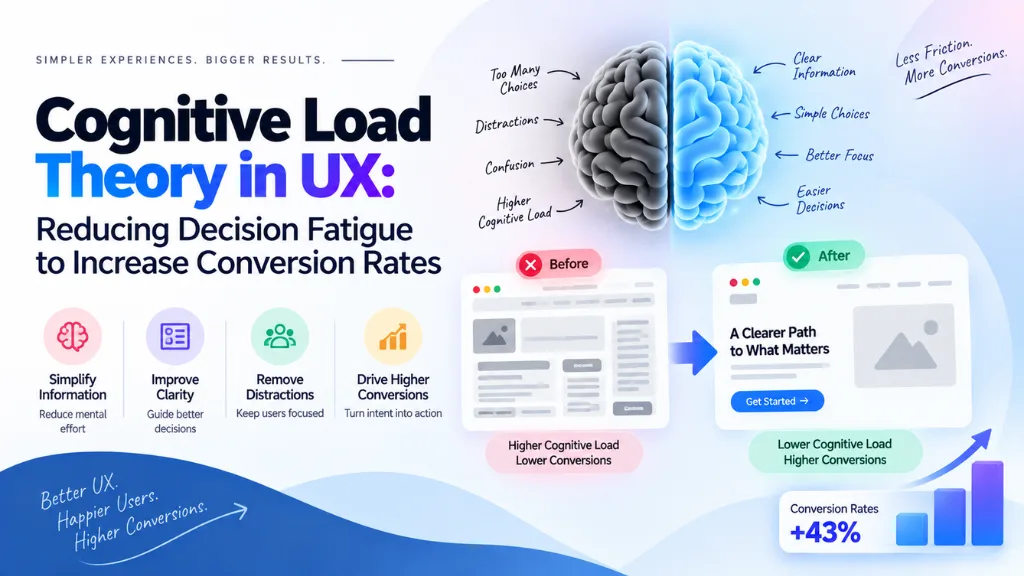

A visitor doesn’t abandon your checkout because they stopped wanting the product. More often, they abandon it because their working memory ran out before their intent did. Cognitive load theory in UX explains exactly why this happens and, more usefully, what to change about an interface so it doesn’t – a diagnostic Search Savvy applies whenever a client’s traffic numbers look healthy but conversions don’t.
In this article13 sections
This article covers what cognitive load theory actually says, the three types of load every interface creates, how excess load shows up as lost conversions, and the specific design changes that measurably reduce the mental effort required to complete a task – from checkout forms to navigation to pricing pages.
What Is Cognitive Load Theory?#
Cognitive load theory holds that working memory – the mental space where a person actively processes information – has a fixed, limited capacity, and that once a task demands more from that capacity than is available, performance degrades and people disengage. The theory was introduced by educational psychologist John Sweller in the late 1980s to explain why learners struggled when instructional material presented too much at once, and it has since become one of the most widely applied frameworks in interface and product design.
The classic estimate of working memory capacity comes from psychologist George Miller’s 1956 research, which suggested people can hold roughly seven items, plus or minus two, in working memory at a time. More recent work by cognitive scientist Nelson Cowan has revised that figure downward, suggesting the real functional limit is closer to four meaningful chunks of information. Either estimate leads to the same practical conclusion for design: every additional decision, label, or visual element on a screen competes for a genuinely scarce resource, and once that resource is exhausted, users don’t slow down gracefully – they stop.
Why Does Cognitive Load Matter for Conversion Rate?#
Cognitive load matters for conversion because a confused or overwhelmed visitor doesn’t push through complexity to complete a purchase or signup – they abandon the task entirely. Every unnecessary form field, unclear label, or extra decision point adds mental effort that competes directly with the effort a visitor is willing to spend on your desired action. Reduce that competing load, and more of a visitor’s limited attention stays available for the task you actually want them to finish. This is one reason cognitive load review keeps coming up in website design and development work, even on projects that started as a purely visual refresh.
The Three Types of Cognitive Load#
Sweller’s framework distinguishes between three categories, and only one of them is something design should try to eliminate.
| Load Type | What It Is | Design Implication |
| Intrinsic load | The inherent difficulty of the task or content itself | Can be managed through sequencing and chunking, but not eliminated – some tasks are genuinely complex |
| Extraneous load | Mental effort caused by how information is presented, not the task itself | Should be minimized aggressively – this is pure design friction |
| Germane load | The effort spent building understanding, patterns, and mental models | Often worth preserving, since it helps users build lasting familiarity with an interface |
Most UX problems live in extraneous load: unclear navigation labels, inconsistent layouts, unnecessary steps, or visual clutter that has nothing to do with the actual task’s difficulty. A checkout form doesn’t need to be simplified because paying for something is inherently hard – it needs simplifying because most checkout flows add friction that has nothing to do with the purchase itself.
Where Cognitive Load Quietly Kills Conversions#
How Do Too Many Form Fields Affect Checkout Conversion?#
Excess form fields increase cognitive load by forcing users to evaluate and complete more decisions than the task actually requires, and each additional field is an opportunity for hesitation or abandonment. Baymard Institute’s large-scale checkout research found that the average U.S. e-commerce checkout displays 23.48 form elements by default, when an optimized flow typically needs somewhere closer to 12 to 14 – and Baymard has documented that fixing checkout usability issues like this can lift conversion by as much as 35% for large e-commerce sites tested. Separately, Baymard’s survey research found that roughly one in five U.S. online shoppers have abandoned a cart specifically because the checkout process felt too long or complicated.
The fix isn’t just deleting fields arbitrarily – it’s asking whether each one is required to complete the transaction or is being collected for a secondary purpose (marketing preferences, account creation, optional profile data) that can be deferred to after the purchase is complete. This is a frequent finding in ecommerce SEO work as well, since a checkout flow that loses visitors to cognitive overload undermines the same traffic that organic and paid channels worked to bring in.
How Does the Number of Choices Affect Decision-Making?#
Hick’s Law describes a well-documented pattern in decision-making research: the time it takes a person to make a decision increases as the number of available options grows. In interface terms, a navigation menu with thirty items or a pricing page with eight plans forces every visitor to spend working memory comparing options instead of choosing one – and comparison, not the decision itself, is what exhausts the available cognitive budget.
This doesn’t mean fewer options are always better in absolute terms; it means options need structure. Grouping related choices, defaulting to a recommended option, and progressively revealing advanced choices only when needed all reduce the number of things a person has to hold in mind at once, without necessarily removing legitimate functionality.
Design Patterns That Reduce Cognitive Load#
- Progressive disclosure. Show only what’s needed for the current step, and reveal additional detail or options only once a user requests it. This keeps intrinsic complexity intact while removing extraneous load from the initial view.
- Chunking. Break long forms, lists, or processes into smaller, logically grouped sections – a multi-step checkout with clear stage indicators is easier to complete than a single long form, even when it collects the same information.
- Consistent patterns. Reusing the same layout, iconography, and interaction patterns across a site reduces germane load over time, since users build a working mental model once and reapply it, rather than relearning navigation logic on every page.
- Clear visual hierarchy. Strong contrast between primary actions and secondary options reduces the effort required to identify what to do next, particularly on pages with more than one possible action.
- Defaults and smart pre-fills. Reasonable default selections and auto-filled fields (address lookups, saved payment details) remove decisions the user doesn’t need to make manually every time.
- Plain, specific labels. Vague microcopy – “Submit,” “Continue,” ambiguous icons with no text label – forces users to infer meaning, which adds a small but real decision cost repeated across every interaction.
Cognitive Load and Mobile UX#
Mobile interfaces amplify cognitive load issues that are merely inconvenient on desktop. Smaller screens force more scrolling and hiding of content behind menus, which increases the working-memory burden of remembering what’s off-screen; touch targets that are too small or too close together add a physical decision-making cost on top of the cognitive one. The same principles apply – progressive disclosure, chunking, clear hierarchy – but the margin for error is smaller, since mobile users are frequently completing tasks in shorter, more interrupted sessions than desktop users.
Testing for Cognitive Load Problems#
How Do You Know if a Page Has Too Much Cognitive Load?#
Look for behavioral signals rather than relying on subjective design opinions: high abandonment at a specific step in a funnel, long dwell times on pages that should require a quick decision, repeated back-and-forth navigation suggesting a user can’t find what they expect, and direct user feedback describing confusion or overwhelm during usability testing. A step in a checkout or signup flow with a disproportionately high drop-off rate compared to surrounding steps is one of the clearest quantitative signals that cognitive load, not just design taste, is the underlying problem.
Usability testing with real users remains the most reliable qualitative method – watching someone hesitate, re-read a section, or abandon a task reveals friction that analytics alone can describe but not explain. Combining funnel-level drop-off data with direct observation gives a clearer picture than either method alone.
Common Mistakes#
- Removing fields or features without checking why they exist. Some fields are legally required or genuinely necessary; cutting them without review creates new problems rather than reducing load.
- Confusing minimalism with lower cognitive load. A visually sparse page with unclear labeling can still carry high extraneous load if the remaining elements are ambiguous.
- Treating every type of load the same. Reducing intrinsic load in a genuinely complex task (like configuring an enterprise software plan) sometimes isn’t possible or appropriate – the priority should be trimming extraneous load around it instead.
- Adding steps to reduce visual density without checking abandonment impact. Splitting one page into three doesn’t automatically lower cognitive load if it doesn’t reduce the total decisions the user has to make.
- Ignoring returning users. Interfaces built entirely around first-time-user simplicity can frustrate experienced users who now have to navigate extra steps for tasks they already understand well.
- Skipping usability testing in favor of design opinion. Assumptions about what feels simple to a designer often diverge from what a first-time visitor actually experiences.
Search Savvy treats cognitive load review as part of a broader website audit rather than a separate design exercise, since form friction, navigation complexity, and unclear page hierarchy usually show up together in the same funnel data – and the same friction that costs organic conversions tends to cost performance marketing campaigns just as much, since paid traffic hits the exact same checkout or signup flow.
Frequently Asked Questions#
What is cognitive load theory in simple terms? It’s the idea that working memory can only hold and process a limited amount of information at once, and once a task exceeds that limit, a person’s performance drops and they’re more likely to give up rather than push through.
What are the three types of cognitive load? Intrinsic load (the inherent difficulty of the task itself), extraneous load (unnecessary mental effort caused by poor presentation or design), and germane load (effort spent building useful mental models). Design work should focus on minimizing extraneous load while managing, not necessarily eliminating, the other two.
How many form fields should a checkout page have? Baymard Institute’s research suggests an optimized checkout typically needs around 12 to 14 form elements, compared to the roughly 23 the average e-commerce checkout displays by default. The right number depends on what information is genuinely required to complete the transaction.
Does reducing cognitive load always mean simplifying the design visually? No. A visually minimal page can still carry high cognitive load if labels are unclear or options are poorly organized, and a denser page can feel manageable if information is well-structured. Load is about mental effort, not visual quantity alone.
How do you measure cognitive load on a website? There’s no single metric, but funnel drop-off rates at specific steps, task completion time, and direct usability testing observations together give a reliable picture of where a page or flow is demanding more mental effort than necessary.
Is cognitive load theory only relevant to e-commerce checkout pages? No. It applies to any interface where users make decisions – navigation menus, pricing pages, signup forms, dashboards, and content-heavy pages all create cognitive load, and the same reduction principles apply across all of them.
Bottom Line#
Cognitive load theory reframes a lot of what looks like a “conversion problem” as what it actually is: a working-memory problem. Visitors don’t abandon tasks because they lost interest – they abandon them because the interface demanded more mental effort than they were willing to spend. Audit checkout and signup flows for unnecessary fields, apply progressive disclosure and chunking to reduce extraneous load, and test with real users rather than design instinct alone. The sites that get this right aren’t necessarily the simplest-looking ones – they’re the ones that ask visitors to think about exactly what matters, and nothing else.