Advanced Image Delivery: AVIF, Responsive Images and Perceptual Quality Scoring
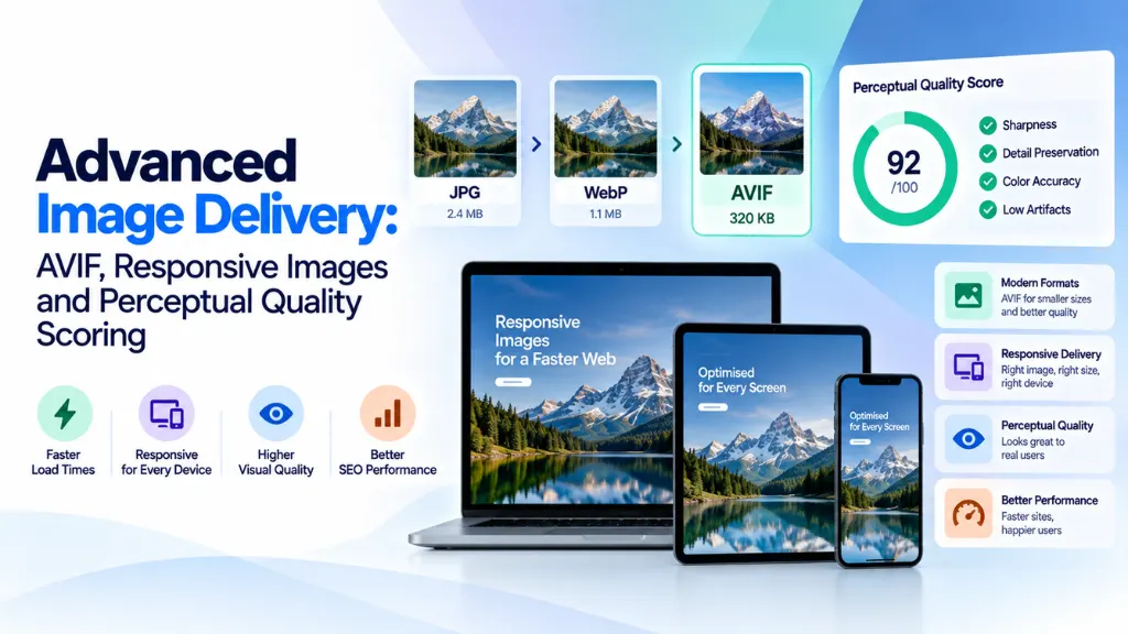

Images account for roughly 45–65% of the total bytes on a typical webpage, and the largest image on the page is almost always the element determining your Largest Contentful Paint score. Advanced image delivery is the discipline of getting that reality under control – choosing the right format, generating the right responsive variants, prioritizing the right image for download first, and compressing everything by actual perceived quality rather than a one-size-fits-all setting.
In this article8 sections
This guide covers the technical stack in full: where AVIF genuinely beats WebP and where it doesn’t, how to implement responsive images correctly with srcset, sizes, and <picture>, how modern perceptual quality metrics actually measure compression quality, and the priority signals – fetchpriority, loading, explicit dimensions – that determine whether all of this actually improves Core Web Vitals or quietly undermines it.
Choosing a Format: AVIF, WebP, and Where JPEG Still Belongs#
AVIF, built on the AV1 video codec, delivers meaningfully smaller file sizes than WebP at equivalent visual quality – commonly cited in the range of 20–50% smaller depending on image content – while WebP remains faster to encode and has marginally broader legacy support. Neither fully replaces JPEG, which still has legitimate use cases in 2026.
- AVIF produces the smallest files for photographic content and supports HDR and wide color gamuts that WebP doesn’t. The trade-off is heavier encoding computation and a still-maturing tooling ecosystem compared to the more established WebP pipeline. Real-world examples are dramatic: an 850 KB JPEG hero image commonly compresses to somewhere in the 150–200 KB range as AVIF with no visible difference.
- WebP offers strong compression, near-universal modern browser support, faster encoding, and support for both lossy and lossless modes plus animation and transparency in a single format. For teams standardizing on one modern format across a CMS, WebP remains a defensible, lower-friction choice.
- JPEG still has a place for email attachments, print workflows, legacy systems that don’t support modern formats, and situations demanding absolute universal compatibility.
Browser support estimates for AVIF vary somewhat between sources – figures in current reporting range from roughly 75% up to the mid-90s percent of global browser usage, reflecting how quickly this figure has been moving and how it’s measured. In practice, this uncertainty matters less than it sounds, because the correct implementation pattern sidesteps the question entirely: serve AVIF as the primary source, WebP as the fallback, and JPEG as the final fallback, using the <picture> element so each browser automatically selects the newest format it can decode.
<picture>
<source type=”image/avif” srcset=”hero-800.avif 800w, hero-1200.avif 1200w, hero-1600.avif 1600w”>
<source type=”image/webp” srcset=”hero-800.webp 800w, hero-1200.webp 1200w, hero-1600.webp 1600w”>
<img src=”hero-1200.jpg” alt=”Descriptive alt text” width=”1600″ height=”900″>
</picture>
A JPEG XL alternative exists but currently has limited browser support and no major CDN auto-negotiation, making it a format worth watching rather than deploying in production today.
Perceptual Quality Scoring: Why “Quality 80” Doesn’t Mean the Same Thing Twice#
One of the most common mistakes in image optimization is comparing formats or compressors at the same numeric quality setting – quality 80 in JPEG, WebP, and AVIF are entirely different operating points, producing different file sizes and different actual visual results. The only fair comparison method is fixing the file size and asking which image looks better, which is exactly what perceptual quality metrics exist to quantify.
| Metric | What It Measures | Approximate Agreement with Human Judgment |
| PSNR | Raw mathematical pixel difference; ignores perception entirely | ~67% – only slightly better than chance |
| SSIM / MS-SSIM | Structural similarity, accounting for spatial relationships between pixels | Moderate – better than PSNR, still limited |
| Butteraugli | Google’s perceptual metric; uses a heat map of psychovisual differences | ~80% |
| DSSIM | A refined, multi-scale variant of SSIM measuring dissimilarity | ~82% |
| SSIMULACRA2 | A newer perceptual metric built specifically to improve on Butteraugli and DSSIM | ~87% |
The practical implication for advanced image delivery: no single metric is authoritative, and different metrics can disagree meaningfully on the same image. Perception-guided compressors that use techniques like gentle posterization or gradient-fitting can introduce tiny, technically measurable deviations that metrics like Butteraugli and SSIM penalize heavily, even when those deviations are genuinely invisible to a human viewer. For enterprise workflows compressing large image libraries, cross-checking at least two perceptual metrics – rather than relying on a single score – and periodically spot-checking against actual human perception at 100% zoom remains the most reliable approach.
Responsive Images: srcset, sizes, and the picture Element#
Serving the right format is only half the job – serving the right size to each device is just as significant a lever, and arguably the more commonly neglected one. A perfectly encoded AVIF file at 4,000 pixels wide is still far heavier than a properly sized 800-pixel image in any format, if it’s being displayed in an 800-pixel slot.
srcset and sizes solve this by letting the browser choose the most appropriate image variant based on the actual rendered width and the device’s pixel density, rather than downloading one fixed-size file for every visitor:
<img
src=”hero-800.jpg”
srcset=”hero-400.jpg 400w, hero-800.jpg 800w, hero-1200.jpg 1200w, hero-1600.jpg 1600w”
sizes=”(max-width: 640px) 100vw, (max-width: 1024px) 90vw, 1200px”
alt=”Descriptive alt text”
width=”1200″
height=”675″
loading=”lazy”>
A reasonable 2026 baseline is at least three width variants for standard content images – commonly 400w, 800w, and 1200w – with additional larger variants (1600w, 2000w, or 2400w) for full-bleed hero images.
The <picture> element serves two genuinely distinct purposes worth keeping separate in your mental model: serving modern formats with fallbacks (the pattern shown above, where the browser picks the first <source> type it supports), and art direction, where entirely different image crops or compositions are served at different breakpoints using media queries on each <source>. Forgetting the JPEG <img> fallback inside a <picture> element is a common implementation error that causes outright rendering failures in any browser that doesn’t support one of the listed <source> formats.
Priority Signals: fetchpriority, loading, and Layout Reservation#
Format and sizing decisions can be undermined entirely by getting image loading priority wrong. Three signals work together to determine both loading speed and layout stability:
- fetchpriority=”high” should be applied specifically to the image that constitutes your page’s Largest Contentful Paint element – typically a hero image or primary product photo above the fold. This tells the browser to prioritize that download over other competing requests, and documented tests have shown this single attribute measurably improving LCP timing.
- loading=”lazy” should be applied to every image below the fold, deferring their download until the browser determines they’re likely to enter the viewport soon. Never apply loading=”lazy” to your LCP image – doing so is one of the most common and most damaging image performance mistakes, since it deliberately delays the exact element the LCP metric is measuring.
- Explicit width and height attributes, matching the image’s intrinsic dimensions, should be present on every image regardless of format or loading strategy. Without them, the browser can’t reserve layout space before the image loads, which is the direct cause of Cumulative Layout Shift as the surrounding content jumps once the image finally renders. Pairing explicit dimensions with width: 100%; height: auto in CSS lets modern browsers compute the correct aspect ratio automatically while remaining fully responsive.
Image Loading Priority at a Glance#
| Image Position | loading | fetchpriority | Rationale |
| Hero / LCP element | eager (or omitted) | high | Prioritizes download of the metric-defining image |
| Above the fold, not LCP | eager | Omit | Loads normally without competing for top priority |
| Below the fold | lazy | Omit | Defers download until near the viewport |
| Off-screen carousel or modal content | lazy | Omit | Defers until the user is likely to interact with it |
Common Mistakes in Advanced Image Delivery#
- Comparing formats at matched quality settings instead of matched file size. Quality 80 means something different in every codec; the fair comparison fixes file size and evaluates perceived quality at that size.
- Trusting a single perceptual metric as ground truth. Butteraugli, SSIM, and SSIMULACRA2 can disagree meaningfully on the same compressed image, and periodic human spot-checking remains necessary for genuinely high-stakes imagery.
- Serving oversized images regardless of format. A well-encoded AVIF shipped at four times the display resolution still wastes more bandwidth than a properly sized JPEG – dimensions and format are separate, equally important levers.
- Lazy-loading the LCP image. This is one of the most common Core Web Vitals regressions, directly delaying the exact element the metric measures.
- Omitting the JPEG fallback inside a <picture> element. This causes outright rendering failures, not just degraded quality, in browsers that support none of the listed modern formats.
- Skipping explicit width and height attributes. Even with a fully responsive srcset setup, missing intrinsic dimensions still causes layout shift as each image loads.
Frequently Asked Questions#
Should I switch entirely to AVIF and drop WebP? Not outright. The safest production pattern serves AVIF first with WebP and JPEG as fallbacks inside a <picture> element, so modern browsers get the smallest files while older or less common browsers remain fully covered without any broken images.
Does image format choice actually affect search rankings? Indirectly. Google’s Core Web Vitals, including Largest Contentful Paint, are treated as a page experience signal, and since the LCP element is almost always an image, faster-loading, well-compressed images can meaningfully improve that score – which Google has stated factors into ranking, particularly as a tiebreaker on competitive queries.
What’s the difference between SSIM and Butteraugli? SSIM measures structural similarity between a reference and compressed image based on spatial pixel relationships. Butteraugli is a more perceptually tuned metric developed by Google that models psychovisual differences more closely, generally showing higher agreement with actual human quality judgments than plain SSIM.
Is lazy loading ever appropriate for above-the-fold content? No. Native lazy loading should be reserved for images below the initial viewport. Applying it to anything visible on first load, and especially to the LCP element, delays content the user should see immediately and directly harms Core Web Vitals scores.
How many responsive image variants should I generate per image? A reasonable baseline is at least three widths for standard content images (commonly 400w, 800w, 1200w), with additional larger variants for full-width hero images. The right number ultimately depends on your layout’s actual breakpoints and how much file-size savings each additional variant realistically delivers.
Do perceptual quality metrics replace the need for human review? Not entirely. Metrics like SSIMULACRA2 offer strong agreement with human judgment on average, but individual compressed images can still diverge from what a metric predicts, particularly with newer, perception-guided compression techniques – periodic manual spot-checking at full zoom remains a reasonable safeguard for high-visibility imagery.
The Bottom Line#
Advanced image delivery isn’t a single decision – it’s four levers that all have to work together: choosing AVIF-first delivery with proper fallbacks, generating genuinely appropriately sized responsive variants, prioritizing the LCP image correctly while lazy-loading everything else, and validating compression quality with more than one perceptual metric rather than trusting a single number. Getting three of these four right while missing the fourth – commonly, forgetting fetchpriority on the hero image or lazy-loading the LCP element by mistake – is enough to undermine the whole effort. Search Savvy’s technical SEO services team routinely audits exactly this stack as part of Core Web Vitals work, and a full website audit is a practical way to catch these image-delivery gaps alongside other technical performance issues.