
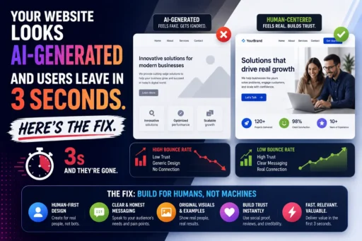
Mobile UX design best practices are no longer a “nice to have” appendix to your web strategy – they are the strategy. More than 70% of global web traffic now originates from mobile devices, and with over 6.5 billion smartphone users worldwide in 2026, the mobile experience your brand delivers is the experience most of your audience will ever see. Not the desktop version. Not the tablet version. The phone.
And here is what the data shows about that experience for most brands: it is failing.
The average mobile bounce rate is 67.4% – more than double the desktop average of 32%. Users form their opinion of your website in 50 milliseconds. A 1-second to 10-second increase in mobile page load time increases bounce probability by 123%. And 88% of internet users say they will not return after a poor experience.
At Search Savvy, we run mobile UX audits as part of every technical SEO and conversion rate review – and the patterns we see are consistent: brands that look polished on a MacBook look broken on a Redmi. Navigation designed for a cursor is impossible to use with a thumb. Forms that take 30 seconds to fill on desktop take 4 minutes on mobile and get abandoned. And the entire time, the clock is running.
This post covers every mobile UX design best practice that matters in 2026 – and the specific mistakes that are silently costing your brand conversions, trust, and rankings right now.
Why Is Mobile UX Design More Important Than Ever in 2026?
Mobile UX design best practices have escalated from an accessibility concern to a core revenue driver – and the companies that understand this are measurably outperforming those that don’t. According to McKinsey’s Design Index, companies that prioritise design – including mobile UX – achieve 32 percentage points higher revenue growth and 56 percentage points higher total shareholder returns than industry peers. The UI/UX design market is on track to grow into an $11.66 billion industry by 2031, with a 32% CAGR from 2026.
The reason is straightforward: mobile UX is now where purchasing decisions are made, trust is established, and brand impressions are formed – permanently.
Consider these 2026 reality checks:
- 70% of mobile pages take more than 5 seconds to show above-the-fold content
- 52% of US consumers sometimes or always walk away from purchases due to bad user experience
- 73.1% of web designers believe non-responsive design is the top reason visitors leave a website
- 86% of consumers will leave a brand they trusted after just two poor customer experiences
- Websites that load in 1 second convert 3x better than those that take 5 seconds
The compounding effect is what makes poor mobile UX so dangerous: a user who bounces from a bad mobile experience not only doesn’t convert – they are statistically unlikely to return and more likely to choose a competitor who made the experience effortless.
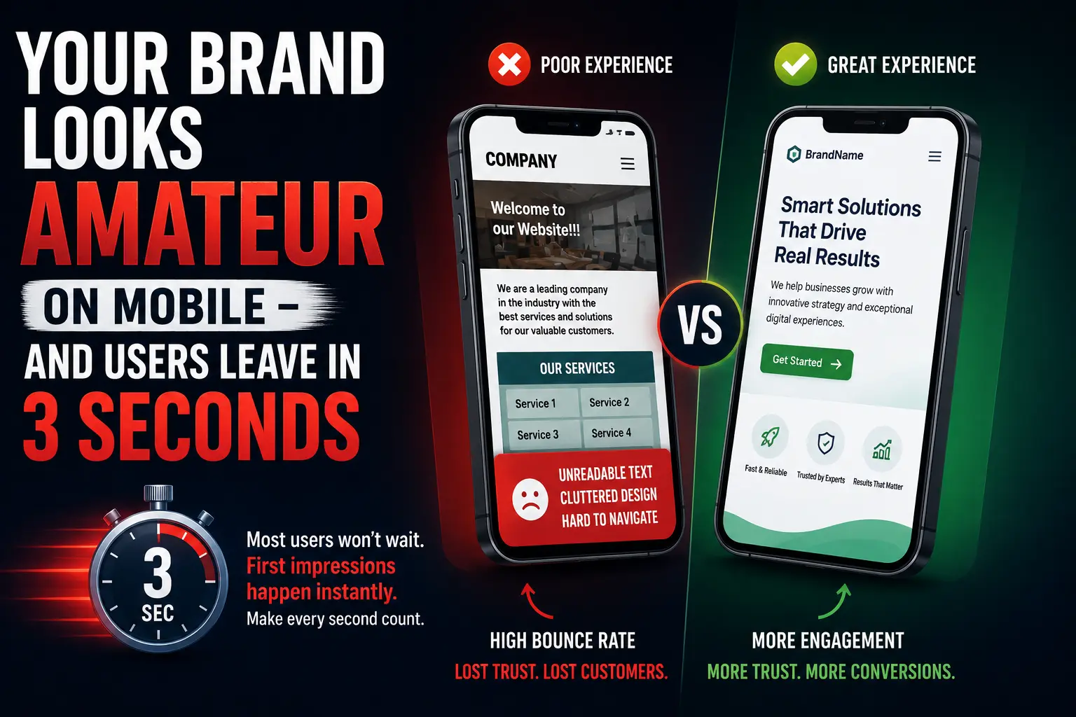
What Does a “Poor Mobile UX” Actually Look Like in 2026?
Mobile UX design best practices are often described in terms of what to do. But the fastest way to understand why they matter is to recognise the specific patterns that signal an amateur brand experience to a user on a phone.
The patterns that kill mobile credibility immediately:
- Text that requires pinching and zooming – a viewport meta tag misconfiguration that was common in 2014 but still appears in 2026
- Tap targets smaller than 44×44 pixels – buttons too small to hit accurately with a thumb, causing accidental misfires and user frustration
- Navigation designed for a cursor – dropdown menus, hover states, and multi-level navigation that requires precise pointer interaction
- Forms with no mobile keyboard optimization – a phone number field that opens an alphabetic keyboard, or an email field that doesn’t trigger autocomplete
- Content that loads but doesn’t render correctly – images that overflow the viewport, tables that require horizontal scrolling, or overlapping text caused by fixed-width elements
- Intrusive interstitials – full-screen pop-ups that appear immediately on a mobile visit and cannot be dismissed easily
The less obvious patterns that silently destroy trust:
- Inconsistent visual identity between desktop and mobile – a brand that looks premium on desktop but generic on mobile signals that the mobile experience was an afterthought
- CTAs that are below the fold on every mobile device – a visitor should not have to scroll through six paragraphs before encountering any invitation to take action
- No visual feedback on taps – buttons that don’t respond visually when tapped create uncertainty (“did it register?”) that leads to duplicate taps, errors, and frustration
Each of these patterns increases the probability that a user leaves without taking action. And every exit – every bounce – contributes to the engagement signal that Google’s ranking systems interpret as low quality.
How Do Mobile UX Design Best Practices Directly Affect SEO Rankings?
Mobile UX design best practices and SEO are not parallel disciplines in 2026 – they are the same discipline viewed from different angles. Google uses real user behaviour signals – measured via Core Web Vitals and field data – to evaluate page quality, and poor mobile UX produces exactly the negative signals that suppress rankings.
The connections are direct:
LCP (Largest Contentful Paint): Mobile pages that take more than 2.5 seconds to show their main content fail the LCP threshold. Failing LCP means a worse Page Experience signal. A worse Page Experience signal is a direct ranking disadvantage when competing against pages of comparable content quality.
INP (Interaction to Next Paint): INP measures how quickly a page responds to user interactions. Slow, laggy mobile interactions – caused by excessive JavaScript, unoptimised animations, or render-blocking resources – produce high INP scores that fail Google’s 200ms threshold.
CLS (Cumulative Layout Shift): Pages where content shifts as it loads – images that push text down, ads that load late and displace content – create layout instability that scores poorly for CLS and creates exactly the kind of user frustration that generates bounces.
Mobile bounce rate as a ranking signal: High mobile bounce rates, particularly short sessions where users return to search results immediately after landing, signal to Google’s systems that your page did not satisfy the query. This pattern – pogo-sticking – is a strong negative quality signal that core updates specifically target.
Search Savvy’s technical SEO framework treats mobile UX as a ranking factor from the initial site audit. The brands that consistently hold top rankings in competitive categories are almost universally the ones with excellent mobile performance – not the ones with the most backlinks but a 78% mobile bounce rate.
What Are the Most Important Mobile UX Design Best Practices in 2026?
1. Speed Is the First UX Decision, Not the Last
Mobile UX design best practices begin with load speed – because users never experience any other element of your design if the page doesn’t load fast enough to keep them. The standard is unambiguous: websites that load in 1 second convert 3x better than those that load in 5 seconds. Bounce risk jumps 123% when load time increases from 1 second to 10 seconds.
The practical steps:
- Serve images in WebP or AVIF format – these next-gen formats reduce image file size by 25–35% compared to JPEG or PNG without visible quality loss
- Implement lazy loading for images below the fold – the browser loads only what is visible on screen initially
- Eliminate render-blocking scripts – JavaScript and CSS that prevent the browser from rendering above-the-fold content must be deferred or inlined
- Target TTFB under 200ms – use edge deployment (Cloudflare, Vercel) to serve content from servers geographically close to your users
- Score your mobile performance monthly via Google PageSpeed Insights – it shows your Core Web Vitals scores for real mobile field data, not just lab conditions
2. Design for the Thumb, Not the Mouse
Mobile UX design best practices exist in a specific physical reality: most users hold their phone in one hand and navigate with their thumb. The thumb zone – the area of the screen reachable without repositioning the hand – is the lower-middle portion of the screen. The areas hardest to reach comfortably are the top corners.
What this means in practice:
- Primary navigation (hamburger menu, bottom nav bar) should live at the bottom of the screen – reachable in the thumb zone – not in a top corner
- Primary CTAs should be within thumb reach, not buried in the footer or pinned to the top bar
- Tap targets must be at least 44×44 pixels – Google’s recommended minimum – with adequate spacing between them to prevent accidental taps
- Avoid placing destructive actions (delete, cancel, logout) in close proximity to confirmatory actions – a misfire in a high-stakes interaction destroys trust immediately
3. Simplify Navigation to the Essentials
Mobile UX design best practices require ruthlessly simplifying navigation for small screens. Desktop navigation often has five to eight top-level items with hover-triggered dropdowns. On mobile, this creates an unusable, frustrating experience.
Better navigation reduces bounce by 10–15% and increases task success by up to 40% – making it one of the highest-ROI mobile UX improvements available.
Mobile navigation principles:
- Maximum five top-level items in your mobile navigation – users scan navigation labels, not read them, and more than five creates scanning fatigue
- No hover states or multi-level dropdowns – everything must be tap-accessible with a single gesture
- A visible, always-accessible search function – for sites with significant content depth (e-commerce, media, SaaS help centres), search is often the fastest path to what a user needs
- Sticky header with key CTA – a fixed header that remains visible as users scroll, containing your brand identity and one primary action button
- Bottom navigation bar for high-priority destinations – Instagram, Amazon, and Google Maps all use bottom navigation because it maps directly to the thumb zone
4. Optimise Every Form for Mobile Completion
Mobile UX design best practices around forms are where the biggest conversion gaps live. Form abandonment on mobile is significantly higher than desktop – because most forms are designed on a desktop and deployed unchanged on mobile.
The specific friction points that cause mobile form abandonment:
- No keyboard type optimisation – use type=”email” for email fields, type=”tel” for phone numbers, type=”number” for numeric inputs – this triggers the appropriate keyboard on iOS and Android
- No autocomplete attributes – add autocomplete attributes to allow browsers to pre-fill known information (name, email, address) – eliminating typing friction entirely
- Labels that disappear when you tap the field – placeholder text used as a label disappears when users begin typing, leaving them unable to remember what the field was for
- Multi-page forms without progress indicators – users on mobile who cannot see how many steps remain in a form have significantly higher drop-off rates
- No inline validation – errors discovered only on form submission force the user to scroll back and re-locate the problem, dramatically increasing abandonment
The mobile form minimum standard in 2026: Single-column layout, large tap targets for all fields, appropriate keyboard types, visible labels (not just placeholders), and inline validation that confirms correct inputs in real time.
5. Eliminate Intrusive Interstitials
Mobile UX design best practices explicitly prohibit interstitials that block the main content. Google has penalised intrusive interstitial use as a ranking factor since 2017 – and the 2026 standard is stricter.
Interstitials that trigger immediately on page load, cover the main content, and are difficult to dismiss are among the most damaging mobile UX decisions a brand can make. They signal desperation to users and create friction at the precise moment when first-impression trust is being formed.
Acceptable interstitial implementations in 2026:
- Cookie consent banners (required by regulation) – should use a small banner at the bottom, not a full-screen overlay
- Age verification for regulated products
- Exit-intent pop-ups triggered only when a user attempts to navigate away (not on arrival)
- Login prompts for genuinely paywalled content – with a clear, accessible option to dismiss and view freely available content
6. Make Loading States and Feedback Visible
Mobile UX design best practices acknowledge a fundamental human anxiety: uncertainty. When a user taps a button and nothing visibly happens, the first assumption is that it didn’t work. The second tap is often a duplicate. The third tap is a frustrated exit.
Every interactive element must provide immediate visual feedback:
- Buttons should visually respond within 100ms of a tap – a colour change, slight depression effect, or haptic feedback via the device
- Loading states must be visible – a spinner, progress bar, or skeleton screen communicates that the system is working, preventing abandonment during processing
- Form submission confirmations must be explicit and immediate – a visible “success” state prevents users from re-submitting the form
- Error messages must be specific and actionable – “check your entry” is not an error message; “your email address needs an @ symbol” is
What Is the Business Case for Investing in Mobile UX Design?
Mobile UX design best practices have a quantified ROI that most businesses underestimate because the cost of poor UX appears as “lost conversions” rather than a direct expense.
The numbers:
- A well-designed UI can increase conversion rates by up to 200%; better overall UX design can achieve conversion rate improvements of up to 400%
- Strategic UX optimisation has reversed traffic loss for top businesses, with bounce rates dropping as much as 78%
- Companies with high design maturity scores achieve 32 percentage points higher revenue growth (McKinsey Design Index)
- 60% of users prefer a simple website over a complex one; 84.6% prefer a clean, organised layout over a cluttered design
- Personalised CTAs convert 42% more users than generic, one-size-fits-all alternatives
The return on mobile UX investment is not theoretical. It shows up in reduced bounce rates, higher session duration, lower cost-per-acquisition, and improved Core Web Vitals – which feed directly into ranking improvements that compound over time.
FAQ: Mobile UX Design Best Practices in 2026
Q1: What is the average mobile bounce rate in 2026? The average mobile bounce rate is 67.4% – more than double the average desktop bounce rate of 32%. This gap reflects the higher friction users experience on poorly optimised mobile sites. Key drivers include slow load times, non-responsive design, small tap targets, and intrusive interstitials. A well-optimised mobile experience can reduce bounce rates by as much as 78% through friction removal across navigation, performance, and interactive elements.
Q2: How quickly do users decide to leave a mobile website? Users form their opinion of a website in just 50 milliseconds – 0.05 seconds. The decision to stay or leave is made almost instantly, driven primarily by visual design and perceived load speed. Additionally, if a mobile page takes more than 3 seconds to load, 53% of users will abandon it. Every second of additional load time after that increases the bounce probability further, reaching a 123% higher bounce risk when load time rises from 1 to 10 seconds.
Q3: What is the minimum tap target size for mobile UX? Google recommends a minimum tap target size of 44×44 pixels for all interactive elements on mobile. Tap targets smaller than this create a high rate of accidental misfires – especially for users with larger fingers or those using a phone one-handed. Adequate spacing between tap targets (minimum 8 pixels) is equally important to prevent adjacent elements from triggering unintended interactions.
Q4: Does mobile UX design affect Google search rankings? Yes – directly. Google uses mobile Core Web Vitals (LCP, INP, CLS) as confirmed ranking signals through its Page Experience framework. Poor mobile UX produces high bounce rates and low session engagement, which are negative quality signals that Google’s systems detect and factor into ranking evaluations. Sites with excellent mobile UX consistently rank better than content-equivalent sites with poor mobile performance, particularly since Google’s mobile-first indexing became the universal standard.
Q5: What is the most impactful single mobile UX improvement for conversions? Page speed is consistently the highest-impact single improvement. Websites that load in 1 second convert 3x better than those that load in 5 seconds. For most sites with poor Core Web Vitals, image optimisation (converting to WebP format and implementing lazy loading) is the fastest path to meaningful load speed improvement – often reducing page weight by 30–50% without requiring code changes. After speed, navigation simplification and thumb-zone CTA placement have the strongest direct conversion impact.
Q6: How does mobile UX connect to E-E-A-T and AI Overview eligibility? Mobile UX signals contribute to Google’s overall page quality assessment, which underpins E-E-A-T evaluation. A site that delivers a poor mobile experience – high bounce rates, slow loading, broken layouts – signals low care and quality to both users and Google’s systems. Given that 96% of AI Overview citations come from sources with verified E-E-A-T signals, and that page experience is part of that quality evaluation, poor mobile UX creates a ceiling on AI citation eligibility regardless of content quality.
The Bottom Line
Mobile UX design best practices in 2026 are not a design discipline separate from your marketing, SEO, and conversion strategy. They are all the same discipline – because users experience your brand as a single thing, and Google measures that experience holistically.
A brand that invests in SEO but ignores mobile UX is building on a foundation that leaks. Every hour spent on keyword research, every rupee spent on paid campaigns, every backlink earned – all of it is diminished by a mobile experience that loses 67% of users before they have a chance to convert.
The fix is not a redesign. It is a prioritised sequence of friction-removal decisions: speed first, navigation second, tap targets third, forms fourth, interstitials fifth. Each improvement is measurable, each has quantified ROI, and none requires starting from scratch.
At Search Savvy, the mobile UX audit is the first step in every performance review – because it is the layer where the most significant, most fixable conversion gaps almost always live. If you want to know exactly what your mobile experience is costing you in conversions and rankings, get in touch with Search Savvy.