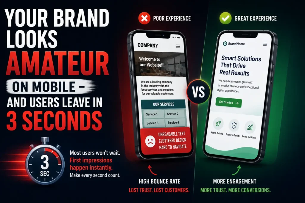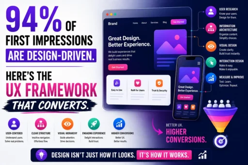
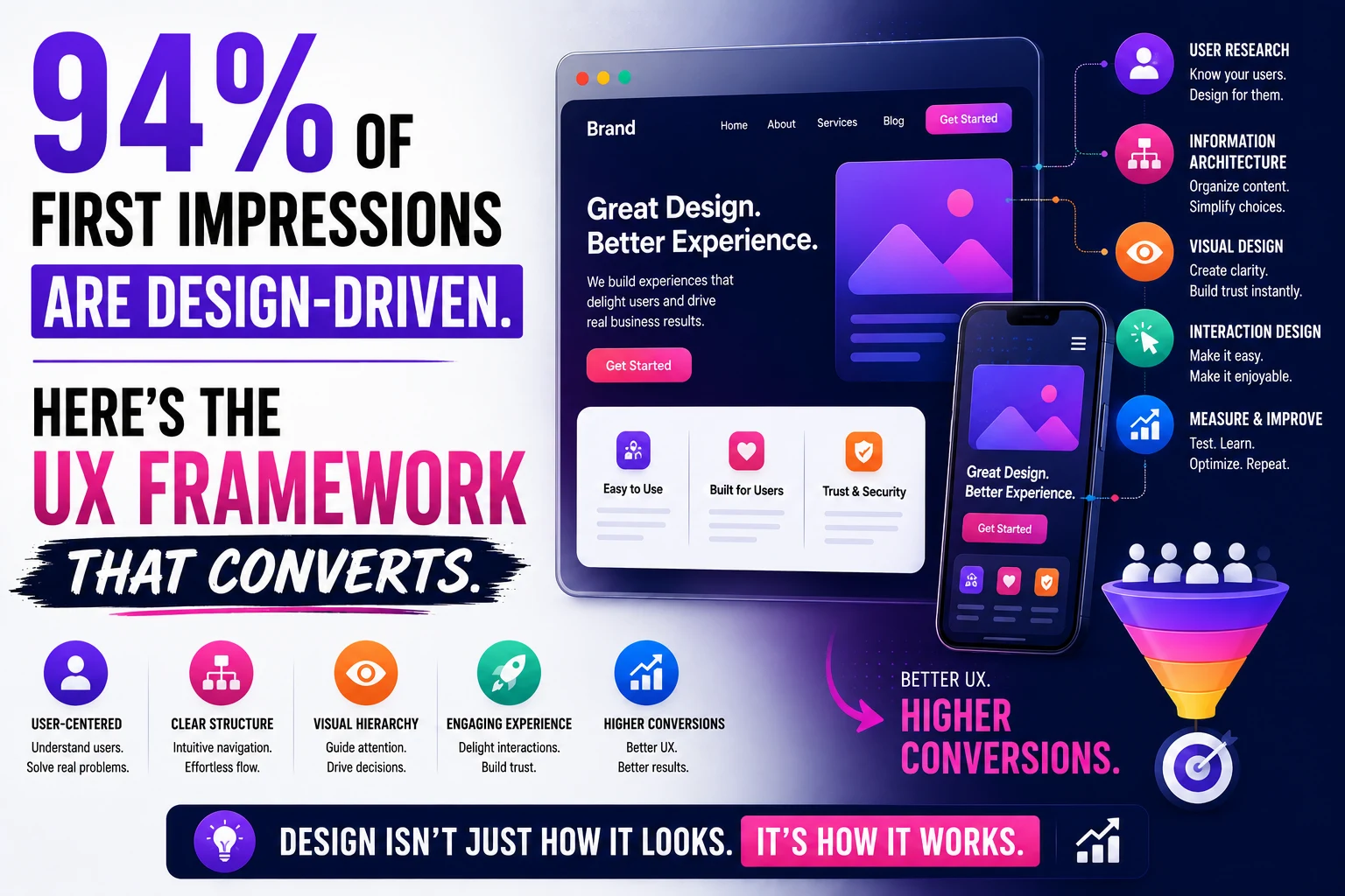
Your website visitor made their decision in 50 milliseconds.
Not a few seconds. Fifty milliseconds. Before they read a word of your copy. Before they processed your value proposition. Before they noticed your CTA button. In the time it takes to blink, a user has already formed an opinion about whether your website is credible, professional, and worth their continued attention.
And 94% of that judgment was based entirely on design.
This is not a soft creative argument. It is documented research from BCS and Northumbria University – the same finding replicated across multiple 2026 studies. Users take 3.5 seconds to form a full opinion about a website, and visual and structural decisions drive that judgment, not content. 75% of users judge a company’s credibility based on its website design alone – before reading a single word about the actual product or service.
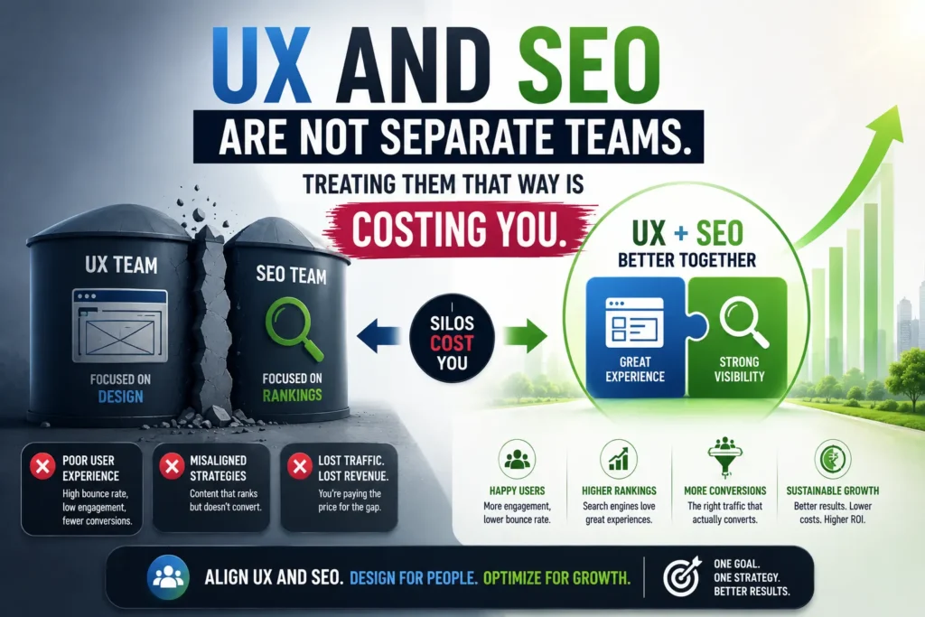
At Search Savvy, we run conversion audits alongside SEO and performance work – and the pattern is consistent. Businesses that invest in content and traffic without addressing their conversion-focused UX design are filling a leaking bucket. They acquire the visitor. The visitor looks, decides in under four seconds, and leaves. The budget that bought that click produced nothing.
This article presents the UX framework that converts in 2026 – built on the data, the psychology, and the specific design decisions that move users from arrival to action.
Why Is Conversion-Focused UX Design So Important in 2026?
Conversion-focused UX design has never carried a higher financial return than it does today – and the business case is supported by numbers that most design conversations understate significantly.
Every $1 invested in UX returns up to $100 – a potential 9,900% ROI according to Forrester Research. Well-designed UX can increase conversions by up to 400%, transforming landing pages into revenue machines. Cutting a website’s load time from 8 seconds to 2 seconds produces a 74% increase in conversions. Websites that load in 1 second convert 3x better than those that take 5 seconds.
The inverse of these numbers is equally striking. 88% of users will not return to a website after a bad UX experience. 70% of online businesses fail because of usability issues. Poor UX costs businesses an estimated $1.4 trillion annually globally. 38% of web visitors leave because of poor design and content – before the content has any chance to persuade.
The business case for conversion-focused UX design is not a design team argument. It is a revenue argument. Top-quartile design companies achieved 32% higher revenue growth and 56% higher total returns to shareholders over five years compared to industry peers, according to McKinsey. Companies that systematically invest in UX improvement see a 42% increase in customer retention, a 33% boost in customer satisfaction, and a 32% rise in cross-selling and upselling opportunities.
The competitive landscape makes this urgent. Only 55% of companies currently conduct UX testing, and just 14% have optimised UX maturity. That gap between UX leaders and laggards is one of the most significant and underexploited competitive opportunities in digital marketing in 2026.
People Also Ask: How much can good UX design improve conversion rates? Short Answer: Well-designed UX can increase conversions by up to 400%, according to multiple 2026 studies. Every $1 invested in UX returns up to $100 (Forrester Research). Cutting load time from 8 seconds to 2 seconds produces a 74% conversion lift. A single checkout button change – from “Register” to “Continue” – generated approximately $300 million in additional annual revenue for a major retailer by removing friction for first-time buyers. Small, precise UX changes produce outsized results.
How Does Conversion-Focused UX Design Actually Work?
Conversion-focused UX design works by systematically removing the friction between a user’s arrival and the action your business needs them to take – while simultaneously strengthening the trust signals that make that action feel safe and appropriate.
The framework rests on four sequential pillars:
- Trust – Does the user believe this website is credible and safe?
- Clarity – Does the user immediately understand what this website offers and for whom?
- Motivation – Does the user see compelling reasons to take the next step?
- Friction removal – Is the path from interest to action as effortless as possible?
Most UX design approaches treat these as parallel concerns. Conversion-focused UX design treats them as sequential ones – because a visitor who does not trust you will not stay long enough for your clarity to matter. And a visitor who is motivated but hits friction will abandon rather than persist.
The sequence mirrors the user’s psychological journey. Trust is evaluated in milliseconds through visual signals. Clarity emerges in the first 3–5 seconds through layout and hierarchy. Motivation is built across the session through content and social proof. Friction is encountered at the conversion moment – and friction kills conversions that everything else has earned.
People Also Ask: What is the difference between UX design and conversion-focused UX design? Short Answer: Standard UX design focuses on usability – making a product easy and pleasant to use. Conversion-focused UX design takes usability as a prerequisite and adds an explicit commercial objective: guiding users toward specific conversion actions (purchases, enquiries, signups) through intentional design decisions that build trust, create clarity, increase motivation, and remove friction at the critical moment. In 2026, conversion-focused UX design is the standard for any website where commercial performance is the primary metric.
What Are the Most Impactful Elements of a Conversion-Focused UX Framework?
Conversion-focused UX design in 2026 has a well-documented set of high-impact elements – and the data on which improvements produce the largest conversion lifts is more precise than it has ever been.
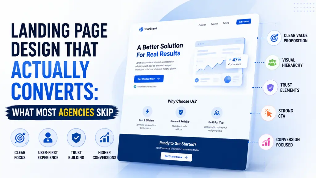
First Impressions: Above the Fold in 50 Milliseconds
Conversion-focused UX design starts where the user starts: the visible viewport on arrival, before any scrolling.
Users take just 50 milliseconds to form an opinion about your site, making first impressions crucial for converting organic traffic into leads. 94% of feedback focuses on design – only 6% on content – meaning your layout, colour palette, whitespace, and visual hierarchy are being judged before a single word registers.
The above-the-fold viewport must deliver four things simultaneously:
- Brand credibility signals – Logo quality, visual consistency, professional typography. 75% of users judge a company’s credibility based on its website design – poor design erodes trust before content is even consumed.
- Value proposition clarity – A single H1 headline that answers “what do you do, for whom, and what outcome do they get?” – in 8–12 words. Vague headlines like “Elevating Your Digital Potential” are trust-neutral at best.
- Visual hierarchy – A clear reading path that guides the eye from headline to supporting statement to CTA. 79% of users scan web pages rather than reading word-by-word, following F-shaped or Z-shaped patterns – content hierarchy and visual design are what determine whether the CTA is seen.
- Primary CTA – One dominant action button, visually prominent, with specific action language (“Get My Free Audit”) rather than generic placeholders (“Learn More” or “Click Here”).
Navigation: Clarity Over Comprehensiveness
Conversion-focused UX design treats navigation as a conversion tool, not a site map.
For 38% of consumers, layout and navigational structure are the first things they assess on a website. Complex navigation menus with 10+ top-level items, dropdown megamenus, and competing pathways create decision paralysis. The easiest response to too many choices is to make no choice – and leave.
A conversion-optimised navigation follows three rules: every item has a defined business purpose, the primary conversion path is visually distinguished from the rest, and the mobile navigation (which serves the majority of your traffic) is at least as carefully designed as the desktop version. The mobile-to-desktop conversion rate gap – mobile converts at 50% the rate of desktop despite carrying 60%+ of traffic – is primarily a navigation and form friction problem, not a content problem.
Page Speed: The UX Element That Algorithms Evaluate
Conversion-focused UX design cannot separate performance from experience – because users experience load time as design quality.
53% of visitors abandon a site if a page takes more than 3 seconds to load. Slow image loading causes 39% of users to lose interest and move on. A one-second delay can kill conversions – speed is not just a technical matter, it is part of brand perception.
The psychological mechanism is direct: a slow page feels untrustworthy. Users associate loading delay with poor product quality, outdated technology, and unreliable service. The site has not yet shown them anything about the business – but the delay has already communicated that this business is not digitally sophisticated.
In 2026, Core Web Vitals (LCP under 2.5 seconds, INP under 200ms, CLS under 0.1) are both ranking signals and conversion signals. Optimising for Google’s performance thresholds produces a dual return: better search positions and better visitor-to-conversion rates.
Social Proof: Converting Scepticism to Trust
Conversion-focused UX design uses social proof to bridge the trust gap – the psychological distance between a visitor’s initial scepticism and the confidence required to take a commercial action.
Social proof works through several mechanisms in 2026:
Customer testimonials – The most effective format is specific: a named customer, a real photograph, a measurable outcome (“increased qualified leads by 65% in 90 days”), and a company name or role that confirms the reviewer’s relevance to the potential buyer’s context. Generic unattributed quotes (“Great service!” – Anonymous) have negligible trust impact.
Review scores – Third-party verified review counts and ratings (Google Reviews, Trustpilot, G2) carry more trust weight than self-authored testimonials because they cannot be self-selected. A prominently placed “4.8 / 5 – 847 verified reviews” badge near a CTA directly reduces the trust friction that prevents conversion.
Client logos – Recognisable brand logos near the above-the-fold CTA transfer credibility by association. The implicit message: “if this calibre of company trusts them, the risk is lower.”
Usage statistics – “Trusted by 2,000+ Indian businesses” or “₹45 crore in client revenue generated” provides social proof at a scale that individual testimonials cannot convey.
Forms: Where Most Conversions Die
Conversion-focused UX design reveals its most quantifiable returns in form design – because this is where the entire preceding user journey either succeeds or fails.
Unexpected costs and forced registration cause nearly half of all cart and form abandonments. The single most impactful form design change – removing the “Register” requirement and replacing it with “Continue as Guest” – produced approximately $300 million in additional annual revenue for a major retailer. That is the power of a single friction-removal decision.
Form design principles with the highest documented conversion impact:
- Reduce fields to the minimum viable set – Every additional field reduces completion rate by 5–10%. If you do not need the information immediately, do not request it on the first form. A phone number field reduces form completion rate by up to 5% in B2B contexts.
- Progressive disclosure – Break multi-step forms into logical stages. “Step 1 of 3” is psychologically easier to begin than a long single-page form. Progress indicators increase completion rates by 28%.
- Inline validation – Show errors as they occur, not after submission. “This email format isn’t valid” appearing next to the email field in real time prevents the demoralising experience of submitting a form and receiving a global error message.
- CTA button text specificity – “Get My Free SEO Audit” converts at a higher rate than “Submit” for the same form – because specificity reduces anxiety about what happens next.
- Trust signals adjacent to the CTA – A padlock icon, “No spam. Unsubscribe any time.” or “Your data is protected” placed immediately beneath the submit button directly addresses the privacy anxiety that prevents form completion.
People Also Ask: What is the most important element of conversion-focused UX design? Short Answer: Research consistently points to trust as the foundational element – because no other UX element functions without it. 75% of users judge a company’s credibility by website design before engaging with content. After trust, clarity (an immediately understood value proposition above the fold) and friction removal (particularly in forms and CTAs) produce the largest measurable conversion lifts. The 94% design-driven first impression means trust signals must be communicated visually before the user has read anything.
How Do You Apply This Framework to a Real Website?
Conversion-focused UX design becomes actionable through a structured audit process – not a complete redesign, but a systematic review of each conversion-critical element.
Here is the conversion UX audit process used in 2026’s highest-performing digital teams:
Phase 1 – Diagnostic measurement (Week 1)
Use Google Analytics 4 to identify your current conversion rate by page and traffic source. Install Microsoft Clarity or Hotjar for heatmaps, click maps, and session recordings on your five highest-traffic pages. Run your key landing pages through Google PageSpeed Insights for Core Web Vitals baseline scores. Document your above-the-fold viewport on both mobile and desktop with a screenshot.
Testing with just 5 users can uncover 85% of usability problems – making research far more accessible than most teams assume. A single afternoon of user testing sessions with five customers produces more actionable insight than weeks of analytics review.
Phase 2 – Above-the-fold audit (Week 2)
Score your most important landing page against the four above-the-fold requirements: credibility signals, value proposition clarity, visual hierarchy, and primary CTA presence. Identify the single highest-impact change – usually the H1 rewrite or CTA consolidation – and implement it. Test one change at a time to measure its isolated impact.
Phase 3 – Form and conversion path audit (Week 3)
Map every form on your site. Count the fields. Identify which are mandatory versus optional. Review the CTA button text and adjacent trust signals. Prioritise removing or making optional the highest-friction fields on your primary lead generation or checkout form.
Phase 4 – Social proof audit (Week 4)
Inventory every piece of social proof currently on your site. Score each on specificity (named > anonymous), verifiability (third-party platform > self-authored), and proximity to conversion (near CTA > buried in footer). Move your most specific, most credible social proof closest to your primary CTA. Test the impact over 30 days.
According to Search Savvy’s insights from running conversion audits alongside technical SEO reviews, the most common finding across Indian business websites is that social proof either does not exist on the page or is positioned so far below the fold that it is never seen by the majority of visitors. Repositioning existing testimonials and review scores above the fold – without adding any new content – consistently produces measurable conversion rate improvements within the first analytics cycle.
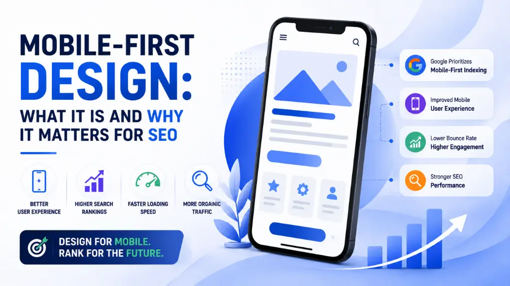
Why Does Mobile UX Demand a Separate Conversion-Focused Design Approach?
Conversion-focused UX design for mobile is not a smaller version of desktop design – it is a fundamentally different behavioural context that requires different design decisions.
Over 60% of all web traffic comes from mobile devices. Mobile conversion rates lag desktop by 50%, despite mobile traffic now exceeding desktop in most markets. 90% of smartphone users continue shopping if their mobile experience is smooth. 74% of visitors are more likely to return to a site with good mobile UX.
The mobile conversion gap exists because most websites are designed on desktop and adapted to mobile – not designed for mobile first. The specific mobile UX failures that create the conversion gap:
- Tap targets too small – Buttons and links under 44×44 pixels cause accidental misclicks and frustrated user exits. This is both a UX failure and a Google Search Console mobile usability error.
- Form fields not optimised for mobile keyboards – A phone number field that does not trigger the numeric keypad, or an email field without the @ character shortcut, creates unnecessary friction.
- CTAs below the fold on mobile – A CTA that is visible above the fold on desktop may require three scrolls to reach on mobile. Mobile above-the-fold should be explicitly designed and tested separately.
- Checkout not adapted for mobile payment norms – In India, UPI QR code display, UPI autopay, and mobile wallet payment options are the default expectation. A checkout that requires card number entry creates unnecessary friction for the majority of Indian mobile users.
At Search Savvy, we review mobile and desktop conversion experiences separately – because the user behaviour, friction points, and trust signal requirements differ enough that a single unified UX audit misses the most impactful mobile-specific improvements.
People Also Ask: Why do mobile websites convert less than desktop websites? Short Answer: Mobile conversion rates lag desktop by 50% despite carrying 60%+ of traffic. The primary causes are: tap targets too small for accurate interaction, form fields not optimised for mobile keyboards, CTAs below the fold on mobile viewports, checkout not adapted for mobile payment preferences, and slow mobile load times that exceed the 3-second patience threshold. These are all UX design failures, not fundamental mobile limitations – addressing them systematically closes the majority of the conversion gap.
FAQ: Conversion-Focused UX Design – Your Questions Answered
Q1: How long does it take to see results from conversion-focused UX changes? Quick structural wins – repositioning social proof near CTAs, rewriting H1 headlines, consolidating CTA options – can show measurable conversion rate changes within 14–30 days when traffic volume is sufficient for statistical significance. Form friction reductions (field removal, button text changes) typically show impact within the same analytics period. More substantial changes – redesigned above-the-fold layouts, navigation restructuring – require 4–8 weeks of data before drawing conclusions. Use A/B testing tools to isolate individual change impact before proceeding to the next improvement.
Q2: What tools do I need to audit my website’s UX for conversions? The essential audit stack costs nothing to start. Google Analytics 4 provides conversion rate by page and traffic source. Microsoft Clarity provides heatmaps and session recordings for free with no user cap. Google PageSpeed Insights benchmarks Core Web Vitals performance. Google Search Console surfaces mobile usability errors. For A/B testing, Google Optimize’s successor tools or VWO provide the testing infrastructure to measure change impact. Five user testing sessions – with real customers watching and thinking aloud – surface the usability failures that analytics data cannot reveal.
Q3: Is conversion-focused UX design different for Indian websites? Yes, in several meaningful ways. Indian mobile users represent a higher proportion of traffic than in Western markets – making mobile-first UX a higher priority. Payment preferences are distinct: UPI, mobile wallets, and EMI options are standard expectations for Indian e-commerce checkout, and checkout UX that does not accommodate these creates disproportionate abandonment. Trust signals carry additional weight in markets where online scam awareness is high – government registration numbers, GST certificates, and named team members with LinkedIn profiles contribute to the credibility signals that convert Indian users. Brand consistency also matters significantly: 32% of customers abandon brands after inconsistent experiences, and this figure is reflected in Indian consumer behaviour data.
Q4: Do I need to redesign my entire website to improve UX conversions? Rarely. The highest-impact conversion improvements are almost always targeted changes to specific elements rather than full redesigns. In order of typical impact: H1 headline rewrite (highest), CTA consolidation and text improvement, social proof repositioning near the CTA, form field reduction, mobile tap target improvement, and page speed optimisation. A full redesign carries the risk of resetting accumulated SEO equity, losing familiarity for existing customers, and introducing new usability problems. Start with targeted improvements measured in isolation before considering whether a broader redesign is warranted.
Q5: How does accessibility affect conversion-focused UX design? Significantly – and in 2026, accessibility is both an ethical and commercial requirement. 95.9% of the top 1,000,000 home pages contain detectable WCAG accessibility errors as of February 2026. Accessibility-first design is required in 40%+ of client briefs, driven by regulation and user demand. Beyond compliance, accessible design is better UX for everyone: sufficient colour contrast improves readability for all users in bright outdoor mobile conditions, not just users with visual impairments. Clear focus states and logical tab order improve keyboard navigation for power users. Descriptive alt text supports screen readers and improves image SEO. Accessibility improvements consistently produce conversion rate improvements as a side effect of removing the friction that poor accessibility creates.
Q6: What is the biggest conversion-focused UX mistake Indian websites make in 2026? The most consistent and impactful mistake is treating desktop and mobile as the same user experience with different screen sizes. Mobile users in India represent the majority of traffic for most commercial websites – and they navigate differently, interact differently, pay differently, and have lower patience thresholds for loading delays than desktop users. Designing for desktop first (or exclusively) and adapting to mobile results in CTAs below the mobile fold, forms not optimised for mobile keyboards, payment flows that do not prioritise UPI and mobile wallets, and load times that exceed mobile thresholds. The conversion gap this creates is the single largest unrealised revenue opportunity in most Indian business websites – and it is entirely addressable without a full redesign.
Is your website’s design losing visitors in the first 50 milliseconds – before they ever read your value proposition? Visit Search Savvy for a conversion UX audit that identifies exactly where your design is costing you customers, and a prioritised action plan to fix it.