

In January 2026, a Miami-based sneaker store’s Shopify site slipped from page one to page three in Google rankings – not because of a Google penalty, not because of lost backlinks, and not because a competitor published better content. The culprit was a Largest Contentful Paint score of 5.8 seconds on mobile: a number that was quietly undermining their rankings every single day until someone ran a PageSpeed Insights test on their phone rather than their laptop.
After fixing LCP from 5.8 seconds to 1.9 seconds, their rankings recovered within weeks.
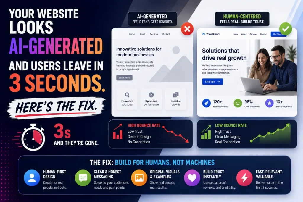
This is mobile-first design in practice – and it illustrates exactly why the gap between understanding and implementing it has real, measurable commercial consequences in 2026.
Mobile-first design is not a visual trend or a UX philosophy. It is a structural design approach – and in Google’s current ranking system, it is the architecture that determines your rankings for every user on every device, not just the ones visiting from their phones. Since Google adopted mobile-first indexing as its primary crawling and ranking mechanism, your mobile site is your only site from Google’s perspective. The desktop version is secondary. If your mobile experience is incomplete, slow, or structurally broken, those are the signals Google uses to rank you – regardless of how polished your desktop site is.
At Search Savvy, mobile-first design is part of every technical SEO audit we run – because the gap between a site’s desktop quality and its mobile quality is consistently the most underestimated ranking drag we find. This article explains exactly what mobile-first design means, how it connects to SEO rankings, and what to do about it.
What Is Mobile-First Design in 2026?
Mobile-first design is a design philosophy and development approach where the mobile version of a website or application is created first, and the desktop version is expanded from it – rather than building a full desktop experience and then adapting it downward for smaller screens.
This matters because the two approaches produce fundamentally different outcomes. Desktop-down design typically results in a “lite” mobile version that strips away content, hides elements, and simplifies navigation to make a desktop-built interface work on a small screen. Mobile-first design produces the opposite: a complete, fully functional experience built for the smallest, most constrained screen first, then progressively enhanced for larger viewports where additional space and capability allow.
The distinction has become consequential for SEO because Google uses mobile-first indexing as its primary method for evaluating websites, meaning the mobile version of your site determines your ranking potential. While desktop experience still matters for users who visit from computers, search engines prioritize mobile signals when deciding rankings.
When Google determines how to rank your pages, it primarily evaluates the mobile version’s content, structured data, links, and technical quality. If your mobile site has less content than your desktop site – a common pattern where mobile versions strip out detailed copy for cleaner UX – Google only sees the stripped-down version. If your mobile site has slower Core Web Vitals, Google evaluates those slower scores for ranking purposes. If internal links exist on desktop but not on mobile navigation, Google may not discover linked pages through crawling.
People Also Ask: What is the difference between mobile-first design and responsive design? Short Answer: Mobile-first design is an approach where the mobile version is designed and built first, then scaled up to larger screens. Responsive design is a technical implementation using fluid grids and flexible media that automatically adapts a layout to different screen sizes. Google strongly prefers responsive web design because it uses a single URL and codebase for all devices – eliminating the canonical errors and crawl budget fragmentation that occur with separate m.dot subdomains. In 2026, the ideal implementation is both: a mobile-first design philosophy executed through responsive design architecture.
Why Does Mobile-First Design Matter for SEO in 2026?
Mobile devices now account for approximately 64% of global web traffic in 2026. Approximately 63% of all Google searches are now performed on mobile devices. This figure is even higher in certain demographics, with 84% of users aged 18-29 using mobile as their primary search device.
Mobile-first design matters for SEO because these numbers have a direct relationship with how Google assigns rankings – and the gap between where most websites are and where Google’s standards require them to be is wider than most businesses realise.
Only 39% of websites pass all three Core Web Vitals on mobile – compared to 54% on desktop. Google uses Core Web Vitals as ranking signals, meaning that the mobile performance gap is also a mobile search ranking gap. Websites that fail their mobile Core Web Vitals are at a competitive disadvantage in mobile search results, which disproportionately affects them given mobile’s 63%+ search query share.
The commercial stakes of mobile underperformance are quantifiable. A 1-second delay in mobile load time can cut conversions by 20%, while improving speed by just 0.1 seconds can boost conversions by 8.4%. 53% of mobile users will leave a site that takes more than 3 seconds to load.
And the ranking penalty for poor mobile performance is direct: real-world ranking scenarios exist where a site drops from position #2 to #15 overnight simply because a developer decided to “hide” comparison tables on mobile devices to save space. The algorithm is not forgiving about mobile content gaps – content hidden on mobile is, from Google’s perspective, content that does not exist.
People Also Ask: Does Google actually rank desktop and mobile sites differently? Short Answer: Google does not produce separate desktop and mobile rankings – but it evaluates every site’s rankings using the mobile version’s signals. Mobile Core Web Vitals scores (LCP, CLS, INP) are the scores used for ranking – not desktop scores. This means a site with excellent desktop performance but poor mobile performance is being ranked on its poor mobile performance, for all search results – not just mobile searches.
How Does Google’s Mobile-First Indexing Actually Work?
Mobile-first design is directly tied to how Google’s crawlers work – and understanding the mechanism clarifies why design decisions that seem purely visual have ranking consequences.
Mobile-first indexing means Google uses the mobile version of a website for crawling and indexing. When Googlebot crawls your website, it primarily looks at the mobile version. The content, structured data, internal links, and metadata on your mobile site determine how you rank in search results.
In 2026, Core Web Vitals are the gatekeepers of your search rankings. Google uses these metrics to measure your site’s actual speed. The latest update introduced Interaction to Next Paint as a core metric – this measures how quickly your site responds when a user taps buttons.
The three Core Web Vitals metrics and their 2026 thresholds:
| Metric | What It Measures | Good Threshold | Poor Threshold |
| LCP (Largest Contentful Paint) | Loading speed of main content | Under 2.5 seconds | Over 4 seconds |
| INP (Interaction to Next Paint) | Responsiveness to user input | Under 200ms | Over 500ms |
| CLS (Cumulative Layout Shift) | Visual stability during loading | Under 0.1 | Over 0.25 |
Mobile page speed is measured differently from desktop. Google’s Core Web Vitals data for mobile is collected from real users on real Android devices, often on 4G or slower connections. A page that loads in 1.2 seconds on desktop fiber may have an LCP of 3.8 seconds on a mid-tier Android phone on a typical 4G connection – which is a failing score.
This distinction is critical for Indian businesses specifically. In India, where the average mobile internet speed on 4G is approximately 25–35 Mbps (TRAI 2024 data) – significantly slower than the 100+ Mbps used in PageSpeed Insights simulations – real-world mobile LCP for many Indian websites is significantly worse than the tool scores suggest. Businesses serving customers in Tier 2 and Tier 3 cities where 4G speeds are lower should target LCP well under 2 seconds to ensure good performance on real Indian mobile networks.
People Also Ask: What are Core Web Vitals and why do they matter for mobile-first design? Short Answer: Core Web Vitals – Largest Contentful Paint (LCP), Interaction to Next Paint (INP), and Cumulative Layout Shift (CLS) – are official ranking factors. Sites rated as “good” on these metrics convert 24% better than those rated “poor”. They are measured from real Chrome user data on mobile devices, not lab simulations – meaning your PageSpeed Insights score may understate the actual problem your real mobile visitors experience on Indian 4G networks.
What Are the Most Common Mobile-First Design Failures That Hurt Rankings?
Mobile-first design fails in predictable, well-documented ways – and most of them are invisible in a standard desktop browser review, which is exactly why they persist.
Content Parity Failures
Mobile-first design’s most ranking-damaging failure is hidden content. A content parity audit ensures that every single piece of text, image, video, internal link, and schema markup present on the desktop version is exactly the same in the mobile HTML DOM.
Websites that serve different content on mobile versus desktop – either through a separate m.site.com subdomain or through JavaScript that shows/hides content based on screen size – may be inadvertently showing Google a less complete version of their content than they intend.
Common manifestations: content collapsed behind “Read More” buttons, comparison tables hidden to save space, FAQ sections excluded from the mobile layout, and schema markup applied only to desktop templates. Each of these tells Google that specific information simply does not exist on your site – because from its crawling perspective, if it is not visible on mobile, it is not there.
Intrusive Interstitials
Intrusive interstitials – popups or overlays that cover the main content and are difficult to dismiss – are explicitly penalised. Google announced in 2017 that it would demote pages with intrusive interstitials on mobile, and this policy remains enforced in 2026.
Full-screen newsletter popups, age verification gates, and large cookie consent banners that obscure content all qualify. The specific exceptions are legally required content and consent dialogs that use a reasonable portion of screen rather than covering the full viewport.
Slow Mobile Page Speed
Images are typically the largest contributor to LCP on mobile. The most impactful fixes for mobile LCP are consistently image-related: converting to WebP or AVIF format (which are 30–50% smaller than JPEG at equivalent visual quality), compressing hero images to under 100KB for mobile breakpoints, and adding a preload hint for the above-the-fold hero image so it loads before the browser discovers it during regular parsing.
Chat widgets, marketing pixels, A/B testing tools, and ad networks routinely add 500ms–2 seconds of main thread blocking on mobile. Third-party script auditing – identifying the worst offenders and deferring or removing them – is frequently the highest-ROI mobile speed improvement available, particularly for sites that have accumulated multiple analytics, marketing, and support tools over time.
Navigation and UX Failures
Mobile navigation requires a different approach than desktop. With limited screen real estate, users need to find what they are looking for with fewer taps. A well-structured hamburger menu with clear categories, a prominent search function for content-heavy sites, and sticky navigation that does not consume excessive vertical space are best practices.
The 2026 standards expect websites to provide fully functional, visually appealing experiences on screens as small as 320 pixels wide. Interactive elements must have adequate spacing for touch navigation, and content must remain readable without zooming.
Google Search Console surfaces these failures explicitly in its Mobile Usability report: text too small to read (minimum 12px recommended), clickable elements too close together (minimum 44×44px touch target recommended), and content wider than the screen.
People Also Ask: What is the most common mobile SEO mistake that hurts Google rankings? Short Answer: Hiding content on mobile that is visible on desktop is the most ranking-damaging mobile SEO mistake in 2026. Real-world ranking drops – from position #2 to #15 overnight – have been documented when developers hide comparison tables, FAQs, or other content elements on mobile to save screen space. Google only sees and ranks the mobile version’s content – so anything hidden on mobile is, from Google’s ranking perspective, content that does not exist on the site at all.
How Do You Audit Your Site for Mobile-First Design Issues?
Mobile-first design problems are identifiable through a structured four-area audit that mirrors exactly how Google evaluates mobile pages for indexing and ranking.
Step 1 – Content Parity Check
Compare your desktop and mobile pages side-by-side using Google’s Mobile-Friendly Test and the URL Inspection tool in Search Console – check that all key content (headings, body text, schema markup) is present on both versions. Confirm that any schema markup on desktop pages is also present on the mobile version – this is a common gap for sites that add schema via desktop-specific templates.
Step 2 – Core Web Vitals on Mobile Specifically
Run PageSpeed Insights for mobile – not desktop. The default in many tools is desktop, which significantly overstates real mobile performance. Check Google Search Console’s Core Web Vitals report, which segments performance by mobile and desktop separately and shows real-world CrUX field data rather than lab simulations.
Step 3 – Mobile Usability Errors
Open Google Search Console and navigate to the Mobile Usability report. This aggregates mobile usability errors across your entire site, revealing systemic template issues affecting many pages simultaneously. Common errors: text too small to read, clickable elements too close together, and content wider than the screen. Each has a direct, documented fix.
Step 4 – Crawlability and Internal Link Parity
If internal links exist on desktop but not on mobile navigation, Google may not discover linked pages through crawling. Crawl the mobile version of your site specifically – using Screaming Frog’s “Spider” mode set to a mobile user agent – and compare the discovered internal link map against what exists on desktop. Pages accessible only via desktop navigation may not be crawled at all.
According to Search Savvy’s insights from running mobile-first design audits across client websites, the most consistently impactful finding is schema markup parity – sites that implemented structured data using desktop-only template blocks, then never verified whether the same markup was present in the mobile HTML, are missing the schema signals that affect both rich result eligibility and AI citation likelihood simultaneously.
People Also Ask: How do I check if my website has mobile-first design issues? Short Answer: A comprehensive mobile-first indexing audit covers four areas: content parity, structured data parity, speed and Core Web Vitals, and crawlability. Use Google Search Console’s Mobile Usability report and Core Web Vitals report for site-wide issue identification, Google’s PageSpeed Insights for mobile-specific speed scores, and the URL Inspection tool to confirm how Googlebot actually renders specific pages. These four free tools together surface the overwhelming majority of mobile-first design issues without requiring any paid software.
How Does Mobile-First Design Affect AI Search Visibility?
Mobile-first design now affects not just traditional Google rankings but AI search citation eligibility – a connection that most mobile design discussions overlook entirely.
AI search engines like Perplexity and ChatGPT fetch data primarily from fast, accessible mobile interfaces. If you aren’t optimizing your Core Web Vitals for mobile, you are blinding both Googlebot and the GEO (Generative Engine Optimization) bots.
The mechanism is direct: AI systems that retrieve content from the web in real time – Perplexity, Google AI Overviews, Bing Copilot – evaluate page accessibility and rendering quality as part of their content selection process. A page that fails to load quickly on mobile, or that renders content differently for crawlers than for human visitors, is harder for AI retrieval systems to process reliably – reducing citation probability regardless of how strong the content itself is.
Consistent structured data across both mobile and desktop versions – the schema markup parity gap identified in most mobile audits – is particularly relevant here: consistent structured data is vital for appearing in modern AI search.
What Are the Specific Mobile-First Design Standards for 2026?
Mobile-first design in 2026 has measurable, specific standards rather than vague best practices – and meeting them is the difference between ranking competitively and leaving the majority of your potential search visibility uncaptured.
The complete 2026 mobile-first design checklist:
Performance Standards:
- LCP under 2.5 seconds on mobile (target under 2.0 seconds for Indian audiences on real 4G)
- INP under 200 milliseconds
- CLS under 0.1
- Core Web Vitals field data (CrUX) passing all three thresholds simultaneously – only 39% of sites currently meet this bar on mobile
Content Standards:
- 100% content parity between mobile and desktop versions
- All schema markup present on mobile HTML (not just desktop templates)
- All internal navigation links accessible on mobile
- No content hidden behind mobile-only CSS visibility:hidden or display:none
Usability Standards:
- Minimum 16px font size for body text
- Touch targets minimum 44×44 pixels
- No horizontal scrolling required
- No intrusive interstitials covering the main content
Technical Standards:
- Responsive design architecture (single URL, single codebase – not separate m. subdomain)
- Hero images in WebP or AVIF format, compressed under 100KB for mobile
- Third-party scripts deferred or audited for main thread impact
- Preload hint for above-the-fold hero image
At Search Savvy, the sites that meet all of these standards consistently outperform equivalent competitors in rankings – not because meeting these standards is a ranking hack, but because the underlying user experience quality that these standards represent is exactly what Google’s ranking systems are designed to reward. The standards and the rankings converge on the same outcome: a website that genuinely serves mobile users well.
People Also Ask: Is mobile-first design mandatory for good SEO in 2026? Short Answer: Practically, yes. Google uses mobile-first indexing as its primary method for evaluating websites, meaning the mobile version of your site determines your ranking potential. Only 39% of websites pass all three Core Web Vitals on mobile. Sites that implement mobile-first design correctly and pass Core Web Vitals on mobile are competing against the 61% of websites that are not – which represents a significant, achievable competitive advantage in almost any niche.
FAQ: Mobile-First Design and SEO – Your Questions Answered
Q1: My desktop site is excellent. Do mobile issues actually affect my desktop rankings? Yes, directly. Google’s mobile-first indexing means that your rankings across all search results – desktop and mobile – are determined by your mobile site’s performance. Mobile Core Web Vitals scores are the scores used for ranking – not desktop scores. A site with excellent desktop performance but failing mobile Core Web Vitals is being ranked on its failing mobile scores, for every user searching on every device.
Q2: Should I use a separate mobile site (m.dot subdomain) or responsive design? Google strongly prefers responsive web design 2026 standards. Moving an old e-commerce brand off a legacy m.site.com subdomain to a unified responsive architecture consolidates crawl budget and solves indexing bottlenecks. A separate m. subdomain creates canonical complexity, doubles the crawl surface, and frequently produces content parity gaps that responsive design avoids entirely. Unless you have a compelling technical reason to maintain a separate mobile domain, a responsive design architecture is both simpler to maintain and better-aligned with Google’s preferences.
Q3: How long does it take to see ranking improvements after fixing mobile issues? The timeline varies by the severity of the issues fixed and the frequency with which Googlebot re-crawls your site, but mobile Core Web Vitals improvements are typically reflected in Search Console’s field data within 28 days of implementation – the update cycle for CrUX data. Ranking improvements that follow from fixing critical mobile issues (content parity gaps, severe Core Web Vitals failures) are generally visible within 4 to 8 weeks of those field data changes being registered. The sneaker store case study cited at the start of this article recovered rankings within weeks of an LCP improvement from 5.8 to 1.9 seconds.
Q4: What is the best way to test my site’s mobile performance without a paid tool? Four free tools cover the complete mobile-first audit: Google Search Console’s Mobile Usability and Core Web Vitals reports (for site-wide issues), Google PageSpeed Insights on mobile mode specifically (for per-page Core Web Vitals diagnosis), Google’s Mobile-Friendly Test (for quick usability checks), and the URL Inspection tool in Search Console (for seeing how Googlebot actually rendered a specific page). Using all four in combination surfaces the overwhelming majority of mobile issues without any paid software required.
Q5: Does mobile-first design matter differently for Indian businesses compared to global benchmarks? In India, where average mobile internet speeds on 4G are approximately 25–35 Mbps – significantly slower than the 100+ Mbps used in PageSpeed Insights simulations – real-world mobile LCP for many Indian websites is significantly worse than tool scores suggest. Businesses serving customers in Tier 2 and Tier 3 cities should target LCP well under 2 seconds to ensure genuinely good performance on real Indian 4G networks, not just in tool-simulated conditions. This means the Indian mobile-first standard effectively requires 20–30% better performance than the global thresholds to deliver an equivalent real-world experience for the majority of Indian users.
Q6: How does mobile-first design affect local SEO specifically? The connection between mobile performance and local SEO is strong and often underappreciated. A well-designed website that loads fast on mobile and carries complete structured data will consistently outrank a technically superior desktop site that neglects mobile experience. For local service businesses, click-to-call buttons dramatically simplify the conversion process. Local SEO services should integrate with mobile-specific features to maximise lead generation from mobile traffic. Local searches carry strong mobile intent – someone searching “dentist near me” on their phone expects to immediately call, get directions, or book. Mobile-first design that streamlines these specific conversion actions is simultaneously a local SEO and conversion rate optimisation improvement.
Suspect your mobile experience might be quietly limiting your rankings – or not sure how your Core Web Vitals scores look to Google’s real mobile crawlers rather than your test environment? Visit Search Savvy for a mobile-first SEO audit that surfaces exactly where your mobile performance is costing you rankings, with a clear, prioritised fix plan.