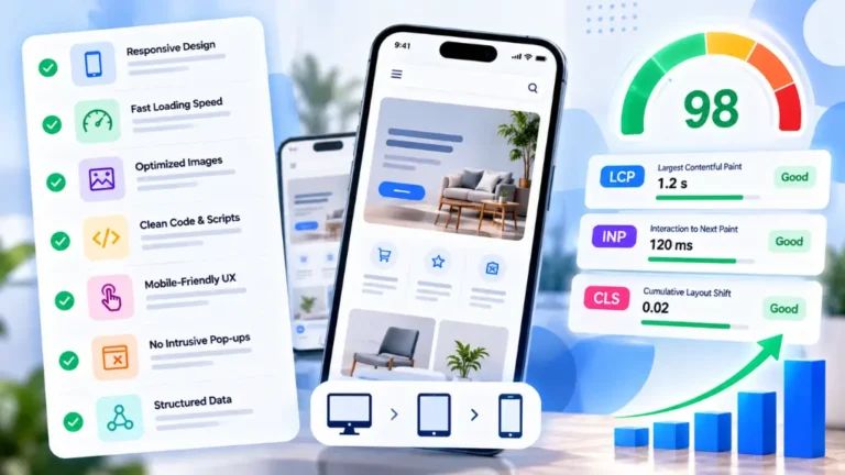
Above the Fold Design: Best Practices for 2026
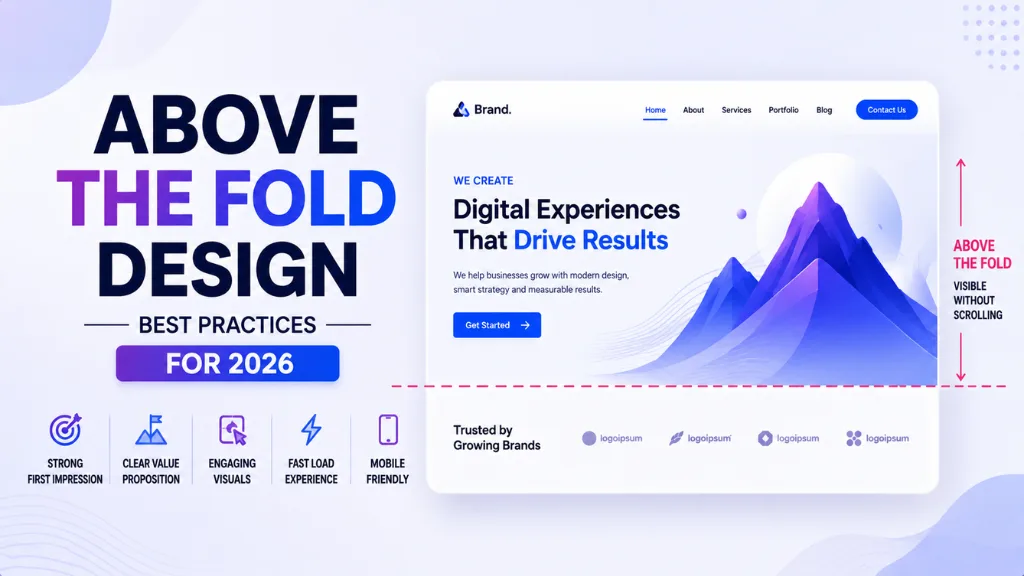

Here is the window where most websites win or lose: the first viewport a visitor sees the moment a page loads, before a single scroll happens.
In this article16 sections
Above the fold design is the portion of a webpage visible on screen without scrolling – and the data from 2026 makes its importance startlingly specific. The average visitor spends 11 seconds above the fold on desktop and 7 seconds on mobile before deciding to scroll, click, or bounce. That is the entire decision window. Miss it, and everything below the fold is irrelevant.
Above the fold design matters because of what happens inside those seconds. 57% of desktop visitors never scroll below the first viewport, and on mobile that figure climbs to 64%. More than half of your visitors make their entire judgement of a page – and often of your brand – based solely on what your fold design communicates before they move a finger.
Above the fold design is simultaneously a UX decision, a conversion decision, and an SEO decision. Google’s Core Web Vitals measure how fast above-the-fold content loads and how stable it is visually, making fold performance a confirmed ranking signal alongside its conversion impact.
At Search Savvy, the above the fold area is the first place we examine in any website conversion audit, because the single highest-leverage improvement available on most websites is not more content, better copy below the scroll, or a website redesign – it is getting the first viewport right. This guide walks through exactly how to do that in 2026.
What Is Above the Fold Design?#
Above the fold design refers to all content, layout, and visual decisions governing the portion of a webpage visible without scrolling – the hero section of a homepage, the first view of a landing page, or the opening viewport of any product or service page.
Above the fold design originated in print publishing, where newspaper editors placed the most important stories in the top half of the front page (literally above the physical fold of the paper) to maximise visibility on newsstands. The same principle applies digitally: the content your visitors see first carries a disproportionate share of the decision-making burden.
People Also Ask: What is considered “above the fold” on a website? Short Answer: Above the fold on a website refers to the content visible without scrolling when a page first loads. The exact pixel boundary varies by device – approximately 600 to 800 pixels on a desktop, 400 to 500 pixels on a mobile phone in portrait orientation – meaning fold design must work across a range of viewport sizes rather than one fixed dimension.
Why Does Above the Fold Design Matter in 2026?#
Above the fold design matters in 2026 more than ever for a reason that surprises most site owners: above-the-fold content garners 57% of users’ total viewing time, even on pages where scrolling is common. The first viewport absorbs more than half of all visual attention regardless of how compelling the rest of the page is.
Above the fold design also directly determines whether a visitor bounces before reading a word of your content. Eye-tracking studies show visitors spend roughly five to six seconds scanning the above-the-fold area before deciding to continue or leave – making the fold the first and most consequential filter in your entire conversion funnel.
Above the fold design matters for SEO too. Google measures Largest Contentful Paint (LCP), the time it takes for the main visible above-the-fold content to render, as a Core Web Vitals ranking signal. A fold design that relies on heavy, unoptimised images or render-blocking scripts directly hurts both user experience and search rankings simultaneously.
- 57% of desktop visitors never scroll below the first viewport; 64% on mobile
- Visitors spend 11 seconds above the fold on desktop, 7 seconds on mobile before deciding
- LCP – the primary Core Web Vitals metric measuring above-the-fold load speed – is a confirmed Google ranking signal
- A one-second delay in page response reduces conversions by 7%
- 90%+ of companies prioritise faster load times and clearer, more prominent CTAs as their top landing page improvements in 2026
People Also Ask: Does above-the-fold design affect Google rankings? Short Answer: Yes. Google’s Largest Contentful Paint (LCP) Core Web Vitals metric specifically measures how quickly above-the-fold content loads and becomes visible. A fold design that delays rendering through unoptimised images, render-blocking scripts, or heavy CSS hurts both user experience and search rankings simultaneously.
How Does Above the Fold Design Work?#
Above the fold design works by completing five sequential jobs in the first moments a visitor spends on a page, before they scroll or take any action. Missing any of these jobs reduces the probability of continued engagement.
The five jobs above the fold design must complete:
- Stop the scroll – an immediately compelling headline and hero visual earn the attention needed for everything else
- Communicate the value – a clear, specific subheadline that answers “what does this do, and is it for me?”
- Build initial trust – at least one concrete social proof signal visible before the fold ends
- Reduce friction – remove competing decisions so the visitor’s attention flows toward one primary action
- Make the ask – a visible, specific, high-contrast CTA that is reachable without scrolling on every device
Above the fold design fails most often when it tries to communicate everything about a brand or product in the hero rather than earning the scroll to learn more.
What Should Every Above the Fold Design Include?#
Above the fold design has seven core components that the highest-converting pages in 2026 consistently include. Not every page needs all seven, but each has a specific job – and leaving one out typically creates a measurable gap in conversion.
1. An Outcome-Led Headline#
Above the fold design starts with a headline that names the outcome the visitor wants, not the features your product offers. Benefit-led headlines outperform feature-led headlines by 27%, and headlines that include a specific number outperform vague benefit statements by a further margin.
“Rank higher and drive more organic traffic” outperforms “AI-powered SEO platform.” The visitor is not buying the tool – they are buying the outcome. Your headline should name it in the visitor’s language, not your own.
2. A Clarifying Subheadline#
Above the fold design should pair every headline with a subheadline of one to two sentences that closes the most likely gap in understanding – what you do, who it is for, or how it is different. 80% of landing page visitors read only the headline and the first sentence of the subhead before deciding whether to continue. Those two lines carry the majority of the above-fold communication burden.
3. A Single, Specific Primary CTA#
Above the fold design should make one primary action obvious. Short-form pages convert 17% better with a single above-the-fold CTA. When a hero section presents two equally prominent CTAs, conversion drops because attention splits between them.
First-person CTA copy (“Start My Free Audit”) consistently outperforms second-person (“Start Your Free Trial”) by 14%, and specific outcome CTAs (“Get My SEO Report”) outperform generic verbs (“Submit”) by 31%.
4. A Real, Specific Social Proof Signal#
Above the fold design benefits enormously from at least one concrete trust signal placed before the fold. “Trusted by industry leaders” is invisible. “Used by 12,400 Shopify stores” is concrete and believable – specific numbers are more credible because they do not sound manufactured.
Effective above-the-fold social proof includes: a star rating with review count, logos of recognisable customers, a specific user count, or a one-line quote from a named, real customer.
5. A Hero Image or Visual That Shows Reality#
Above the fold design works best when the hero visual shows the actual product, actual users, or actual outcomes – not stock photography of generic business scenes. Real product screenshots, real customer photos, and genuine results-based visuals convert significantly better than abstract imagery because they answer a visitor’s implicit question: “Is this real and is it relevant to me?”
6. A Navigation Header That Does Not Compete#
Above the fold design should keep the navigation header clean and minimal. Landing pages with navigation menus convert at 10 to 15% lower rates than equivalent pages without navigation. For homepages where navigation is necessary, limiting the main menu to five to seven items and avoiding drop-down complexity in the header preserves valuable fold attention for the primary message.
7. Speed That Does Not Make Visitors Wait#
Above the fold design must load fast enough that the decision window starts with the page visible, not with a loading spinner. Pages that load in one second convert three times better than pages that load in five seconds. The LCP target of 2.5 seconds is the minimum standard – every second above that compounds conversion loss directly.
People Also Ask: What is the most important element of above-the-fold design? Short Answer: The headline is the most impactful single element in above-the-fold design, since 80% of visitors read only the headline and first line of the subheadline before deciding to continue. An outcome-led headline that names the specific benefit in the visitor’s language, paired with a clear CTA, is the highest-leverage starting point for any fold optimisation.
How Should You Design Above the Fold for Mobile in 2026?#
Above the fold design for mobile requires a fundamentally different approach from desktop, not just a scaled-down version of the same layout. In 2026, 63% of web traffic is mobile. Pages designed desktop-first and adjusted for mobile consistently underperform against pages designed mobile-first.
Above the fold design for mobile means designing the hero for a 400 to 500-pixel-tall viewport first – approximately the height of a phone screen in portrait orientation. If the headline, subheadline, and primary CTA do not all fit comfortably within that height, the fold design needs to be simplified, not stretched.
Practical mobile fold design checklist:
- Primary CTA is thumb-reachable without scrolling or zooming
- Headline fits within two lines at mobile font sizes without truncation
- All images are WebP format (25 to 35% smaller than JPEG or PNG with no visible quality difference)
- Images have explicit width and height attributes to prevent layout shift (CLS)
- Critical CSS is inlined in the HTML to avoid render-blocking delays
- Non-essential JavaScript is deferred until after above-fold content renders
How Do You Test Whether Your Above the Fold Design Is Working?#
Above the fold design improvements are only confirmed through testing, not assumptions. Three testing methods give the clearest signal:
Scroll-depth analysis reveals what percentage of visitors scroll past the fold at all. The median scroll-past rate is around 60%, meaning roughly 40% of traffic only ever sees the hero. If your scroll-past rate is below 50%, the fold design is failing to earn the scroll regardless of how strong the content below it is.
Session replays (using tools like Hotjar or Microsoft Clarity) show where visitors’ cursors linger, hesitate, or tap repeatedly – revealing confusion and friction that standard analytics miss entirely.
A/B testing on individual elements – headline, CTA copy, CTA colour, hero image, social proof placement – produces reliable data when run to statistical significance (at least 2,000 conversions per variant). Test one variable at a time.
How Should Indian Businesses Approach Above the Fold Design?#
Above the fold design for Indian businesses must account for mobile-first usage at scale and variable network conditions across city tiers. The most common fold design failure in Indian SMB sites is an overloaded hero section – heavy, uncompressed imagery, multiple competing CTAs, and slow LCP – that simultaneously fails the user experience and Core Web Vitals benchmarks.
Above the fold design for Indian audiences also benefits from India-specific social proof signals in the fold – a customer count from recognisable Indian brands, a testimonial in context, or a specific outcome relevant to the local market – since generic international social proof (“Trusted by Fortune 500 companies”) carries less resonance than proof from familiar regional contexts.
According to Search Savvy’s insights from auditing conversion funnels for Indian D2C and service businesses, the most common and most easily fixed above-the-fold issue is a CTA that either does not appear in the mobile viewport at all, or uses generic copy like “Learn More” or “Contact Us” rather than a specific, outcome-driven action.
Conclusion: The First Viewport Is Where Decisions Are Made#
Above the fold design is not a stylistic preference – it is the most commercially consequential section of any webpage, responsible for the majority of your visitors’ total attention and the decision of whether to stay or leave.
Search Savvy treats above the fold design as a core conversion and SEO audit item on every client website review, because getting this one section right consistently produces faster, more measurable improvements than any equivalent investment in content or traffic.
FAQ: Above the Fold Design – Your Questions Answered#
Q1: What exactly is “the fold” on a website in 2026? The fold refers to the content visible on a user’s screen without any scrolling. It varies by device – roughly 600 to 800 pixels on desktop and 400 to 500 pixels on mobile in portrait mode. Since there is no fixed universal fold height, above the fold design must work across all these viewport sizes rather than targeting one specific pixel dimension.
Q2: Does the fold still matter if most users now scroll? Yes. While most users scroll when a page earns their attention, above-the-fold content still receives 57% of total viewing time and determines whether a visitor decides to scroll at all. A poor fold design stops 40% to 64% of visitors before they reach any other content, regardless of how strong that content is.
Q3: Should the primary CTA always be above the fold? For short-form pages with a simple offer, yes – a single above-the-fold CTA converts 17% better than one placed only below the fold. For long-form pages with complex offers, multiple CTAs spaced throughout the page perform better because the decision requires more information. A/B testing your specific page context is the only reliable way to confirm which placement works best for your audience.
Q4: How does above-the-fold design affect Core Web Vitals? Largest Contentful Paint (LCP) – the time for the main above-the-fold content element to render – is a direct Core Web Vitals ranking signal. Heavy images, render-blocking scripts, or undeferred JavaScript in the fold all delay LCP, hurting both user experience and Google rankings simultaneously.
Q5: What is the biggest above-the-fold design mistake in 2026? The most common mistake is a feature-led headline that describes the product instead of naming the outcome the visitor wants, combined with a generic CTA like “Learn More.” These two elements together produce the highest rates of immediate bounce, since visitors cannot quickly determine whether the page is relevant to their specific need.
Q6: How often should you test and update your above-the-fold design? Run continuous A/B tests on individual fold elements – headline, CTA copy, hero image, social proof placement – rather than doing a complete redesign periodically. Test one variable at a time to at least 2,000 conversions per variant. The fold is never finished; it is always being refined based on what the data shows your specific audience actually responds to.
Think your above-the-fold design might be costing you conversions – or not sure if your mobile fold is visible at all on the most common devices your visitors use? Visit Search Savvy for a conversion and technical audit that evaluates your fold design against every 2026 best practice.