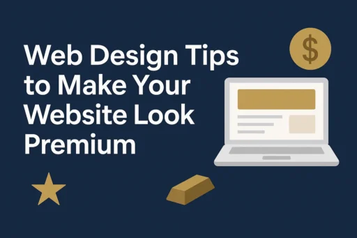

In today’s competitive digital landscape, making a strong first impression is essential. Your website isn’t just a digital brochure-it’s the face of your brand, and it needs to communicate quality, professionalism, and trustworthiness from the moment visitors land on your homepage. At Search Savvy, we’ve helped countless businesses transform their online presence with design strategies that make sites look premium without breaking the budget. Whether you’re a startup or an established business, these web design tips will help you create a website that exudes sophistication and keeps visitors engaged.
The difference between an expensive-looking website and a generic one often comes down to strategic design choices rather than the actual budget. From intentional use of white space to thoughtful typography selections, every element plays a role in shaping user perception. According to Search Savvy’s research, websites that implement premium design principles see significantly higher engagement rates and lower bounce rates compared to cluttered, outdated designs.
Let’s explore the essential web design tips that will elevate your site from average to extraordinary in 2025.
How Does Strategic White Space Make Your Website Look More Expensive?
Web design tips start with understanding the power of negative space. White space, also known as negative space, is the empty area surrounding your content and design elements. Far from being wasted real estate, white space is a hallmark of luxury brands and premium design.
Websites featuring generous amounts of macro white space often convey minimalism and luxury, creating an impression of sophistication that immediately sets your brand apart. Think of iconic brands like Apple (), Chanel, or Tesla-their websites use ample breathing room around each element, allowing content to command attention without competing for space.
The psychological impact is powerful: when users encounter a clean, uncluttered interface, they perceive the brand as more professional, trustworthy, and high-end. At Search Savvy, we recommend implementing white space in these strategic ways:
- Create visual hierarchy: Use generous margins between sections to guide the eye naturally through your content
- Improve readability: Add sufficient line spacing (leading) to make text blocks easier to scan and digest
- Highlight key elements: Surround important call-to-action buttons or featured products with negative space to draw focus
- Balance complexity: If your content is information-dense, white space prevents cognitive overload
Remember, white space doesn’t need to be literally white-it can be any background color, texture, or pattern that serves as a neutral canvas for your primary content. The key is creating visual breathing room that makes your design feel intentional and curated rather than cramped.
Why Is Premium Typography Critical for Expensive-Looking Web Design in 2025?
Web design tips for 2025 emphasize that typography is no longer just about readability-it’s a brand statement. Bold, expressive typefaces that capture attention and establish clear brand voice are gaining popularity, with designers using typography as a storytelling device.
Expensive-looking websites use typography strategically in several ways. First, they often pair contrasting fonts-such as an elegant serif for headings with a clean sans-serif for body text-to create visual interest while maintaining professionalism. Second, they pay attention to details like letter spacing (kerning), line height, and font weight to ensure every word appears polished.
Search Savvy recommends these typography best practices:
- Invest in quality fonts: Explore premium typefaces from sources like Adobe Fonts or Google Fonts for professionally designed options
- Limit your font families: Stick to 2-3 complementary fonts maximum to maintain consistency
- Use generous sizing: Don’t be afraid of large, bold headlines-they command attention and feel confident
- Consider variable fonts: These allow precise weight and width adjustments for more sophisticated designs
- Optimize for readability: Ensure sufficient contrast between text and background, especially for body copy
Custom typography can also set your brand apart. Designers are experimenting with custom typefaces, unique ligatures, and abstract letterforms to make logos and brands stand out. Even if a fully custom font isn’t in your budget, thoughtful selection and implementation of existing premium fonts can dramatically elevate your site’s appearance.
What Role Do High-Quality Visual Elements Play in Premium Web Design?
Web design tips from industry leaders consistently emphasize that imagery quality directly impacts brand perception. Nothing undermines an expensive-looking design faster than pixelated photos, generic stock images, or poorly optimized graphics.
Luxury websites use special effects, intelligent design, and unusual display features to convince customers they deserve expensive time and attention. The visual content you choose must align with this principle.
According to Search Savvy, high-quality visuals include:
- Professional photography: Custom photos of your products, team, or services always outperform stock imagery
- Cohesive visual style: Maintain consistent filters, color grading, and composition across all images
- Strategic image placement: Use large, edge-to-edge hero images to create impact and immersion
- Optimized file sizes: Use tools like TinyPNG or ImageOptim to compress images without sacrificing quality
- Thoughtful illustrations: Custom graphics or premium illustration sets add personality and differentiation
Movement and animation have become distinguishing factors, with many brands using animated web design to showcase their colors, fonts, and dynamic personalities. However, animation should enhance rather than distract-subtle hover effects, smooth transitions, and micro-interactions feel premium when executed tastefully.
Consider incorporating 3D elements where appropriate. WebGL and related technologies are being used beyond portfolios-product showcases, interactive charts, and landing pages are getting 3D treatment. These immersive experiences create memorable moments that elevate perceived value.
How Can Color Choices Make Your Website Appear More High-End?
Web design tips for color selection in 2025 have evolved beyond simply choosing brand colors. The right palette can instantly communicate luxury, sophistication, and professionalism-or undermine your credibility if chosen poorly.
Web design color trends for 2025 embrace a significant shift toward digital comfort, with designers moving toward soothing and nurturing color palettes that create welcoming digital spaces and reduce visual fatigue. This doesn’t mean designs are becoming dull; rather, they’re using rich warm tones to create interest while maintaining elegance.
At Search Savvy, we guide clients through these color strategy considerations:
- Sophisticated neutrals: Grays, beiges, and muted tones create an upscale foundation that lets other elements shine
- Accent colors strategically: Use bold colors sparingly for calls-to-action and key highlights
- Dark mode options: Dark mode is becoming increasingly popular, saving battery life on OLED screens and reducing eye strain in low light conditions
- Color psychology: Choose hues that align with your brand values and industry expectations
- Test contrast ratios: Use tools like WebAIM’s Contrast Checker (https://webaim.org/resources/contrastchecker/) to ensure accessibility while maintaining visual appeal
The Pantone Color of the Year 2025 is PANTONE 17-1230 Mocha Mousse, a shade that invites us to slow down and indulge in everyday pleasures. Incorporating trending colors thoughtfully can make your design feel current and considered.
Premium websites often use restrained color palettes-limiting themselves to 2-3 primary colors plus neutrals. This restraint prevents the “rainbow effect” that makes sites look amateurish or overwhelming.
Why Does Minimalist Layout Design Signal Premium Quality?
Web design tips for layout structure emphasize that less is genuinely more when creating expensive-looking websites. Minimalism doesn’t mean boring-it means purposeful, with every element earning its place on the page.
Minimalism puts user experience first, making it one of the most consistent top web design trends. This timeless approach creates calm, focused environments where your content and offerings take center stage.
Search Savvy’s minimalist layout principles include:
- Clear visual hierarchy: Establish importance through size, color, and positioning rather than decorative elements
- Intentional asymmetry: Asymmetric grids are popular, as breaking perfect grid rules adds personality while keeping layouts structured
- Focused content blocks: Group related information together with ample spacing between sections
- Strategic use of shapes: Using shapes deliberately in website design can generate emotion and influence the viewer
- Streamlined navigation: Make it effortless for users to find what they need without visual clutter
One emerging approach is the bento box layout style, which uses modular blocks to organize content-particularly effective for portfolios and dashboards. This organizational method feels both contemporary and premium when executed with generous spacing and high-quality content.
Minimalist design also improves website performance. Fewer elements mean faster load times, which is crucial for both user experience and search engine rankings. In 2025, speed is luxury-users expect instant access to information without waiting for excessive graphics or animations to load.
What Technical Elements Separate Expensive-Looking Sites from Average Ones?
Web design tips must extend beyond aesthetics to include technical excellence. Premium websites feel polished because they load quickly, respond smoothly, and function flawlessly across all devices.
Smooth scrolling makes sites feel smoother and more premium, giving users that fluid, effortless flow that feels high-end. While not yet standard everywhere, this simple addition can instantly elevate the browsing experience when implemented correctly.
At Search Savvy, we emphasize these technical considerations:
- Lightning-fast load times: Optimize images, minify code, and leverage caching for sub-2-second load times. Test your site regularly with Google PageSpeed Insights (https://pagespeed.web.dev/) to identify bottlenecks
- Responsive design excellence: Mobile-first approach continues to be crucial, with websites designed to work seamlessly on smaller screens. Learn more about responsive design at MDN Web Docs (https://developer.mozilla.org/en-US/docs/Learn/CSS/CSS_layout/Responsive_Design)
- Micro-interactions: Subtle yet impactful animations or responses to user actions breathe life into websites and enhance engagement
- Accessibility compliance: Premium design is inclusive design-ensure your site meets WCAG 2.2 AA standards (https://www.w3.org/WAI/WCAG22/quickref/) for accessibility
- Performance monitoring: Regularly test and optimize for speed, particularly on mobile devices using tools like GTmetrix (https://gtmetrix.com)
Consider that many designers overlook setting a maximum width, resulting in layouts that stretch awkwardly on larger displays. A properly contained design that scales beautifully from smartphones to ultra-wide monitors demonstrates attention to detail that users notice, even if unconsciously.
How Do Animation and Interactivity Enhance Perceived Value?
Web design tips for 2025 recognize that static websites feel dated compared to thoughtfully animated experiences. The key is subtle, purposeful motion that enhances usability rather than distracting from content.
Interactive devices from animation to scrolling effects to beautiful imagery help weave stories and keep users engaged with websites. This storytelling approach transforms browsing from passive viewing to active exploration.
Search Savvy recommends these animation strategies:
- Hover effects: Simple color changes, scale adjustments, or underlines on buttons and links provide immediate feedback
- Scroll-triggered animations: Reveal content progressively as users scroll, creating rhythm and anticipation using libraries like AOS (https://michalsnik.github.io/aos/)
- Parallax effects: Subtle depth through different scroll speeds adds dimension without overwhelming
- Loading animations: Replace generic spinners with branded micro-animations that entertain during brief waits
- Transition smoothness: Ensure all state changes happen smoothly rather than abruptly
However, restraint is critical. Overanimation can make sites feel gimmicky or, worse, slow them down. Every animation should serve a purpose-guiding attention, providing feedback, or enhancing storytelling. When in doubt, test with real users to ensure motion adds value rather than annoyance.
What Design Details Make the Biggest Difference in Perceived Quality?
Web design tips often focus on major elements, but the details truly separate premium sites from mediocre ones. These finishing touches demonstrate care and professionalism that users intuitively recognize.
Consider these detail-oriented improvements that Search Savvy implements:
- Consistent spacing systems: Use a mathematical scale (like 8px or 10px increments) for all margins and padding
- Perfect alignment: Ensure every element aligns precisely to your grid system
- Polished icons: Use a cohesive icon set with consistent stroke weights and style from sources like Font Awesome (https://fontawesome.com) or Feather Icons (https://feathericons.com)
- Thoughtful loading states: Display skeleton screens or progress indicators rather than blank pages
- Error prevention: Guide users with clear labels, helpful placeholder text, and inline validation
- Consistent button styling: Maintain hierarchy with primary, secondary, and tertiary button styles
The devil truly is in the details. Users might not consciously notice perfect alignment or consistent spacing, but they’ll certainly feel the difference between a polished site and a careless one. These micro-decisions compound to create an overall impression of quality and trustworthiness.
Frequently Asked Questions
Q: How much does it cost to make a website look expensive?
A: Creating an expensive-looking website doesn’t require an expensive budget. The key is strategic design choices like generous white space, premium typography, high-quality imagery, and attention to detail. Many of these elements-such as thoughtful layout and color selection-cost nothing but time and expertise. Focus on quality over quantity, and invest in professional photography or premium fonts where budget allows.
Q: What’s the difference between minimalist and cheap-looking web design?
A: Minimalist design is intentional and strategic, using restraint to create focus and elegance. Cheap-looking design often results from lack of planning or expertise-characterized by poor spacing, low-quality images, inconsistent styling, and cluttered layouts. Minimalism enhances content; cheap design detracts from it.
Q: How long does it take to redesign a website to look more premium?
A: Timelines vary based on site complexity, but a focused redesign emphasizing premium aesthetics typically takes 4-8 weeks. This includes strategy, design, development, and testing phases. Quick improvements-like upgrading typography, increasing white space, and replacing images-can show results in 1-2 weeks.
Q: Should my expensive-looking website include animation?
A: Animation can enhance perceived value when used thoughtfully and subtly. Focus on micro-interactions, smooth transitions, and purposeful motion that guides users or provides feedback. Avoid excessive animation that slows load times or distracts from content. The goal is polish, not spectacle.
Q: How do I maintain an expensive look while keeping my website fast?
A: Optimize all images (use modern formats like WebP), minify CSS and JavaScript, leverage browser caching, and use a content delivery network (CDN) like Cloudflare (https://www.cloudflare.com). Premium design and fast performance aren’t mutually exclusive-they’re both essential. Modern techniques allow beautiful visuals without sacrificing speed.
Q: What colors make a website look more expensive in 2025?
A: Sophisticated neutral palettes (grays, beiges, muted earth tones) paired with strategic accent colors create upscale impressions. Avoid overwhelming color schemes. Current trends favor warm, comforting tones like Mocha Mousse (Pantone 2025’s Color of the Year) alongside classic blacks, whites, and rich navy blues. Consider offering dark mode options for added sophistication.
Conclusion
Creating an expensive-looking website isn’t about unlimited budgets-it’s about strategic design decisions that communicate quality, professionalism, and attention to detail. By implementing these web design tips from Search Savvy, you can transform your online presence into a premium experience that builds trust, engages visitors, and drives conversions.
Remember that premium design is an investment in your brand’s future. Every element, from white space to typography to subtle animations, shapes how users perceive your business. Take time to refine these details, test with real users, and continuously improve based on feedback and performance data.
Ready to elevate your website? Start with one or two of these strategies today, and watch as your site transforms from ordinary to extraordinary. Your visitors-and your bottom line-will thank you.
Additional Resources
- W3C Web Accessibility Initiative (https://www.w3.org/WAI/) – Learn more about making your site accessible to all users
- Google PageSpeed Insights (https://pagespeed.web.dev/) – Test and optimize your website’s loading speed
- Pantone Color of the Year (https://www.pantone.com/color-of-the-year/2025) – Stay current with color trends and inspiration
- CSS-Tricks (https://css-tricks.com) – Comprehensive tutorials and guides for modern web design techniques
- Smashing Magazine (https://www.smashingmagazine.com) – Expert insights on web design and development
For personalized guidance on implementing these web design tips for your business, contact Search Savvy today. We specialize in creating premium, high-performing websites that don’t just look expensive-they deliver exceptional results.